TF2 - Polypack - RobSkib
Hey y'all, long time lurker, first time poster. I've finally pulled my finger out and settled down to do some work for this awesome competition, but I've been wracking my brains trying to come up with a decent concept. I'm self-taught (read: awful) at XSI and I've just weaned myself off PSP and onto Photoshop, so bear with the awful drawings. From what I've learned from this place though, everyone is incredibly friendly and helpful which is good, I'll certainly need a lot of help!
I've scoured the forum and (to my knowledge) nobody has done anything similar to this, and if they have, I'm sure someone can point me in the right direction. I realise I've started this competition fairly late in the game, but I have plenty of spare time now that Uni has finished and I'd really like to get something ace out of this, so I hope to update with doodles and renders even if nobody replies. Anyhoo, on with the show...
CLASS: Pyro!
THEME: Aztec Fire God!
Three items:
- Melee Weapon - 'Macahuitl' or 'club with sharp rocks'
- Primary - An ancient Mayan Flamethrower
- Hat - Fancy Headdress
I've done a couple of rough sketches so you realise there is method to this madness:
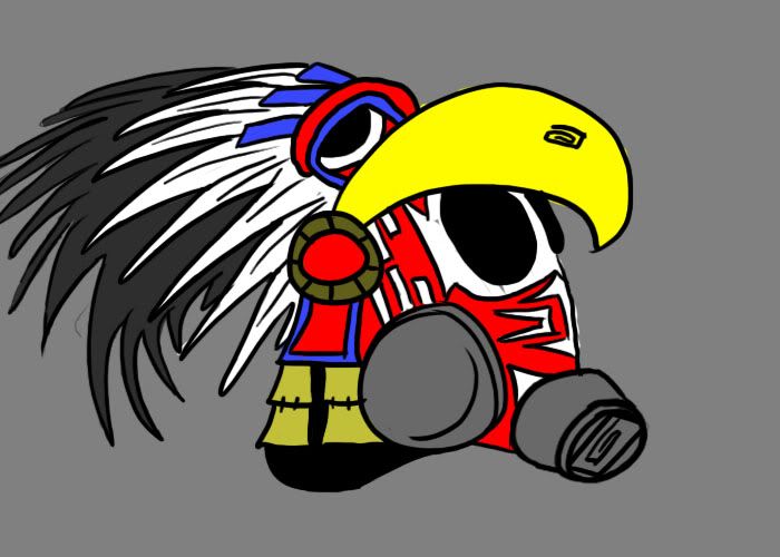
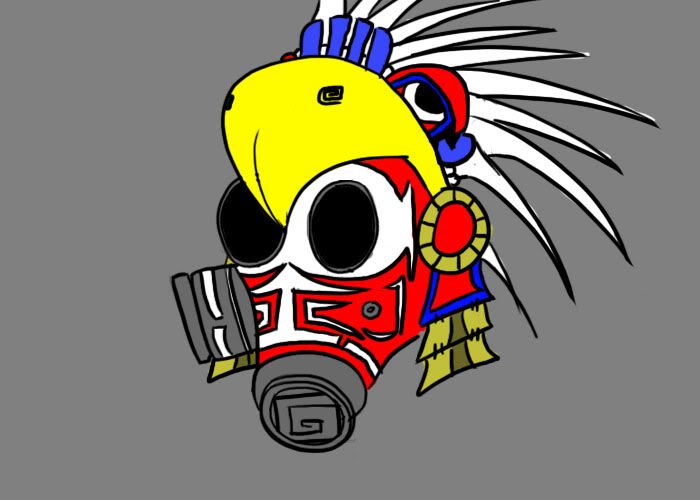
In the morning I'll get some proper concepts done, various designs etc and I'll start blocking out some ideas for the Macahuitl and the flamethrower. To save excessive googling, a macahuitl is essentially this:
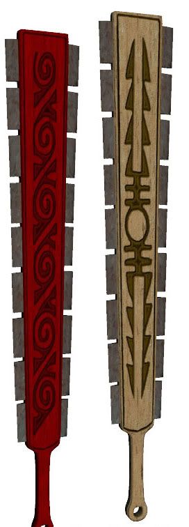
Not my work, just plundered off t'internets.
I havn't put any of this into practice yet, but you have to start somewhere, right? I thought although Pyro holds his axe with one hand near the bottom of the handle and his other hand near the top, this wouldn't be too much of a problem as when he's going hell for leather, both hands are at the bottom.
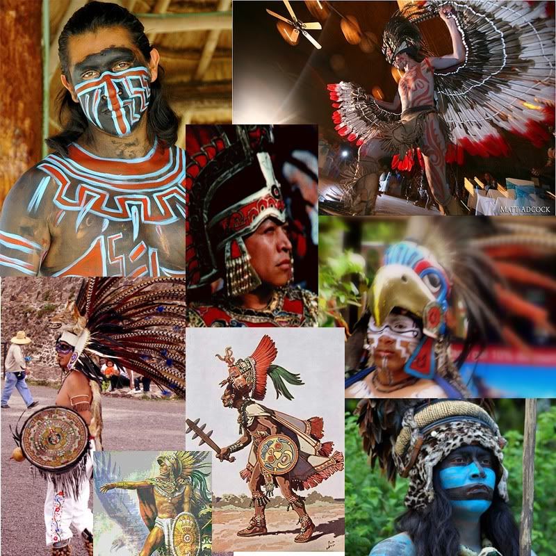
I'm using images such as these for reference so you know where I'm coming from. Bright, bold colours with a very distinct 'old world' feel. I know at first glance this might not seem to fit into the TF2 universe, but I think once I've got work starting to take shape, it'll tie in quite nicely. Well, that's the theory anyway.
Watch this space!
I've scoured the forum and (to my knowledge) nobody has done anything similar to this, and if they have, I'm sure someone can point me in the right direction. I realise I've started this competition fairly late in the game, but I have plenty of spare time now that Uni has finished and I'd really like to get something ace out of this, so I hope to update with doodles and renders even if nobody replies. Anyhoo, on with the show...
CLASS: Pyro!
THEME: Aztec Fire God!
Three items:
- Melee Weapon - 'Macahuitl' or 'club with sharp rocks'
- Primary - An ancient Mayan Flamethrower
- Hat - Fancy Headdress
I've done a couple of rough sketches so you realise there is method to this madness:


In the morning I'll get some proper concepts done, various designs etc and I'll start blocking out some ideas for the Macahuitl and the flamethrower. To save excessive googling, a macahuitl is essentially this:

Not my work, just plundered off t'internets.
I havn't put any of this into practice yet, but you have to start somewhere, right? I thought although Pyro holds his axe with one hand near the bottom of the handle and his other hand near the top, this wouldn't be too much of a problem as when he's going hell for leather, both hands are at the bottom.
I'm using images such as these for reference so you know where I'm coming from. Bright, bold colours with a very distinct 'old world' feel. I know at first glance this might not seem to fit into the TF2 universe, but I think once I've got work starting to take shape, it'll tie in quite nicely. Well, that's the theory anyway.

Watch this space!
Replies
I knocked this together quickly as a starting point for the macahuitl. My modelling skills leave a lot to be desired, so bear with me! I've added a few nicks to the blades here and there to break up the symmetry, I've still got plenty to do though. I was thinking some dangly feathers at the top as a kind of charm or ward, and makybe some more at the bottom hanging off the handle. The handle itself I'm not sure what to do with, probably add some tape (if I knew how!) and a cap at the end to make it look better.
http://thedarkblade.com/wp-content/uploads/Macahuitl1.jpg
Interesting theme you've chosen, and I like how the macahi... macahu... the club-thingie is turning out.
You musta read ma mind!
That's precisely the images I'm working with, I'm a big fan of Old World history, and a big stone 'feathered serpent' idol will be the ideal replacement for the flamethrower. I was thinking some kind of bellows mechanism at the back blowing across a brazier of liquid fire, but we'll have to see how that goes.
Yup, the club is a replacement for the Axe and for now I'm using the axe animations as placeholders, so when not hacking things apart, Pyro will be resting the club in his other hand. When he starts a-swinging however, I noticed he has both hands at the base of the handle, exactly where my handle is on the model, so hopefully it should gel quite nicely.
[IMG]file:///C:/Users/Rob/AppData/Local/Temp/moz-screenshot-1.png[/IMG]
in the bottom left there is a horrible horrible mess of points that I can't seem to work out/fathom what to do with, any advice for sorting something like this out?
there's a pretty good introduction to UV mapping in there, just skip forwards to the texturing parts, don't forget material clusters!
However, currently your idea (at least the face thing) looks a bit out of place in TF2.
The colors are too vivid, and the facepaint might make Pyro less recognicable, not to mention how it may interfere with the misc slot items.
If you were to go with this theme I'd suggest skipping the facepaint and just doing the hat, and to further make the colors match TF2's art style.
@Simski: I totally ignored your post when posting last, sorry! :S Yup, I'm well aware that the concept sketch is not in the TF2 style at all, I'm hoping to pick that up as I go through the texturing stage, there's lots of goodly tutorials that help with that.
Okay, I fixed my UV map! It's only taken me.. ooh.. several days