TF2 - Polypack - Ikimono

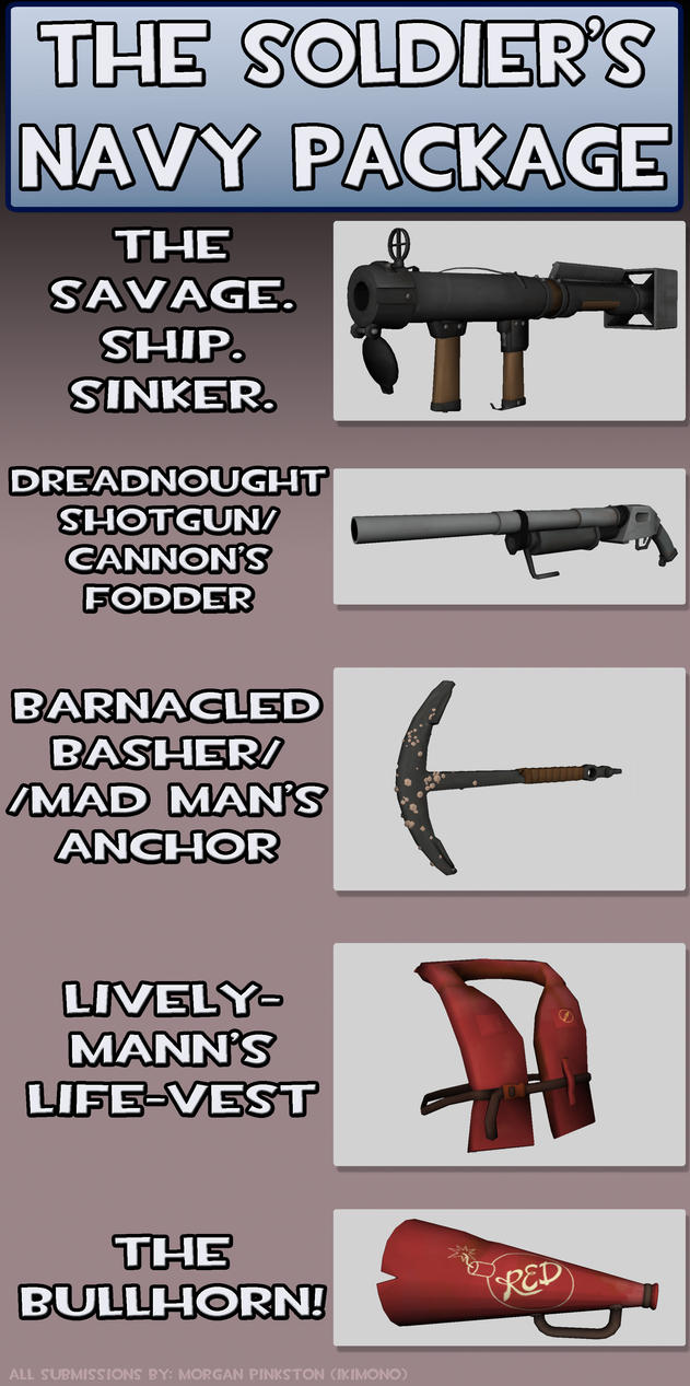
Theme: "NAVY"
First up: the Savage/Superb Ship Sinker (Torpedo Launcher) + Torpedo (not shown)
Second: Dreadnought Shotgun/Cannon's Fodder shotgun
Third: Mad Man's Anchor/Barnacled Basher
Fourth: The Lively-Mann's LifeVest - Replacement for Gunboats/Buff Banner/Misc Item
Fifth: Bullhorn
*had to do this quickly*
Replies
And I've always liked anchors as weapons since Warcraft.
That's your colour palette. Grab yourself some references from the game and see how the do metal and wood.
I have extensively studied the color pallets TF2 uses. Direct hit has green, however if you could make a better suggestion as to what a tube end protector should be colored, I will both listen and test.
How I have emulated the metal is almost exactly how the Soldier's Rocket launcher is textured; I grabbed the VTFs in photoshop and copied the painting style used from that texture.
The only arbitrary texturing I did was the red splotches which are there to give it a feel that it has been sprayed with sea salt and slightly rusted.
- Posting more items shortly -
The current rocket launcher is about 2600 polygons (cant remember exact number), but knowing that I tried to stay as close as possible to that number.
Mostly because its kind of the soldier's signature appearence
http://www.math.pitt.edu/~bard/bardware/popeye/popeye1.gif
Thoughts?
As far as other advice... you can only have 3 items, I'm sure you know, so you're going to have to drop one of these. Honestly, I'm leaning toward the anchor right now- it's not a bad idea, but it's just not very interesting, I think. The lifejacket I really like (though I'm not sure what exactly it would do), the torpedo launcher is most excellent, and the hat... I actually like seeing the soldier's eyes now and then, so I like the hat.
Your call, of course. But think about that periscope, I think it would be very cool.
I'm glad you finally changed the tone of the green cover, it didn't mesh well with the rest of the gun.
It is a minimum of 3 items, not a maximum.
I'll try a version with a periscope and cram the UVs into where the old Crosshair was.
As for the Life jacket, I was going under the idea that they would just replace the gunboats, "self preservation against self shrapnel."
For the anchor, I'm really addicted to the idea at this point, but I agree that it needs something. I will try and do some proportions exaggeration, as well as slap a grip wrapping onto it to see what that looks like. Maybie part of the Anchor's chain as well. (if i had 3D max I would slap on some jigglebones for the chain as well)
You could also put an engraving on it somewhere.
I like the idea of an engraving.
*Edit*
The idea of barnacles is growing on me.
I had rust on it before, probably not a enough, but I will try try various levels of rust and see how it looks.
at any-rate, I added a grip and first link of a chain to the anchor. I'm gonna start thinking of engravings for the anchor. Any suggestions?
*Edit*
Now i feel silly...Just realized the anchor's first chain link isn't an actual chain link. It's a different piece entirely... Well, back to work.
It's placement is exactly where the Rocket Launcher and Direct Hit's handles are.
I tried to add a "soot around the barrel" I suppose it's not working though. I'll clean it up some then.
And some nautical symbolism?
The boxiness on the end already gives it a good distinctive silhouette from the others. If you wanted to and had time you could always add some doohickeys like valves and pressure gages so the first person view would be really unique too.
When you redo the anchor texture some contrast around the edges would help to highlight them
and I would also put a few more edges on the hat to smooth it out a bit - you're still under the 800 tri limit
just noticed your soft normals on the rocket launcher in the first screens
remember to harden those outer/inner edge normals of the barrel exit and rear box thingy...well any edges that should define a hard intersection really...
*Wish I had thought about doing rope instead of a tape-like grip before I did it. I'm not all that good at making grips, but I will try another version.
Actually, If I were to add a symbol, I should probably do the TF2 symbol or something.
Updated Anchor:
When loaded the Direct hit and the Rocket Launcher into Maya, every single edge on the mesh was smoothed, so i've been going by that the entire time.
Mostly I'm not going to make them as normals because they are very good at changing silhouette and making it a little more interesting.
Added a wire, a valve (*ba-dum-tish*), and the things that go with that:
You saying to make the wire thicker makes me cry lol
Most people are saying along the same lines of "it adds shape to the front"
The wire gives some interest, I like it. The valve is great and really makes the tube more interesting. Considered making the valve/wire team palette colored?
Either way, looking good.