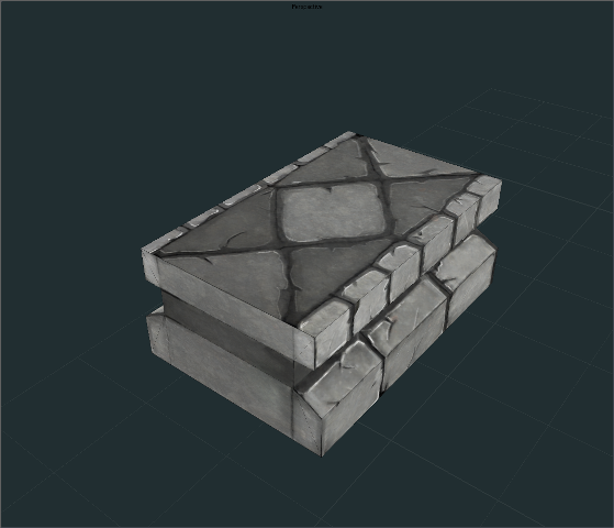
I ran into a cool little tutorial on this site. It inspired me back into creating game art. I'm creating a scene that is inspired by Torchlight/DiabloIII. Here is the first prop modeled and textured. Crits are welcomed.
How are we meant to take this? I mean to say: is it finished, or is this a first pass?
If it's finished, then you should look at adding some colour, right now it's very monochrome. Add an ambient (shadow) colour, some slight colour variation between stones, coloured highlights (blue for the sky, for instance)...
Also, you have a lot of seams that are detracting from your material, as they make it seem very boxy. These could be caused by not having enough space around your uv-islands, but we can't tell without seeing your texture and uvs.
Sorry for the confusion. I have not done game art in a while and I'm trying to get back into it. I want to work on being a environment artist. This is going to be a scene that I'm creating and Im slowly building up the props. This is my first real attempt at painting textures. I never fully understood it and I am trying to get a grasp of it.
Here is the uv/color layout. This is a first pass with confidence to show progress. I dont understand about the seams. I'm not a complete noob but I do have a long way to go. Thanks for the help.
It looks good as far as brush handling. You could use a bit more color for the shaded areas or maybe even some weeded stuff in the cracks. Basically paint in the light color to set the mood, that should make it pop more...nice start though.
Looks pretty cool man. I agree though that it needs more color. Can start with green in the cracks, denoting some sort of mold or whatnot. Also, I'm not sure 100%, but it seems like you have a bunch of wasted space in the texture on the bottom-left. You could just stretch that piece on the left all the way down to gain some more pixels.
Looks good! I would probably try not to use absolute 0,0,0 black just to keep the values of the texture from blowing out.
if you add a browny tinged tile and greeny tinged tile (just slightly) it could add a bit more variety. Have a play around with adding colours like the others have mentioned
In addition to some color variation, play with some edge highlights, as well as continuing some cracks across edges to help get rid of the boxiness. Did a quick paintover (though I didn't touch on the color variation, moss, etc).
ya i like what lotex did with the highlights, i was confused why you painted your edge highlights black, thats kind of the opposite of what i would expect
a lot of your cracks look too soft, random or oddly placed. along the bottom stones, the crack highlight is on the top, implying your lighting is coming from the bottom, contrary to the other highlights.
Replies
If it's finished, then you should look at adding some colour, right now it's very monochrome. Add an ambient (shadow) colour, some slight colour variation between stones, coloured highlights (blue for the sky, for instance)...
Also, you have a lot of seams that are detracting from your material, as they make it seem very boxy. These could be caused by not having enough space around your uv-islands, but we can't tell without seeing your texture and uvs.
Here is the uv/color layout. This is a first pass with confidence to show progress. I dont understand about the seams. I'm not a complete noob but I do have a long way to go. Thanks for the help.
if you add a browny tinged tile and greeny tinged tile (just slightly) it could add a bit more variety. Have a play around with adding colours like the others have mentioned
@ LoTekK - Thank you for the paint over to illustrate the point. It made a world of difference and I will incorporate that at the next pass.
Here is the next pass with some tiling to illustrate what I'm going for.