Sci-fi Rifle WIP

polycounter lvl 10
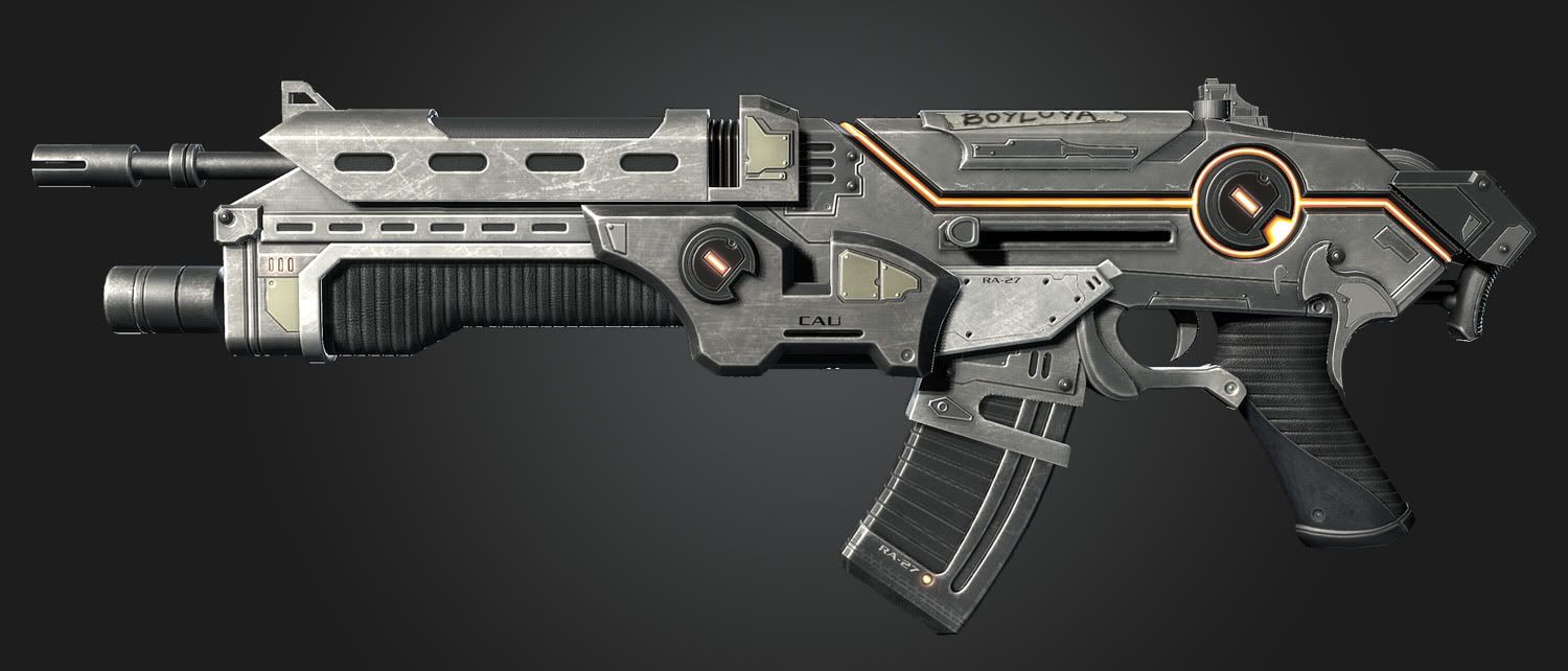
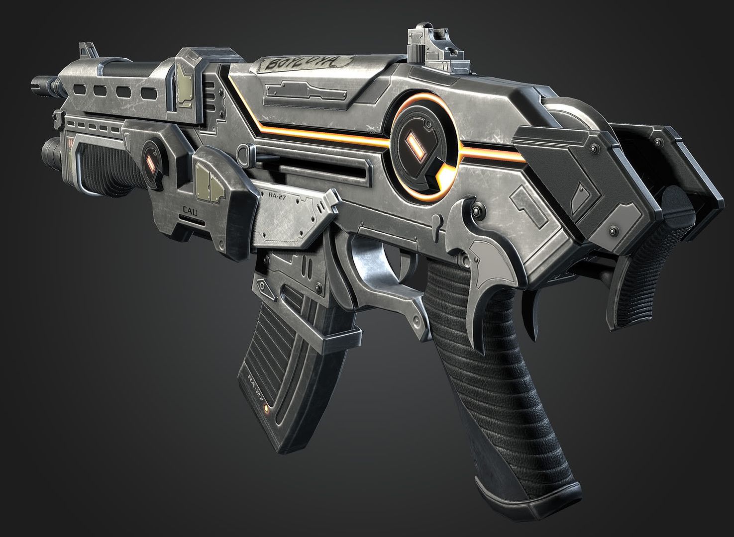
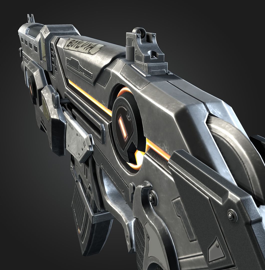
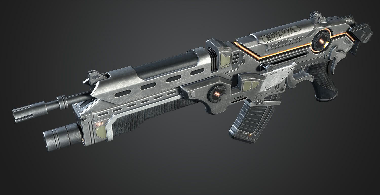
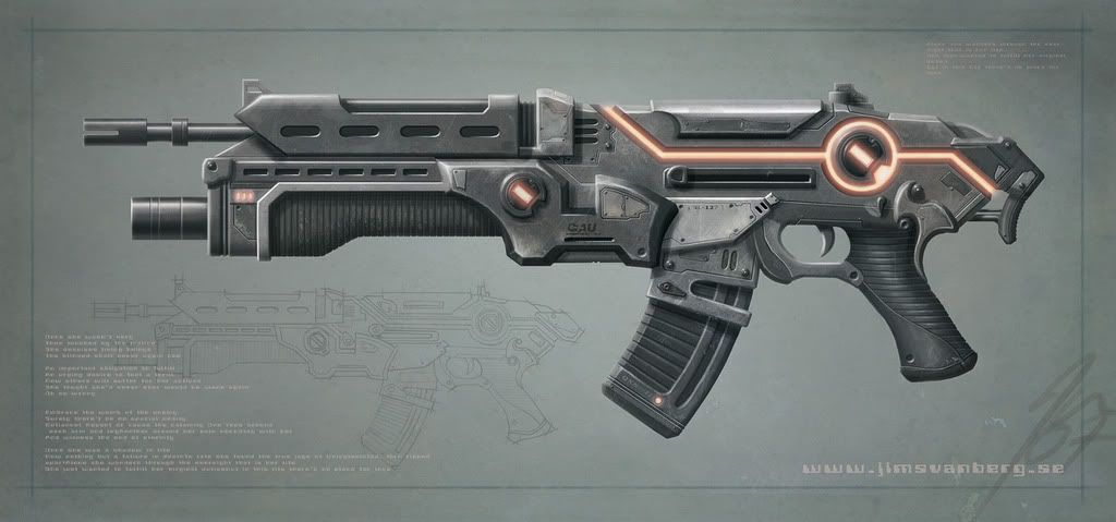
Another stuff for my portfolio. Almost done, I just have to rebake the normals to fix some shading errors and maybe add a bit more to the texture (depending on what you guys recommend). Realtime shots in max viewport with Xoliul's shader. Concept art by Jim Svanberg.
Concept art
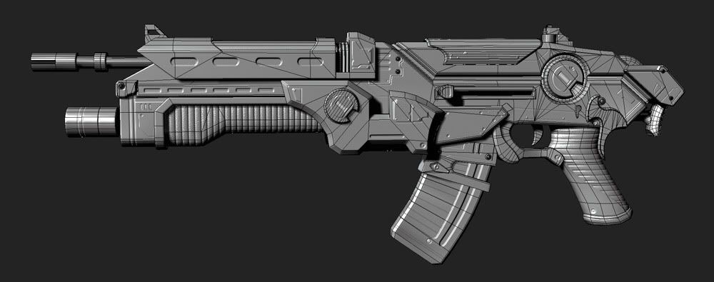
Wires
Concept art
Wires
Replies
This thing looks bad ass.
Reminds me more of a shot gun with that fore grip and no butt (I see yours is retractable)
But it looks helllllllllllllllllla good no doubt.
I'll agree with whats being said about the tape. I think I'd rather see the name carved in with a knife rather than tape though. But who knows. lol.
Looks great though. Nice work.
the back stock design is really kick ass and i think you could capitalize on that more. i would bring it further out and increase it's size. if the stock looks like it hugs the carriers shoulder more i think it would lend more credibility to this being a badass powerful weapon.
think about how you would hold this weapon, it's scale and where it would rest on your shoulder. the weapon is a bit front heavy looking as well. increasing the size of the stock would give it a more balanced design.
right now that part doesn't look realistically functional. i only offer lots of criticism on that because you have such a badass design. better than a lot of AAA games i see. i can tweak the side render in photoshop quickly if you would like to show you what i mean.
SUB-****ing-BLIME dude. love it!!!
edit**
i also noticed the colors used leaves a lot of light silver in the front. i would match that silver with the rear sight piece or another major piece light silver near the back to give it better composition. see the lights i used here to make an even scanline of color that your eyes follow.
http://img338.imageshack.us/i/dmcarbonbetav12.jpg/
exactly what you did with the stron silver piece right above where the magazine is inserted. it could just be an adjustment of your specular map. one render is perfect while the others with mroe light increase the composition issue. hope this post was helpful, that was my aim. nice work regardless.
Xoliul: Thanks laurens, really love your shader. Too bad I can't get cubemaps work for some reason.
armagon9177: Thanks mate. I read your pm but didn't quite get what you were trying to say.
Only tiny gripe I have is those spikes sticking down on either side near the back of the pistol grip - they look like they'd impale anybody trying to hold it.
EDIT: The more I look at it in the concept, the more that shape looks like it's supposed to be a contoured fillet that wraps from one side of the gun, down across the back of the pistol grip, and back up to the other side, to provide a smooth rounded seat for the web of the hand, between the thumb and trigger finger.
I LOVE the texture work. You should do a video tutorial with this - it's a very clean and very eye-catching model without too many really convoluted shapes, which would make it easy to learn from.
One thing with the texturing is that the edge wear is on some inner edges, that wouldn't really be able to get scratches/scuffs on them in those spots. That really is being picky though.
The spikes are a bit weird as cholden mentioned, but I like the overall piece so much that I can just look past that :P Learn for your next piece and just keep bashing em out mate!
Otherwise I agree with some previous posts in that the stock needs to be bigger; the gun looks like it kicks like a mule, especially with the shotgun/grenade launcher undercarriage, and to fire it you'll want a sizable butt on the stock. It's a beautiful piece though, great work.
electro and lonewolf: Thanks. Your works are such an inspiration to me.
Thats how I read the sticker at first glance at least
It looks slick dude. Nice style. It could use a good reflection map though to push the metal bits in it.
I agree with the comments about the spike pieces. Also, if that stock was extended, it looks like it would be a little flimsy for a gun like that. That's a VERY small gripe though, I just felt like I had to add something instead of repeating what everyone else said, lol.
whats_true: I'm not a gay! Haha! :poly124:
Why don´t you give the 3Point Shader a try, this thing really rocks, espacially with high quality normals enabled.
Nothing against Xoliul´s shader(it´s very good too) but 3point shader is just almost uncomparable.