The BRAWL² Tournament Challenge has been announced!
It starts May 12, and ends Oct 17. Let's see what you got!
https://polycount.com/discussion/237047/the-brawl²-tournament
It starts May 12, and ends Oct 17. Let's see what you got!
https://polycount.com/discussion/237047/the-brawl²-tournament
Cathedral
Hello  ive just finshed my first year of university and now want to build a portfolio up for placements in the 3rd year
after playing Darksiders ive decided i really want to do a Cathedral. As well as improving my UDK skills i want to get to know Zbrush alot more too so i was thinking i could add some sculptures around the Cathedral.
But one thing i do not quite understand is how to model so everything is modular, i understand what it is but i have no idea how to decide which bits to make modular on a building.
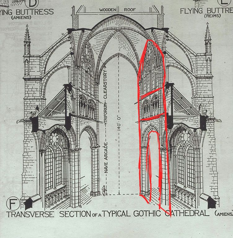
I have grabbed a picture and marked out what i think would be modular but if im wrong could someone please tell me where i am going wrong

so there would be three sections to it and then all three bits as a whole would run the length of the Cathedral as a whole?and then for eachscetion there would be a section of vaulted roof?
any help is most appreciated
after playing Darksiders ive decided i really want to do a Cathedral. As well as improving my UDK skills i want to get to know Zbrush alot more too so i was thinking i could add some sculptures around the Cathedral.
But one thing i do not quite understand is how to model so everything is modular, i understand what it is but i have no idea how to decide which bits to make modular on a building.
I have grabbed a picture and marked out what i think would be modular but if im wrong could someone please tell me where i am going wrong

so there would be three sections to it and then all three bits as a whole would run the length of the Cathedral as a whole?and then for eachscetion there would be a section of vaulted roof?
any help is most appreciated

Replies
Pillars at the bottom.
Archway on the top of the pillars.
First window above the archway, duplicated again for the other window.
Same for the section above.
I'll do a PS paintover to show what I mean, that doesn't make much sense!
ok so here are all the modular bits for the nave and some of the transcepts. You cant really see the recesses but yeah there will be like mini sculptures sitting inside there and the windows will be all pretty looking too!
Here is the overall layout, i am undecided as to where to put the big sculpture if i put it near the back then i can have a little altar thng slap bang in the middle but if i have the sculpture in the middle the back will be empty!
a shot down one of the transcepts
and a shot down the nave, i dont know if its as epic as id lke but im hoping that when i get more decorated stuff in it will look better
im off to a Cathedral tomorrow to get more reference and then ill finsh the block out
overall layout
here are all my main modular pieces for the building
ive started makking things and i started with one of the less important coloumns just as a test really
but ive decided i dont like it i knid of want a more stylized feel to it so im going to try and and see what i get!
yeah it was more a test, i think i went too far with the damage etc so ill redo and def look at the smoothing groups!
also pic a better shape, its just not that interesting when alot of gothic pillar bases have nice forms that would translate better to 3d
maybe we have a boring Cathedral or something i don't know but i didnt really like the base so i deviated! Admittely without reference! I will have another poke around for more interesting Columns!
also this is one of the side columns and wont be as prominent in the cathedral, the main columns in the middle will look alot better!
Also Sheperio i have another scout about the internet and as far as I can tell anyway, the bottoms tend to be a plain, its the tops that are full of detail?
feel free to prove me wrong though
simply copying the side profile and lathing that would give you a better more interesting form
without sounding like a fool what do you mean by lathing?
hmmm i dont know though! I actually really like it! I quite like the form i have!
Sorry didn't realize your screenshots were Maya shots. Just noticed.
let me know what you think!
lols.........Dex said benny
anyway ive spend most of the day on the base, i need to speed up! Although i did have a zbrush crash and i lost 2 hours work but hey ho!
crits would be awesome as im not sure of it! I think i need to go in and actually model some of the damage on the edges, some of the bigger bits anyway!
although this for one of the columns standing against the outer walls so i dont even know how much detail i should give them!
also worth making a polys worth of overlap on the HP and LP (although out of 0-1 in the UVs so it doesnt render) will give you a much better bake once you rotate... you can also do an extra strip down one sidebake it seperatelywith the LP uvs at each end of the UV and then paste this in PS to get it to tile perfectly
im not actually rotating this column as its only half pressed up against a wall there is the modular piece, and there will actually be a arch roof, so the two upper most faces probably wont be there!
also i have a question about laying out my uvs and maps. Does each modular piece have its own map yes? and what size?like this would be the outer wall and part of the floor so would i make it a 1024 as its actually part of the main building?
As Shep mentioned, the damage looks small and miniscule for such a large prop. Don't be afraid to shear off some chunks and get some cool looking large areas of damage.
To answer your question, your modular pieces should be sharing the same map. You should arrage your textures sizes based on visual priority and in a "game related" note should be the most detailed based on what the player can walk up to and most often.