The BRAWL² Tournament Challenge has been announced!
It starts May 12, and ends Oct 17. Let's see what you got!
https://polycount.com/discussion/237047/the-brawl²-tournament
It starts May 12, and ends Oct 17. Let's see what you got!
https://polycount.com/discussion/237047/the-brawl²-tournament
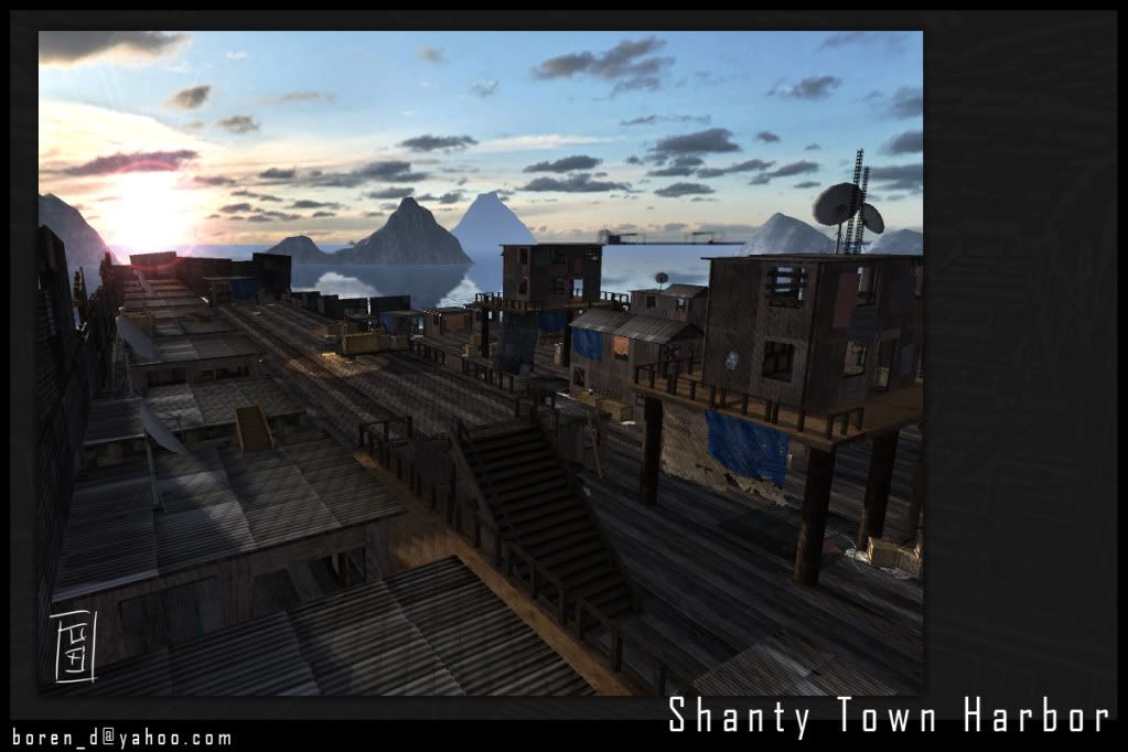
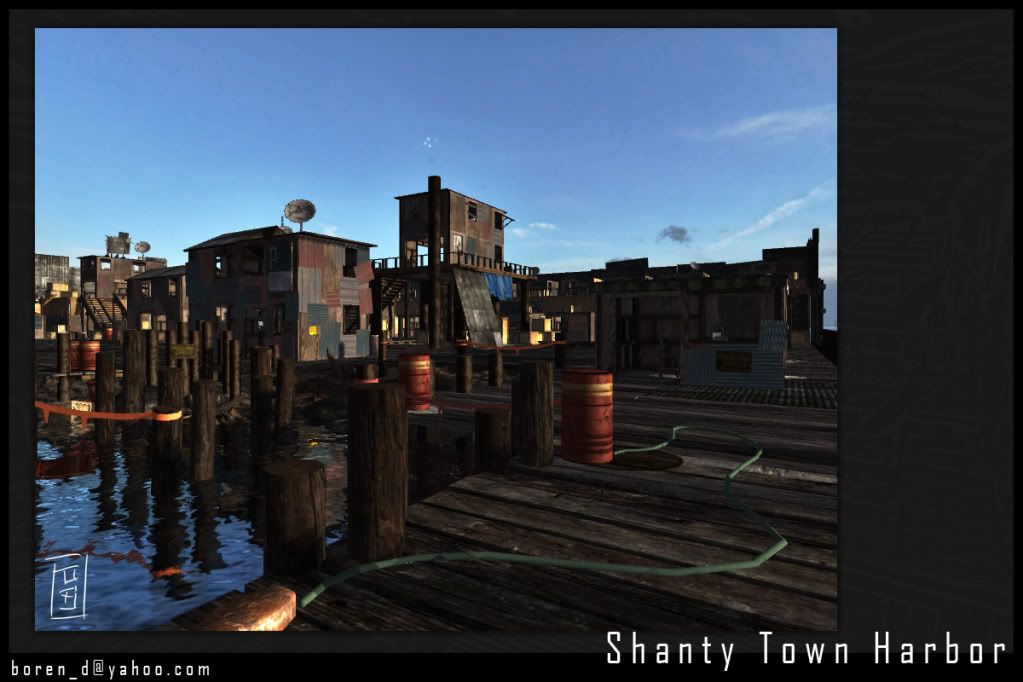
Shanty Town Harbor
This is a project I've been working on since Jan. of this year. It's based off a concept from "Stranglehold" done by Tae Young Choi (here) and it was all built out in Unity. The water, lens flare, and a few of the scripts are not done by me, but all the rest is of my own doing. I'm pretty happy with what I've accomplished so far, but I still feel it is lacking believability and diversity in its appearance. I'd love to hear your thoughts, comments, and critiques. You can download my latest build here and I've included a couple screens below.


Thanks!


Thanks!
Replies
I really like it!! you say you think it may lack believability. Maybe to help remedy that you could add more rubbish scattered about, things like old tires and smaller bits and bobs. Also all the planks of the floor are quite uniform (from what I can see of the shots you've posted) maybe have a few missing ones, broken ones and some that have come loose and are slightly raised?
Not sure if that helps as I'm pretty new to all this stuff
Here's one of the refrence images I've been using for my little project, not sure if this is what your going for but it deffinatley shows the messy look, with all sorts of junk around the place!
P.S. just noticed the satalite dishes on the rooves of some of the buildings, maybe add some power cables?
Too many right angles for haphazard construction.
It looks like the large sections of dock, pier or cat walk in the first screenshot should be replaced with more shanties. The hills in the back and the shanties help frame the shot.
I'm not really sure why you went with red tones instead of blue like the concept.
I'm not really sure how modular any of this is, in theory you should be able to mix and match a few pieces to get unique buildings without having to model new pieces.
All roof look same, try some variety textures.
Also add some bright colors to you texture, like in the city concept.