Home 3D Art Showcase & Critiques

Zero-One

polycounter lvl 18
Offline / Send Message
X-Convict polycounter lvl 18
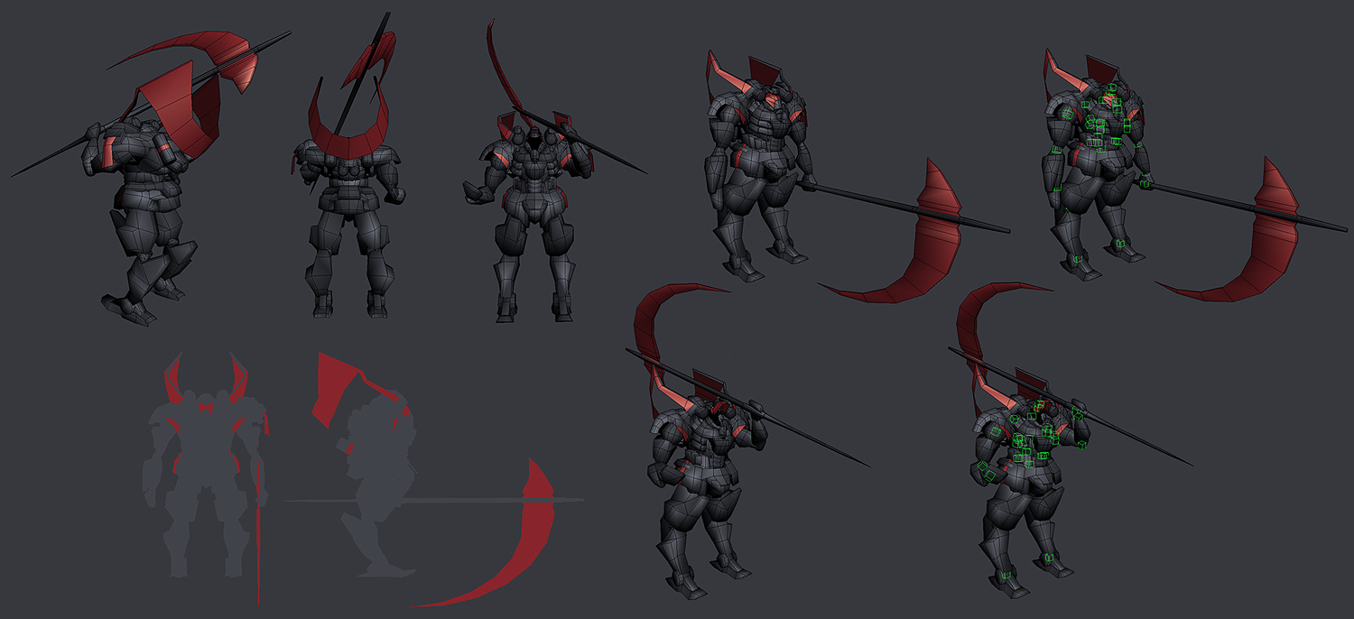
Started last Monday with this:

scythe_block01.jpg

Went to this:

zeromech_wip01.jpg

Now at this:

zero-one_high02.jpg


Still working.. need a break though to come back and make it better

More work in progress screens here: Extra Screens
Replies

  • Xoliul
    Offline / Send Message
    Xoliul polycounter lvl 14
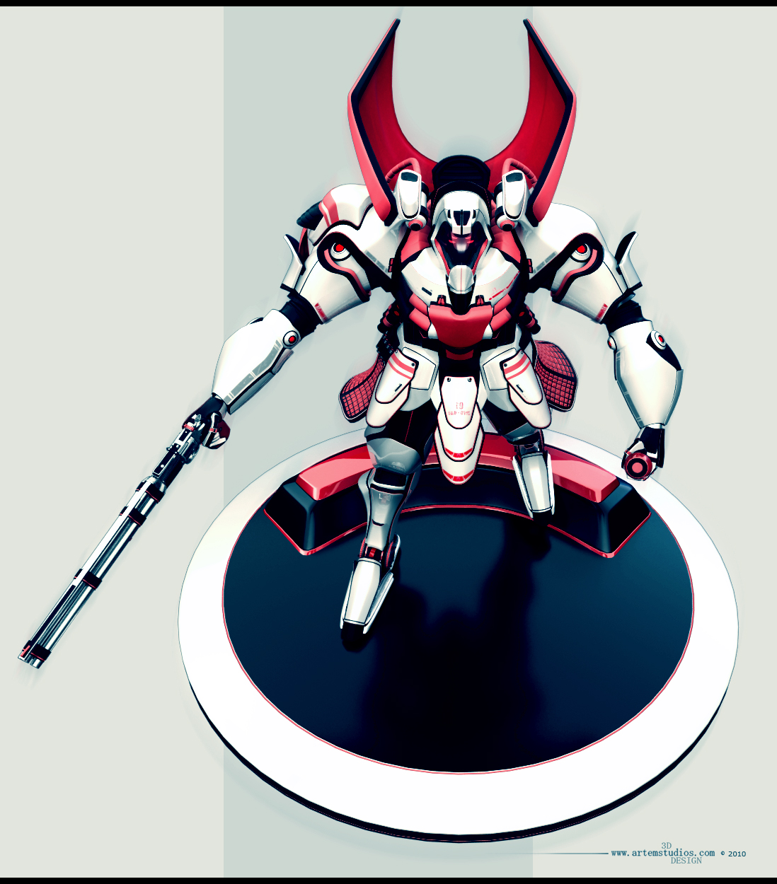
    Hey man, cool to see something different from you. I like the design, but can't say I dig his gun. It looks very unbalanced and almost impossible to wield.
    Also I notice he seems to have chicken-legs ? It's a bit strange as it's not very pronounced and it looks like a human would fit inside. Not too sure about that...
  • X-Convict
    Offline / Send Message
    X-Convict polycounter lvl 18
    Xoliul - I threw the gun togethere pretty quick, was playing with different ideas, I think I'll go with a more stylized idea that should also fix that issue. That is a pinstripe and actually has half a guy in the suit - started as a cyborg but I decided to focus on the suit design first - might be better when I finish him or change that idea. Thanks for the feedback :)

    zero-one_flat.jpg
  • Ksan
    Well, how bout them characters :). That render is slick. Pulling at my heart-strings with a mobile suit like thing, then calling it zero one. For shame, dirty trick.

    Very nice work, really dig the color palette. Wanna see it w the new gun. Maybe the forearms should be more angled and sharp instead of as round? I dunno, personal choice. Stellar as always.
  • X-Convict
    Offline / Send Message
    X-Convict polycounter lvl 18
    Thanks Katie! I'll try to play with the forearms, I think maybe the inside half could do with some harder surface. Still gotta play with the legs too..

    I'm enjoying his toyish look on the pedastal.. makes me want to print him out when finished.. mm..

    zero-one_gun01.jpg

    zero-one_high04.jpg
  • Rens
    poly113.gif

    I can call on some stuff, but i know you've seen it and will make changes you think are nessecary.
    Great work man, seems like you never take a break, all after work hours seem to be work hours :P
  • MoP
    Offline / Send Message
    MoP polycounter lvl 18
    Pretty cool stuff, although that last image makes the suit look super unbalanced (like he's falling forward), also I'm not a huge fan of how thin a lot of the panels are, it makes the suit look very flimsy.

    Also, while the designs and large shapes around the head/chest/shoulders are nice, the other areas (especially the forearms) look pretty lacking in any sort of design, they just look kinda slapped on as an afterthought.

    Nice rendering style though :)
  • Chclve
    The new gun looks niiice. Love the render
  • Cheez
    Wait, this isnt a car ! :P
    Looking cool, kid. I agree with MoP, though. It feels a little off balance. Part of that might be that the arms are posed so stiff. I know its a mech, but its still a pretty stylized mech so I would expect a little more dynamic shapes/posing in the arms. I bet if you gave the arms a nicer line of action, that would help a lot.
    In any case, looking cool.
    Now get back to work.
Sign In or Register to comment.