Cast Away - realtime artillery game character
Hello all,
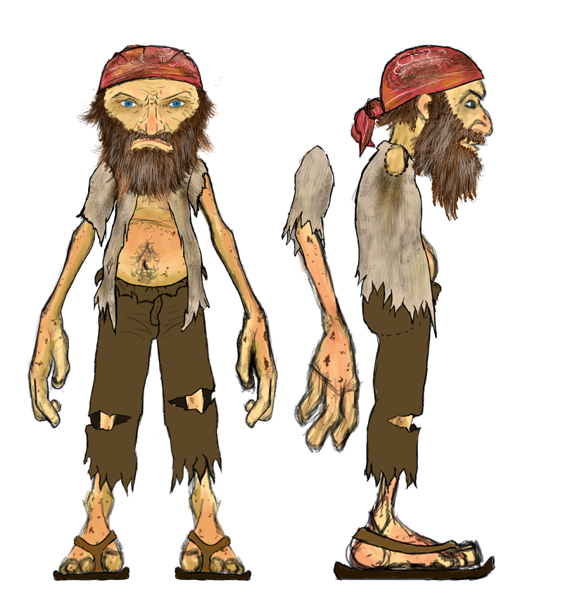
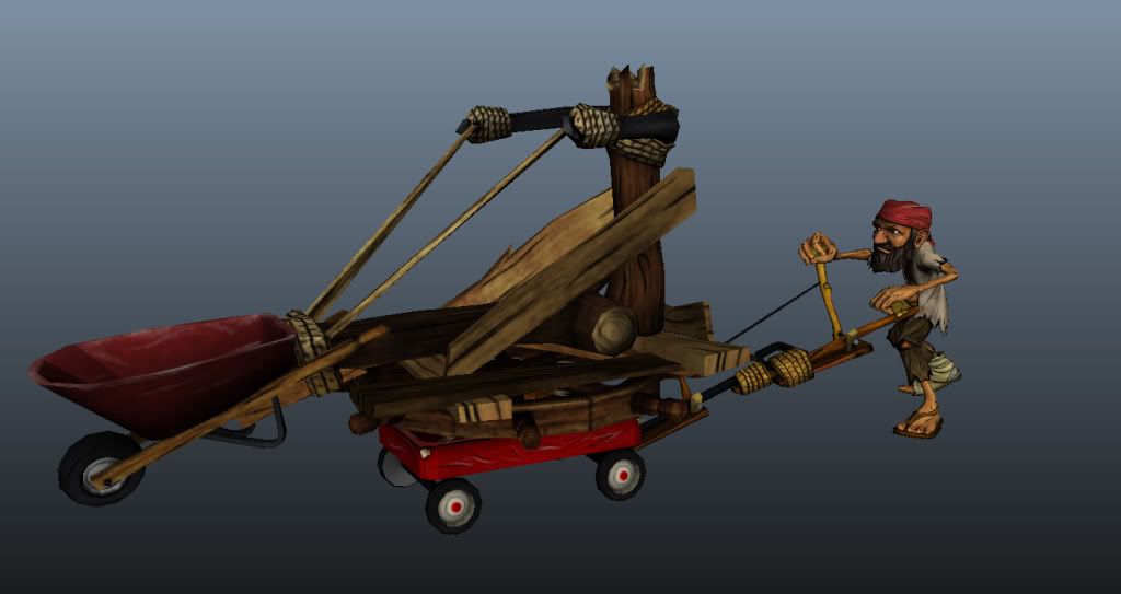
I'm on a team with 3 other artists, 7 programmers, and 2 managers, and we're making our own game from scratch. We call it "Cast Away" and it's a 3D, comical, realtime artillery game. You play as Captain Jacob, a ship wrecked sea captain stranded on an island with your rival, Captain Steve, stranded on his own island 20 feet away. Rather than team up and try to get back to civilization, your rivalry burns deep, and instead you both MacGyver up a catapults to launch crazy island junk at each other.
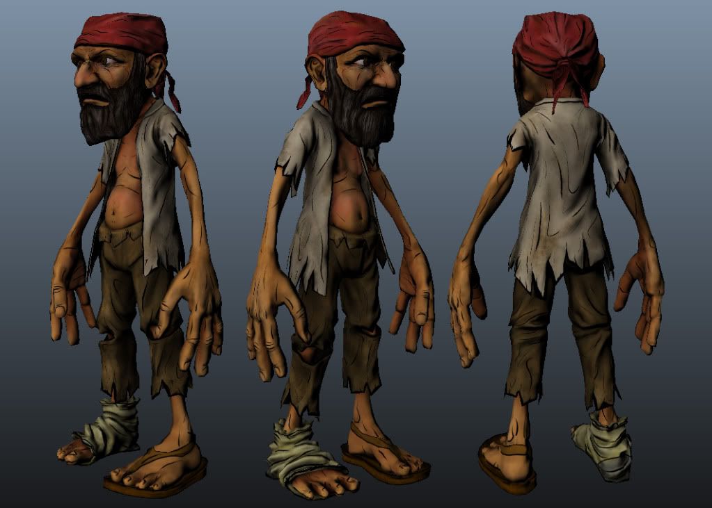
I'm the character artist of our team, and I recently got our main character done. With that synopsis in mind, I wanted to post him up online and see what you all thought of him. We're going for saturated colors, dark comic book lines, and slightly noisy textures. Almost like a Borderlands-ish kind of look, but more light-hearted and fun, less serious and intense.
We've already got this character rigged, animated, and in-game, so the mesh can't change, but the texture is not as solid. I'm currently making a second version (the rival you the player shoot at), so any mesh critiques you have I can incorporate into this one.
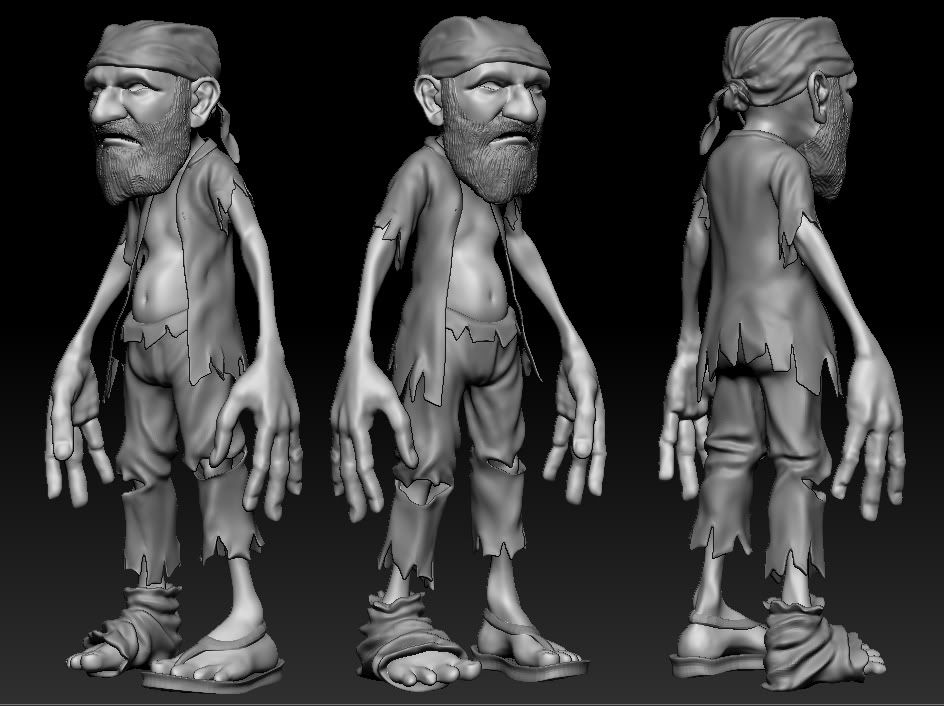
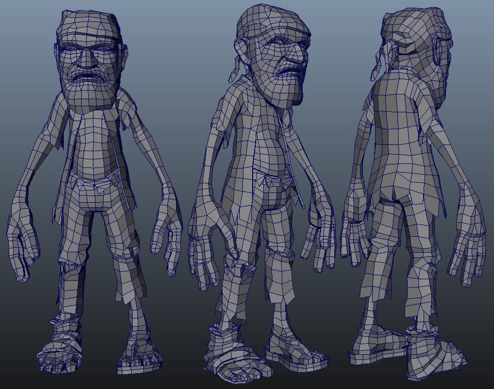
[just under 6k tris]
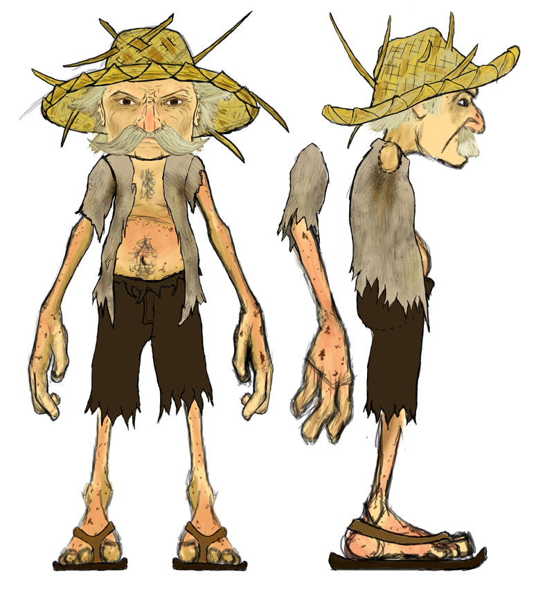
Here's my concept for the next character.
Thanks for looking! For more information on our game, look up "Cast Away" by Painfully Awesome on Facebook. Or check out www.benjaminday3d.blogspot.com for more character pictures and my workflow.
Ben
I'm on a team with 3 other artists, 7 programmers, and 2 managers, and we're making our own game from scratch. We call it "Cast Away" and it's a 3D, comical, realtime artillery game. You play as Captain Jacob, a ship wrecked sea captain stranded on an island with your rival, Captain Steve, stranded on his own island 20 feet away. Rather than team up and try to get back to civilization, your rivalry burns deep, and instead you both MacGyver up a catapults to launch crazy island junk at each other.
I'm the character artist of our team, and I recently got our main character done. With that synopsis in mind, I wanted to post him up online and see what you all thought of him. We're going for saturated colors, dark comic book lines, and slightly noisy textures. Almost like a Borderlands-ish kind of look, but more light-hearted and fun, less serious and intense.
We've already got this character rigged, animated, and in-game, so the mesh can't change, but the texture is not as solid. I'm currently making a second version (the rival you the player shoot at), so any mesh critiques you have I can incorporate into this one.


[just under 6k tris]


Here's my concept for the next character.

Thanks for looking! For more information on our game, look up "Cast Away" by Painfully Awesome on Facebook. Or check out www.benjaminday3d.blogspot.com for more character pictures and my workflow.
Ben
Replies
The character reminded me of MI.
Looks great by the way..
When will we see Oceanic 815 modelled?
Personally I preferred the red beard and blue eyes for the first cast away, kind of gave him a little more personality, but that's personal preference. I'd up the overall saturation and sharpness of diffuse on those textures to make the colors blend in less with the black edges too.
What platform are you making this for?
This is for the PC. I'm not a programmer so I'm not sure I know all the limits, but I know we're only allowed to use 256MB of RAM and there is some other limit set on the CPU and GPU. I dont know though. So to answer question, we developing for a crippled PC, haha.
This sounds like a cop out to avoid lots of work, and that's exactly what it is, haha. Our game has something like 70 character animations, and we won't have enough time to make unique animations for both Jacob and Steve. So we're using the same rig and animation files, we'll just swap out meshes and textures. So to ensure it fits on the rig, I'm trying to keep them as close to the same as possible.
Picture time:
Any crits or comments so far? Anything is welcome and appreciated!
Ben
Awesome job.
Ben