Home 3D Art Showcase & Critiques

Amazon character - "next gen" character based off concept

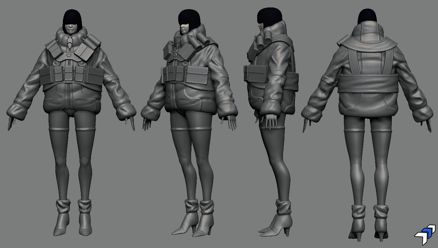
I've been working on this sculpt I want to turn into a nice "next gen" character. It's based off "amazon" by Manuel Augusto Dischinger Moura
210_realsize.jpg

anyways, here's my sculpt so far:
amazon_main.png

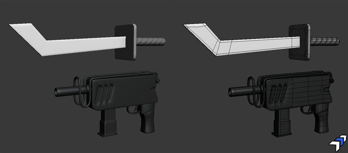
and the sword and gun:
amazon_wepz.png

still a long ways to go before i start the retopo. crits/comments appreciated :)

Replies

  • stonedove
    Options
    Offline / Send Message
    stonedove polycounter lvl 9
    Very nice likeness. Sword is on the money.
  • grimmrobe
    Options
    Offline / Send Message
    grimmrobe polycounter lvl 9
    Hey,

    Nice work. She looks good proportionally etc

    My advice would be, if you are aiming to match the style of the concept artwork, try to match the way he has treated the edges and contours of the various forms, they are more decisive and angular.

    Your jacket for example looks softer and more bulbous compared to the jacket in the art which is a lot harder in appearance and more structural with sharper creases. As it is they don't read as being constructed of the same material, and you loose some of the character.

    The art style is evident in the sword which you have captured, but it pervades everything in the image even natural forms like her legs and hair.

    Then again, it may not be what you're going for.

    Either way, it's an interesting piece.
  • Rojo
    Options
    Offline / Send Message
    I don't think you're capturing the concept in terms of basic shape, her body mass should be a triangle, but you've got something more square. Her legs are too thick overall.

    In the concept, her coat feels like it's a stiff waterproof (?) material that holds its shape. In the sculpt, it's too poofy and her frame is getting lost in it, and the collar/cuffs/waist need those hard edges.

    Excellent start.
  • comic_craig
    Options
    Offline / Send Message
    While I am interested in this model and I look forward to seeing it complete- I have to agree with Tim- the triangle makes the concept look more feminine, the sculpt square makes the model take on a more asexual design- it makes the shoulders appear too wide. The sculpts arms also look too long- they reach beyond the bottom of the coat/crotch area too far. In the concept, her head is enveloped by the coat- in your model, putting the head above the coat separates it from the body. If you haven't done so already- make sure to check the model proportions without the coat. My guess is that some of the proportions are becoming too far away from an appealing female.
  • Neox
    Options
    Offline / Send Message
    Neox godlike master sticky
    i agree with what Tim said and would like to add, that your cloth is too soft and overall flowy as opposed to the pretty hard looking jacket she's wearing in the concept
  • BlackulaDZ
    Options
    Offline / Send Message
    thanks for the crits :) Im still working on the folds in the jacket, it still isnt looking quite right. I tried to pull a more triangular shape out of the jacket, also I pulled the end of the sleeves up a bit, along with the hands, and legs, and scaled down the shoes a bit.


    q45hq45hq45h45h.png
  • Sirdelita
    Options
    Offline / Send Message
    Sirdelita polycounter lvl 10
    diggin that concept! totally agree with the cloth, excited to see this one finished!
  • BlackulaDZ
    Options
    Offline / Send Message
    still plugging away on this...
    gunbitch_latest.png
  • Ged
    Options
    Offline / Send Message
    Ged interpolator
    looks like its coming along fine, the blue backgrounds a bit harsh on the eyes but thats ok.
  • kanga
    Options
    Offline / Send Message
    kanga quad damage
    This is looking really good! The concept you chose in my opinion is way kick as. I am just a bit pissed I didnt make it :(

    There sure is a lot going on here,
    To me the opposing muscle of the calf muscle (peroneus longus: had to look that up) doesnt wrap around enough so I can see it more from the front. Might make the leg sexier. The folds you have changed are now mostly with a pinch brush on the peaks while the valleys are still round. The hardness of the folds is now a sort of concave pattern instead of an approximation of the folds just squared off.

    Great work man!
    Cheers
  • Cap Hotkill
    Options
    Offline / Send Message
    Cap Hotkill polycounter lvl 13
    I think you are making the Jacket too puffy, In the concept it looks more Stylized and Less tick in material, like hard cloth like the one used in jeans. but for the rest its looking good, keep going ;)
  • seth.
    Options
    Offline / Send Message
    seth. polycounter lvl 14
    can only third what Kanga and Cap Hotkill said about the folds on the jacket, I think that they stull need a little work, perhaps a pass with the H polish brush on the larger expanses of material would help give the material a sharper apperance, and reduce the puffyness?

    Really digging it so far though BlackulaDZ you are doing an ace job on a great concept I think :)
  • comic_craig
    Options
    Offline / Send Message
    definitely looking better. Has something changed in the face... or is that just the shader? She looks.... chubby?
  • KyleJensen
    Options
    Offline / Send Message
    KyleJensen polycounter lvl 12
    I think you should make the head just slightly smaller to match that of the character in your reference image.
  • BlackulaDZ
    Options
    Offline / Send Message
    im still tinkering with this. mostly added some trinkets but I still gotta fix the jacket, and make those changes that comic_craig and shad0wforce mentioned >_< her face is pretty jubby...
    gunbitchBITCH.png
Sign In or Register to comment.