The BRAWL² Tournament Challenge has been announced!
It starts May 12, and ends Oct 17. Let's see what you got!
https://polycount.com/discussion/237047/the-brawl²-tournament
It starts May 12, and ends Oct 17. Let's see what you got!
https://polycount.com/discussion/237047/the-brawl²-tournament
Yet another UDK Environment
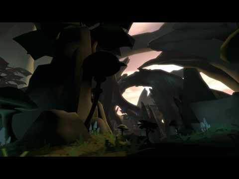
I have been working on this project part time for the past two months in the UT3 editor. I wanted to make a really cool environment that supported game play and was interesting to look at. Since hardly anyone cares about UT3 any more, I am going to port this thing over to the UDK starting next week so I can take advantage of all the newest features.
I have worked in passes and have deliberately avoided making textures and complex shaders. Working on just colors and silhouettes while assembling this environment has made it easy improve meshes, asset placement and lighting.
Obviously things are still very rough and many meshes still need to be finished. This is why I decided to begin a thread about this project. I think that I have developed this environment enough for it to make sense to others, for quite a while it has just been really basic shapes with really rough lighting and did not come across as a “jungle environment” at all. I think now it just barely communicates that idea, so now with your input I think I can begin texturing and finish up the primary static meshes. All C&C welcome. Thanks for checking it out.


[ame=" http://www.youtube.com/watch?v=jzNLkzDdHxI"]Edit: here is the video. You can watch it in HD too.[/ame]
I have worked in passes and have deliberately avoided making textures and complex shaders. Working on just colors and silhouettes while assembling this environment has made it easy improve meshes, asset placement and lighting.
Obviously things are still very rough and many meshes still need to be finished. This is why I decided to begin a thread about this project. I think that I have developed this environment enough for it to make sense to others, for quite a while it has just been really basic shapes with really rough lighting and did not come across as a “jungle environment” at all. I think now it just barely communicates that idea, so now with your input I think I can begin texturing and finish up the primary static meshes. All C&C welcome. Thanks for checking it out.


[ame="
 http://www.youtube.com/watch?v=jzNLkzDdHxI"]Edit: here is the video. You can watch it in HD too.[/ame]
Replies
I think it's probably just all the brown tones, try getting some more green in there with materials and/or lighting to help give the impression of moss and light being filtered through the canopy above.
I think this is going to be an awesome scene when you are finished, keep it up.
in movement it just screeeams atmosphere all over it. i especially like the use of these arches reaching high up in the air. the lighting situation they create when moving around is just plain beautiful
it has such a solid and lifelike feeling already with just being flatcolored so far. definately watching this thread progress !
"really cool environment that supported game play and was interesting to look at" - goal accomplished to me - I'd love to run around in this anytime you let me :P
Environment setings create nice depth and silhouetes r poping out which is great.
Actually I guess ppl talk firstly about rock formations cauz they have the best contrast situation. Moreover, seen from the dark forest and being against bright sky they create an attractive landmark that makes ppl willing to walk towards it
Great work so far.
OMG, there is so much left to do! This is going to take so long!
And put it out of your mind, no good in dwelling on how much more work is ahead. You can only do it one step at a time anyway
really enjoying the dramatic silhouetting against the sky. looks great even in block-out mode.
That little speck near the bottom of the image there, that is a scale model of a player. This mesh will end up being nearly 25k polys when finished. I dont think that is too bad considering that it is over 1000 feet tall. Also yes, I know this is an insane scale, but part of the reason for working on this project was to try something new and challenging.
This is the map after moving it all to the newest UDK (before that was all old unreal lighting with no bounce light). Here is a shot after I blasted photons all over it. It looks worse, but textures will buff that ugly pixelated lightmap right out (not quite, but textures make it much less noticable)
Also, notice the lack of completely pitch black areas...
This concludes my weekly update for this week, hopefully I will have some more time to work on it and will have made some real progress this weekend.
Thanks again for checking it out!