The BRAWL² Tournament Challenge has been announced!
It starts May 12, and ends Oct 17. Let's see what you got!
https://polycount.com/discussion/237047/the-brawl²-tournament
It starts May 12, and ends Oct 17. Let's see what you got!
https://polycount.com/discussion/237047/the-brawl²-tournament
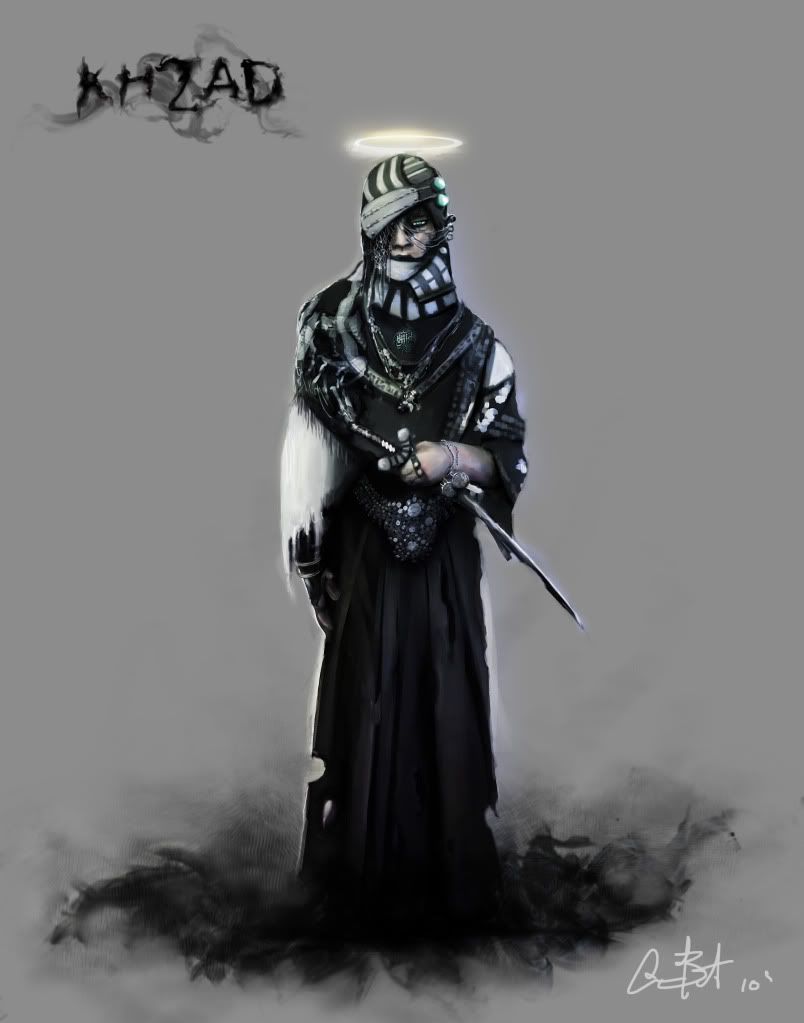
UDK Khzad Prototype
Hey polycounters!
So, I'm in my last year of school and have to make a demo or a part of a game in UDK. I have the next 6 months (including summer break) to complete this project. I am an artist and not a programmer, so my goal is to create mood and story, over interesting game play.
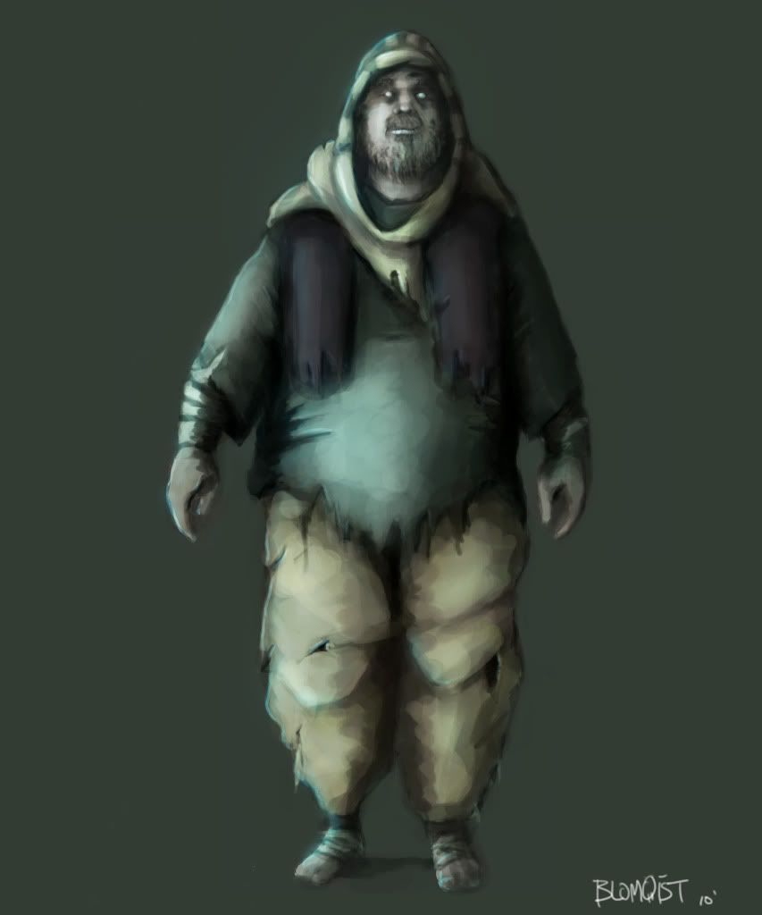
My main focus is concept art, so I'm going to be doing a simple and stylized visualization for my prototype. Inspirations were that of Yoshitaka Amano's 1001 Nights, Soul Reaver, Prince of Persia, Muramasa, Odin Sphere, as well as hundreds of photos from real life.
The game will be 2 1/2d, and will have a camera that will move with the character. There's a story that goes along with all of this, but I'm going to show that all off when I get to the voice acting and such. All the animations will be motion captured, and it will all be very simple lower poly (ps2, wii) models, along with hand painted textures.
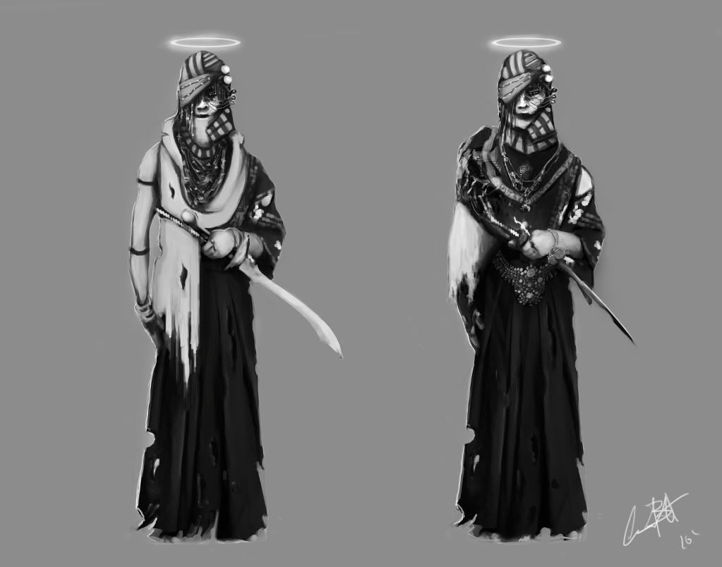
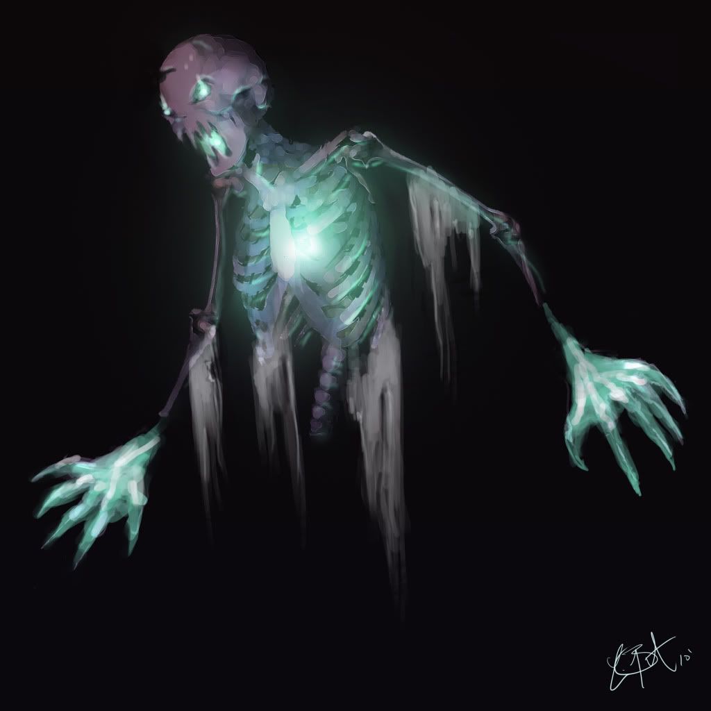
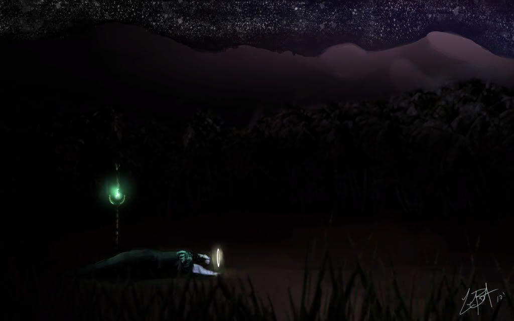
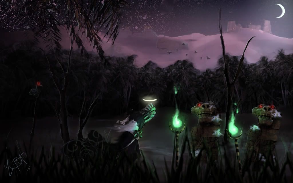
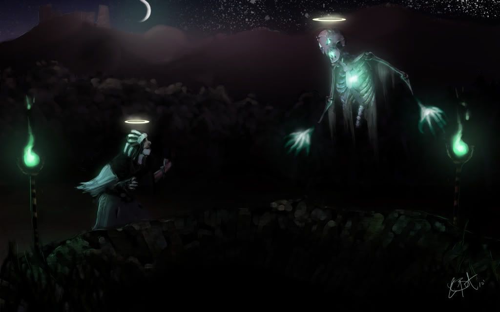
Quick overview, its an limbo type underworld, everyone is dead. They all have halos to signify this. In the concepts, he will meet with an evil apparition, and I'm going to change the color of the halo to a violet red to show that he's bad. (to clear up early confusion.) I want the halo's to be the iconic imagery to represent my world. I love when they had this in dragon ball Z (even the bad guys had halos) But people in western culture would find this confusing and complain about it.
In addition the halo would be the "life gauge" instead of having a HUD, as it gets dimmer the less life you have left. (even though your dead lol, im sure i'll come up with what happens when you die...again)
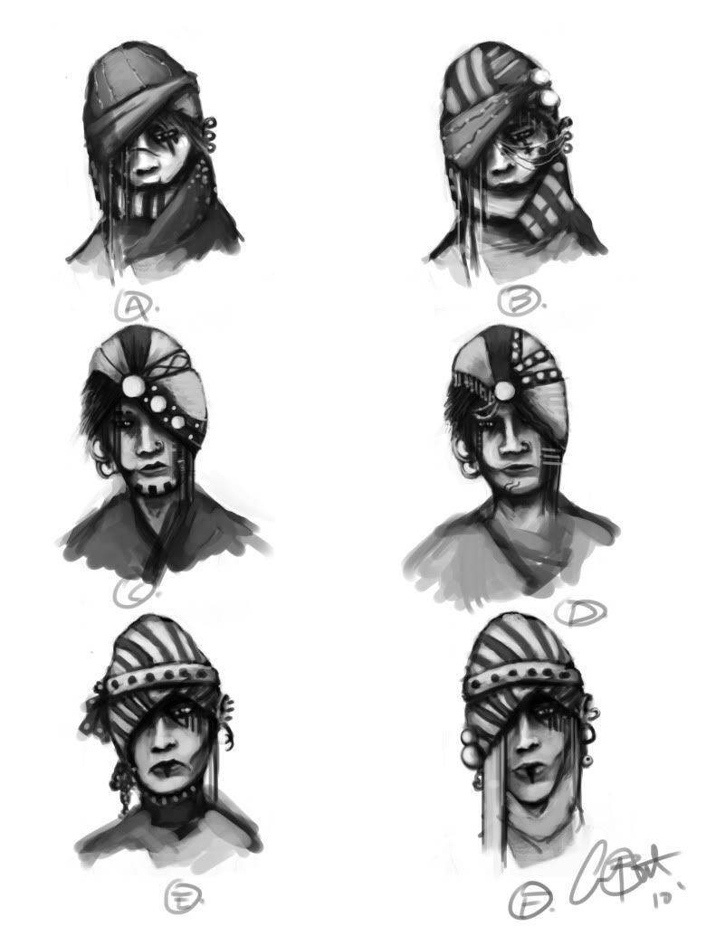
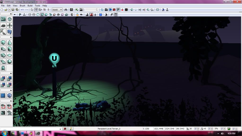
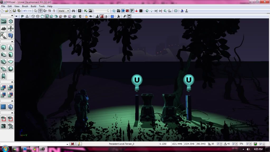
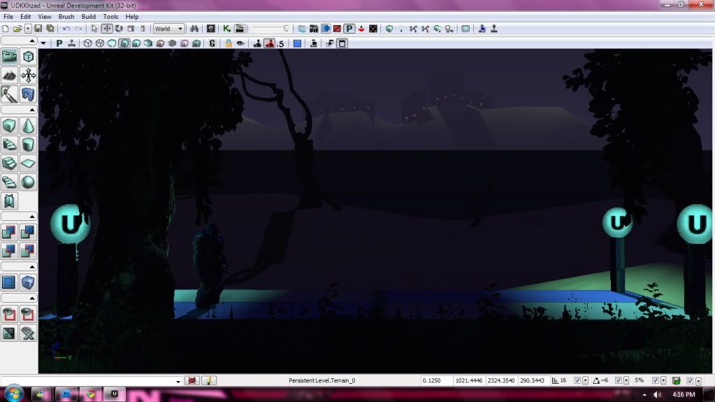
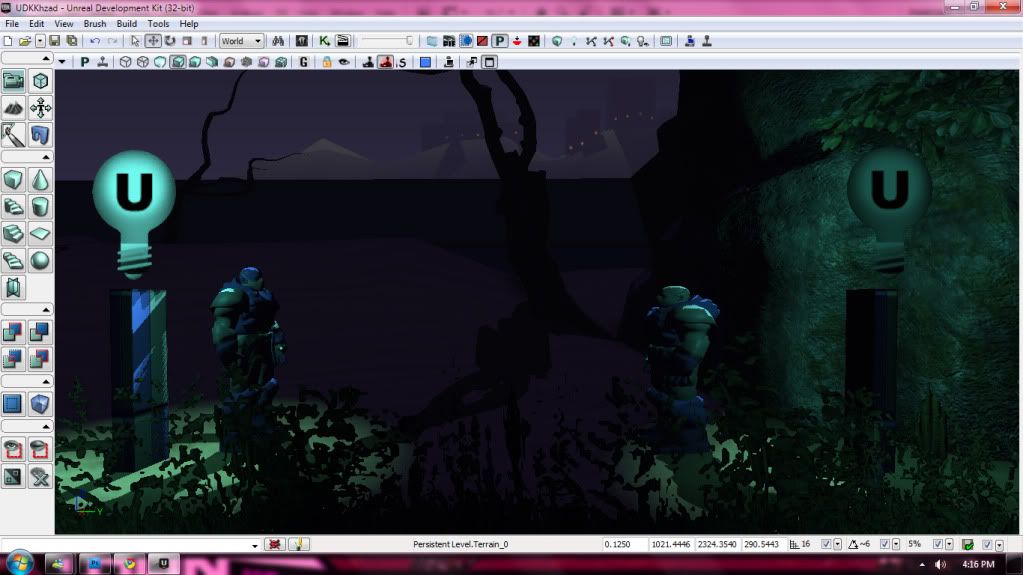
So here are the concepts, as well as my early UDK screens. Nothing in UDK was made by me except for the terrain and sand texture. It's my first time in UDK, so im greyboxing with their assets to get a feel for my composition.
ART DUMP! (Please excuse some of the rushed artwork, I am on a time budget!)


Replies
The first character is a bit too emo for my taste but I suppose being in a limbo type underworld would do that to you.
About the environments, I think they're a bit too dark overall right now. I could see the player getting lost or confused in them quite easily. Maybe go for desaturated but brighter colors rather than black everywhere to signify the negativity of the place. Or if you really want to go with black foreground objects against a brighter background then try to make your silhouettes very recognizable and less busy.
Keep posting as things progress.
This seems like a very ambitious project, good luck
thanks for the advice! I definitely will have more lighting, as the character will have the halo following him around. I want to have that deep contrast, but that grass in the foreground is temporary. It will (hopefully) be much more recognizable!