Low Poly Modellor Test
Hi All,
This is my first post on the forum, looks like a great place so here goes...
I am doing a modellor test and thought I'd post my progress and see if the stuff is any good
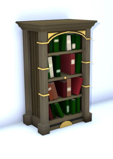
Bookshelf
500 tris, 128x128 color map.
Concept:
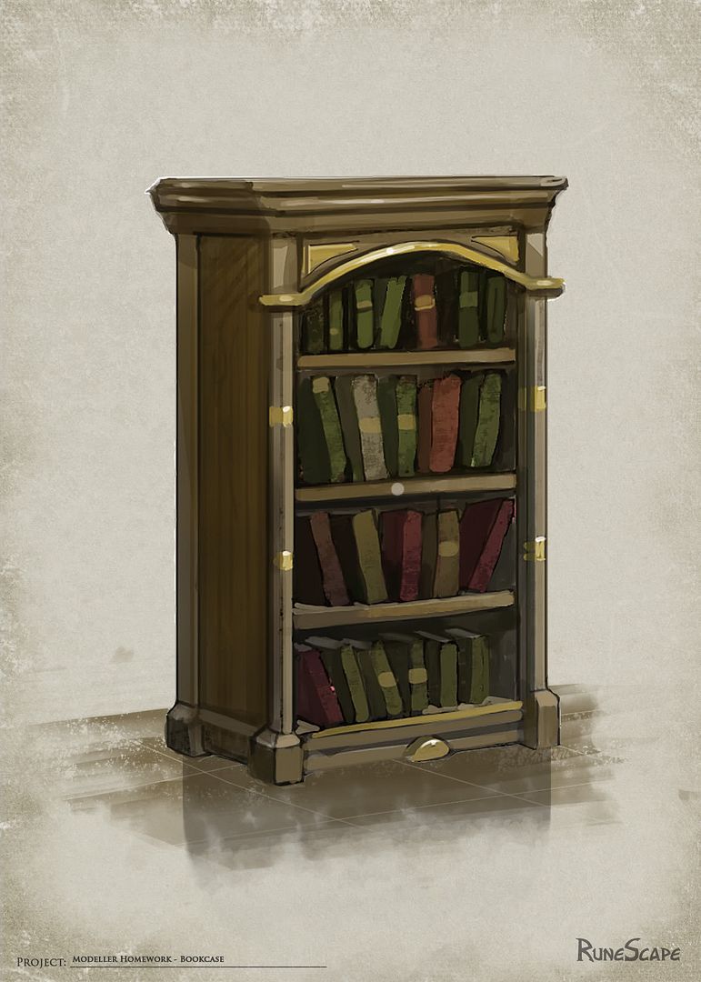
Render:
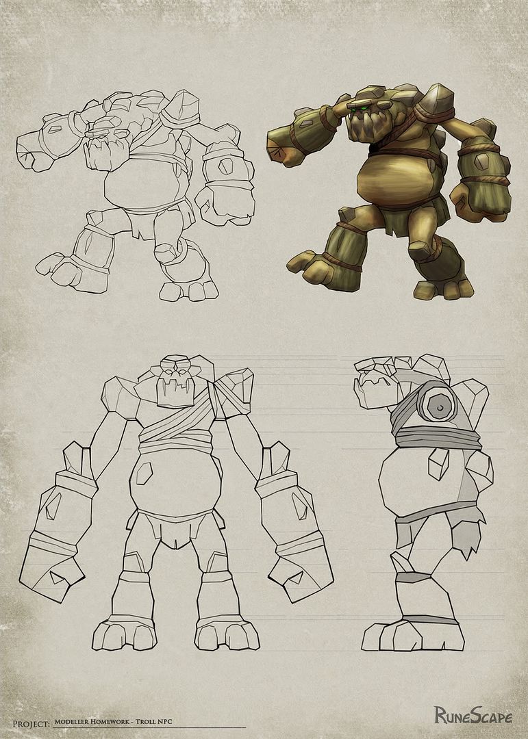
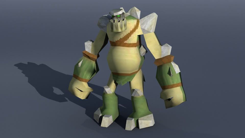
Troll
1000 tris, 128x128 color map
Concept:
Render:
Turntable:
[ame] http://www.youtube.com/watch?v=ylY2ebm8Qb8[/ame]
Flang
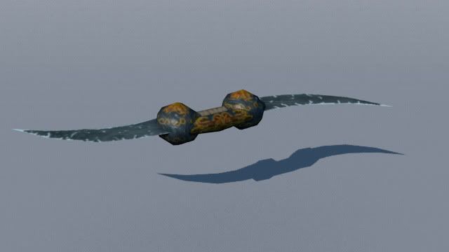
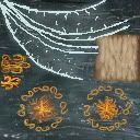
My own single handed melee weapon concept, 240 tris, 128x128 color, normal and spec maps.
Render:
Turntable:
[ame] http://www.youtube.com/watch?v=23G5_nU2UCo[/ame]
Color map:
Any feedback and crit would really be appreciated so feel free to dig in! Also please let me know if there is other information I need to post to enable you to give helpfull feedback.
Cheers
Andrew
This is my first post on the forum, looks like a great place so here goes...
I am doing a modellor test and thought I'd post my progress and see if the stuff is any good
Bookshelf
500 tris, 128x128 color map.
Concept:

Render:

Troll
1000 tris, 128x128 color map
Concept:

Render:

Turntable:
[ame]
 http://www.youtube.com/watch?v=ylY2ebm8Qb8[/ame]
Flang
My own single handed melee weapon concept, 240 tris, 128x128 color, normal and spec maps.
Render:

Turntable:
[ame]
 http://www.youtube.com/watch?v=23G5_nU2UCo[/ame]
Color map:

Any feedback and crit would really be appreciated so feel free to dig in! Also please let me know if there is other information I need to post to enable you to give helpfull feedback.
Cheers
Andrew
Replies
Also, the book shelf looks nice, but it doesnt seem to follow the concept that well. Does that mean u fail the test? lol just teasing. I like the fang, too bad the movie is so small. Cant really see well, or see wires. Show your wires man!
The other thing you may want to consider is using marmoset to show your game stuff. Is nice to have a cool composited render in a 3d app. But if ur doing game art, gotta show that your maps and your model will indeed work within a game engine.
So, just keep it up!
The bookshelf definitely needs work on the texture side as it does stray from the original concept. I'll update the movie size for the Flang tonight and post some wires.
Good point re game engine, I have used Unreal in the past so I may port everything into that. Marmoset looks cool so I may have a look at it too.
Thanks again for the crit much appreciated!
Andrew
The bookshelf looks nice however the the bookshelf seems to be wider on the concept that your is. I don't know how exact you need to be, and the turntables are going way too fast. Good progress man, can't wait to see some more.
The bookcase and books are the wrong colour and the concept looks chunkier than your model, the top bevels in and the gold details are more extruded. Look at the colour of the Rock Troll, try and get more surface definition into the texture, is it scales or warty skin? You might have to make a call on that one, if not do two versions, one like the concept and one exaggerating it. Going the extra mile always looks good.
I'm not feeling the weapon at all, its a nice idea to do a Klingon style blade but the silhouette is really undefined. The characters in RS are small so weapons need to be really bold. I would flare out the blades so they have a identifiable shape. I'm not sure I would use a normal map unless it is asked for in the brief, especially a 128*128 one as Runescape it pretty basic tech wise (or maybe they wants normals and they are gearing up for a new project, I don't know...)
Don't bother with marmoset or fancy renders as it won't impress them, I would do good clean bold renders with a good layout. Detail tri counts, textures and wireframes as well.
Good luck, there are some ace people on the Jagex Art teams, I had a great time working there and its a brilliant first job!
oh yeah, its spelt Modeller, might as well know how to spell your job title!
Also, 1 thing that stood out to me about your weapon was that you seem to have put a couple of overlays over a texture you found online. It just kinda like the type of metal you found wouldnt work for a blade.
I thought the art was familier without even seeing the watermark.
Here is a link to my folio, there are some characters on it that should give you a better idea.
http://www.nickfarley.co.uk/runescape.html
easterislandnick: Wow, thank you so much for taking the time to give me some advice, amazing to hear from someone who worked at Jagex! I'm in the process of adjusting the models but wanted to check I understood you correctly. I've rendered the troll again without any textures, just procedurals and different materials, is that what you meant? The other thing is how do you cube map a troll, I mean that just generates a mess in the uv map? Thanks for the link to your portfolio, really incredible work btw.
zakhar2: Good plan, I have been playing Runescape a bit for that exact reason, yeah you guesed it re texture
samgriffiths: Yeah, it's pretty definitive!
Update to the weapon:
Update to the bookshelf:
Once again thank you for all the crit, it really is much appreciated!
Cheers
Andrew
With that said, you have failed to achieve most of it. On the book shelf, your throwing your own flare everywhere, and on the character your not really working the silhoutteve values. And the textures...well, just look at the screen shots im posting.
Details are everything!!
Sample your colors from your reference. Make sure u have the same hues, the stones on the monsters are not grey, they are shades of green and grey. Missing a lot of ropes,
The other thing is, that as far as i know. An art test is something secret u dont want to post it online unless they say its cool. So...i may have already helped u too much. Again, good luck!
The advice about colour is spot on, sample from the concept. The missing details such as rope will be noticed. I wouldn't worry about making procedural textures, hand drawn ones will be fine but they are not looking for a full unwrap, make a generic scale texture, select a leg and cylindrical map it, you can adjust the uvs a little but they are not looking for the whole model mapped out on a single texture. At the moment he is 3 colours, I would shade the faces under his belly darker and lighter on top to give it that Runescape look it makes the model look slightly cartoon shaded by baking the colours into the faces, does that make sense, look at the centre orange dude in my folio, he had darker shading applied to the model on his thighs and lower legs to bake in shadows.
...just kidding.
My feelings regarding feedback are a mixed bag. Feedback is a great (and essential) tool in order to advance your abilities. However, this is a test of your current ability. If I were you I would use your initiative, play Runescape, analyze and break down the graphics yourself. Try and replicate the visual style.
Good luck.
Our engine doesn't support UVW mapping so when you're texturing something use cube or planar maps, much more important than the textures is your use of triangles to describe detail. Before you even start thinking of textures get your colours right, sample from the concept and 'bake' shading into the triangles themselves by applying different colours where light and shadow would fall.
The troll and bookshelf would benefit from the above advice but your weapon just doesn't work at all. The amount of detail in your texture would be entirely lost ingame and you seem to be wasting triangles somehow because there's not much geometric detail that I can see to be taking up all 240. As above, use triangles for detail and colour first, then add procedural texture as a finishing touch. When I applied I couldn't use textures at all in my art test, and it forced me to examine my geometry more closely because that was all I had to define shape and form. The assignment says it right there: " [FONT="]Due to the engine providing our players with both textured and un-textured version of the game, all models need to look good without any textures. This means any intricate details will need to be present on the model itself."[/FONT]
Good luck!
Ofcourse, mailing them back to let them know they'd made a cockup didn't do much.
So yeah, good luck with their HR department, I suppose?
Aside from that, the advice you've been given so far is pretty much spot on. You're not hitting your target (the reference), and your texture is very bland, especially so on the wooden cabinet. I'm not sure I agree with the whole 'you can't ask for feedback'-thing, since in a job you're going to get feedback as well, but I do know that some people make a stink about it.
Im also attempting this art test and now just a bit confused about the texture. I interpreted it as unwrap entire troll, hand paint 128*128 texture. Didnt even consider procedurals but after reading this thread and having another look at the game itself it does kinda make a bit more sense....
Baj, would you mind just clarifying exactly what Jagex wants in term of texturing?
E.g, if you want to create a stone wall then you don't unwrap the model, you just apply a texture via a planar/cube/etc map.
The test is a bit ambiguous and if I remember come Tuesday i'll probably have a word with someone to see if we can get this changed. However, the important thing is to remember that a lot of the detail is obtained via colour banding and by modelling it in.
Cheers
Andrew
PredatorGSR: Hehe, yeah that is true! The art test is available on the Jagex website so it is kinda public... And you're clearly right re Jagex members using this forum
easterislandnick: Thanks again for the advice, much appreciated. Yeah I suppose I take the view that in a real job you would also be getting feedback on your work so that's kinda why I posted this stuff, just wanting to make sure it was up to scratch before applying.
Baj Singh: Lol, hi to big brother
lysaara: Heya, thanks for the advice especially re how the engine handles textures. I think you are right about the weapon, gonna scrap it and make a different one... something a bit bolder, the tri's were all getting eaten up making the two spheres...
MightyPea: Sucks man, gonna be following the advice given so far.
OX14: Hey, welcome to the party
OK, thanks again to everyone for contributing to this thread, I'll keep on at it!
Cheers
Andrew