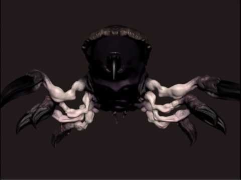
BlazeF starting out - finished(ish) model and WIP
Heyo,
Pretty new to the 3D world to be quite honest but have been working at night every day after my normal job to do as much 3D as I can push. Have been learning loads of new information and it's all hitting me pretty well Primarily have stuck to 2D stuff building out textures, UIs and concept work... I'm always looking for more!
Polycount was recommended to me by a guy over at Vigil and to be honest I'd love to start modeling for them in the future.
I decided for my first project I was going to do something different and a bit complex just so I could take some time to learn the ropes of ZBrush. ZBrush has been a little bit of a bastard at times, but eventually I was able to get a decent product out of it.
Original models coming from Max and ported into ZBrush...
So this is my first character model completed... didn't really make it ready for importing into a game, that's my next project I'm going to be doing these over and over and over... I'm having way too much fun with this shit. I didn't think 3D would be this fun, but I'm loving it.


Here's a little turn around of it...
[ame] http://www.youtube.com/watch?v=EPfyTZAvPIE[/ame]
Sorry if I posted too much on that... : /
OH! And this is the WIP I have going... you might already be able to tell who it is >.>

Anyway, thanks for checking the post out Please destroy and rip this crap apart, I need to learn and I'm willing to fix and do anything to become better!
Pretty new to the 3D world to be quite honest but have been working at night every day after my normal job to do as much 3D as I can push. Have been learning loads of new information and it's all hitting me pretty well
Polycount was recommended to me by a guy over at Vigil and to be honest I'd love to start modeling for them in the future.
I decided for my first project I was going to do something different and a bit complex just so I could take some time to learn the ropes of ZBrush. ZBrush has been a little bit of a bastard at times, but eventually I was able to get a decent product out of it.
Original models coming from Max and ported into ZBrush...
So this is my first character model completed... didn't really make it ready for importing into a game, that's my next project


Here's a little turn around of it...
[ame]
 http://www.youtube.com/watch?v=EPfyTZAvPIE[/ame]
Sorry if I posted too much on that... : /
OH! And this is the WIP I have going... you might already be able to tell who it is >.>

Anyway, thanks for checking the post out

Replies
So one thing that I had to imagine with some of these rare mobs is that they have to have something on them that gives them the annoying lightning or poison etc. So for Rakanishu I'm deciding to make his gauntlet the source of that power. Going to have to put a lot of focus on it.
Hah, man do I hate having him stand like a normal bipedal... Need da HUNCH going on!
Anyway, little more progress for tonight.
Bah... just have some detail passes to go through and then add some of the weapons. Good stuff
Also, one of the goal in modeling is clarity, even when low res. Your spider chick is kind of, more or less, fuzzy. She's hard to see. The shapes and colors all just sort of fart together.
Just keep that in mind.
Your 2nd sculpt here is much better, much easier to read. My crit would be to instead of just throwing detail on there, you really think it through, and take your time getting crisp clean details.
The flow of the cloth and the little circular bits on there have that rushed feel you should avoid. Make them work.
Anyways keep it up buddy
for character artist/prop artist, the best way to present your work is through still pictures showing off the wire frames, final renders and what not... video takes time to load... no one wants to wait for that, and normally its to small of quality to even see details. If your an animator, different story.
Great work! I hope some of this helps.