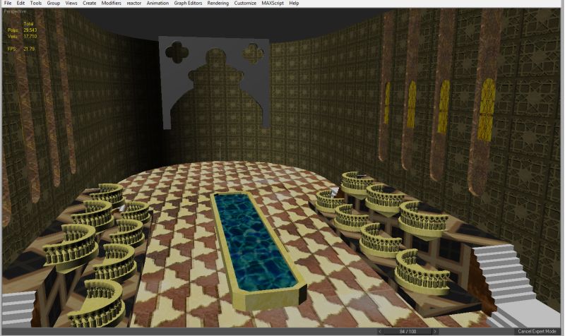
Feel better about your portfolio, take a look at mine! (CC welcome)
Hey there I have some work I'd like to show off and improve. I'm trying to set up a portfolio to break in as an environment/prop artist. Admittedly, I'm a little embarrassed to be putting my work out there. Whenever I think about finally applying for that job, I always end up making a portfolio that doesn't represent the full extent of my abilities, and never use it.
Known Issues:
I rendered the files at ridiculous sizes (ranging from 4096x3112 to 1536x830) (resized)
Textures aren't great, absence of them leaves images looking like a WIP
Lighting is abysmal
What I wanna hear:
Particular images/scenes that might be redone-thrown out.
Suggestions on how to improve whatever needs work.
"Wanna work for us here at "supercoolgamedev inc.?" (:D)
Because the renders were so ridiculously large, I uploaded it to a .rar that you can get here or here at megaupload (nevermind). I know that I have a ways to go, and one of the best ways to improve is to get peer criticism.
Here's what I'm working on at the moment.

Replies
Scale the images down and post them here for feedback.
A lot of people seem to be under the impression that junior positions are filled by people who aren't as good as senior/leads (in terms of talent and basic skills, not experience). This isn't really the case, if you can't make artwork that would fit into Left 4 Dead 3 or whatever then you shouldn't send out your work yet.
I made this mistake, and wasted 2 or 3 weeks on a portfolio that was too early. Once I realised this I revamped everything for 2 months and then started getting job interviews. Don't waste huge amounts of time on job stuff until the portfolio will go somewhere. (This is assuming you would actually be doing the proper application process, wherein you treat applying for jobs as a 9-5 job in itself).
Anyway, sorry I can't crit the art itself, just want to try to give what help I could.
In overall. Try to focus on texturing skills. Use Real images as source even if you want to create cartoon style. If you want to apply your own pattern, no problems but still try to combine it with overlay to a real texture.
Modelling looks ok you've got a good base it will improve with time. Nonetheless try to be carefull to your topology. On the tree trunk in the second image you've got ambiguous quads. As a rule keep everything tris or quad, true, but try also to keep a flow in your topology
This flow im talking about is even more apparent in the car. Try to use long smooth curves loops instead of merging into tris. You will avoid strange shadows like the one you've got about the front wheels.
You also need to work in composition. In your first scene all the details are on one point the rest look deadly empty. Document yourself about image composition. MeanWhile, It is much easier to develop modeling and texturing skill whithou worring about compo by using existing reference. Go out take a picture of en objet or a place you like and make it.
Depend of the company you'll end up but chances are that you will have to create real life or improved real life things. Doesnt mean that it requires no creativity or imagination believe me. So develop your skills and portfolio by making high quality real life things and once you feel confident with tools and techniques let you imagination freeeeee
Keep going!
edit:
James is 100% right.
"if you can't make artwork that would fit into Left 4 Dead 3 or whatever then you shouldn't send out your work yet."
Im Junior and I have to the same work as my colleagues with the same constraints. The asset you create has to be consistent with the art quality level of the whole game