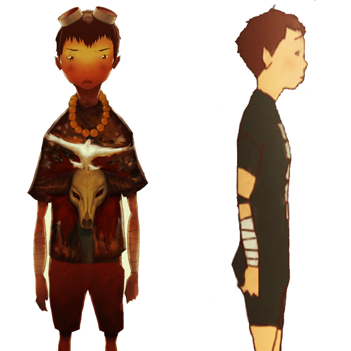
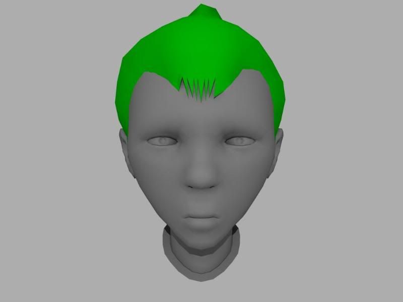
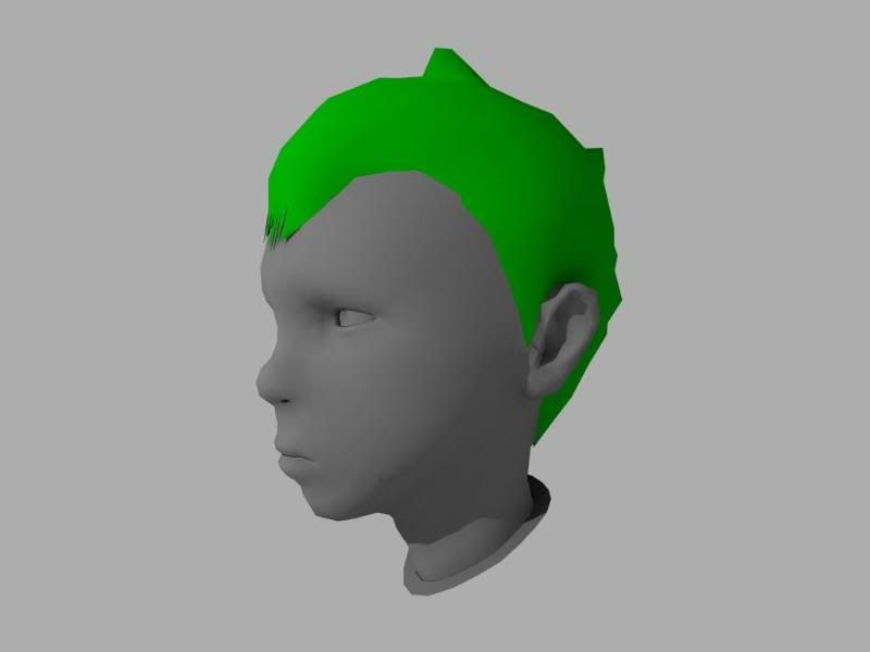
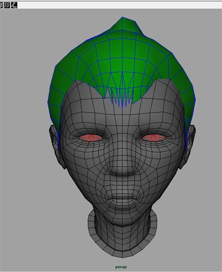
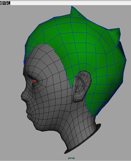
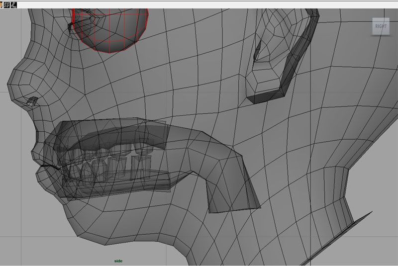
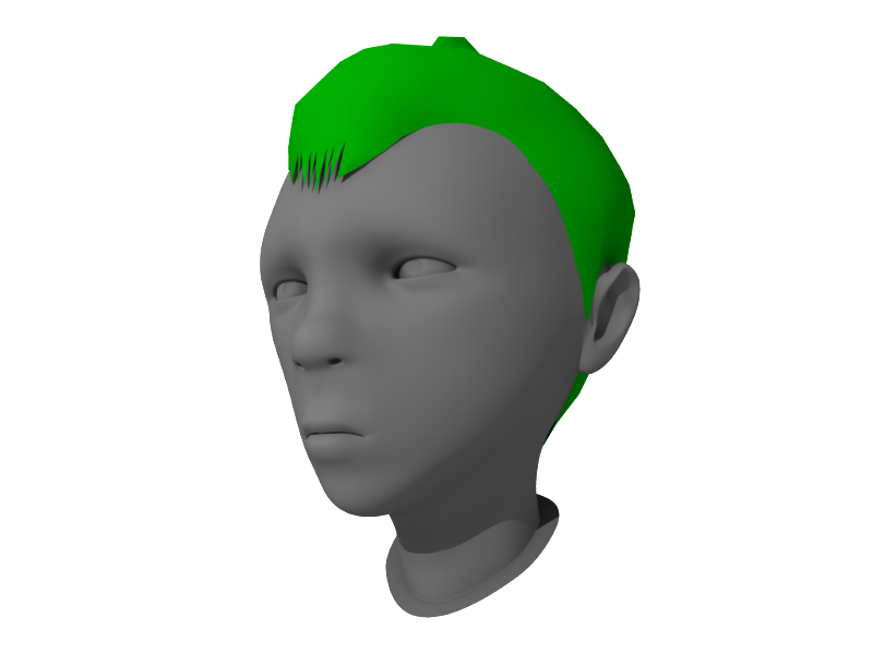
Hey guys, started a new character after seeing an awesome movie called Tekkon Kinkreet. I am modeling one of the main characters, Kuro. Before I go any farther with the modeling, I had a couple of questions. As far as game characters go, should I separate the hair from the skull for zbrushing? The only reason I am thinking this might be the way to go, is because there might not be enough geometry on the skull to get the hair the way I want it. I also created a sock for the inside of the mouth and some teeth. I did this because the character screams a lot in the film and the pose I want will probably have the mouth open. I am also wondering if the way I did this is correct? I am going to do my best to create a real nice portfolio piece, and try to do the film and comic justice. Anyways here's the pics:
heres some initial thoughts,, also,, that body you are doing, looks waaaaaaayyyyyyyyy off from the concept, the shoulders should be about where your sleeves are cut off at , and the body should be well wider than the head, yours now is not much larger than the neck.
are you intentionaly trying to "humanize" it? like make it look like a real boy in cosplay outfit? or are you trying to actualy make the character like the concept?
i personaly think the concept would be the way to go, and it is possible take a look at other anime based 3d models
Hey Rhinokey, thanks for the paintover. I was starting to feel that the character was veering away from the concept and your crit's helped me kind of see what I need to correct. I think the weird proprtions of the character is causing my brain to try and make it more standard human instead of just following the concept. I'm going to try and rework the face and body and try to fix where I unconsciously started fixing proportions. Also the hair is kind of a placeholder, just wanted to have to get a better idea of the whole picture. Anyways, back to work.
no prob, its really really easy after hammering in all these rules about proportions and stuff to get trapped by them, but the key is to know when and why you are breaking the rules to achieve the desired purpose. it seems wrong to model eyes that are 3 or 4 eye widths apart when you train that they are "suposed" to be one apart. just get in the habit of everytime you start on a section compaire that with the concept, measure it out acuratly, you will have to deviate some, because some 3d things will never translate 100% to 3d but with a bit of work you will have it close enough that people wont notice
Tekkon Kinkreet rules, I wanted to make Kuro for Comicon, but I chickened out.
Good start, you should block out the body as soon as possible I think, cause it's tricky keeping the overall proportions right with these kind of very stylised characters.
Giving him his metal bar like at the end of the movie could be nice too, for posing him when your done.
Hope you make his minotaur head too. http://born-robotic.net/stuff/kurominotaur.jpg
Bal: Yeah, I thought modeling this character wouldn't be that big of a deal, but the proportions are so wacky it's giving me a hard time. I like the minotaur head, I may model that after I get character done. The metal bar will of course be included
Rhinokey: I messed with the mouth to tried to match the front ref, but I don't think I can push it as far as the ref does in 3d. When I tried to make the up arrow shape for the lips, it just makes him look like he is about to cry. I am thinking I am going to move some verts and make him have a tough guy smirk or maybe even yelling like a crazy bastard. I want to avoid any facial rigging, cuz honestly I hate rigging with a passion and the less I have to do, the more likely I won't get burnt out on this piece. I'll post some more progress later today.
Also here is the pose I am thinking of putting the character in :
The jaw still needs to be a touch more square,
compared side by side, your face is either too tall, or too thin, the ref is way more of a cube
and the front of the face needs to be more flat, almost all of the face should be in the front 20% of the head
Did a few tweaks, then did a check against the references. Everything looks pretty good and seems to match up. Gonna try and finish the rest of the body and maybe get into zbrush today, as long as work doesn't get too busy.
the heads looking much better, specialy in that last post,, the body,, is going wrong, and i think you need to take a fresh look at it.
the sholder shape on that concept is real stylized and neat, its almost a straight line down from the neck to the shoulder peak, then another near straight (slight concave) jut down to the sleve end, the model has too many lumps an stuff on this angle, also the model the neck of the shirt is real thick an flares out,, like it was made of thick rubber or something.
your sleeves are waaayyy too short for that concept,, and your body is about 25% thinner than the concept making him look like a stick figure.
also the concept the neck tapers a bit more in the front view to be smaller at the bottom.
Damn you Rhinokey, you keep showing me my mistakes Took your advice and fixed the body, things are looking much better now. I can't wait to work on the shoes, I need to practice making a good sneaker. Do you think I should rough in a shoe and then zbrush in the details? Or should I try to make a high poly sneaker and bake it to a low rez mesh in xnormal? I have tried baking from a high poly boot to a low poly boot in maya before, but I had serious issues with both maya and xnormal's bakes. I tried tweaking the cage in maya, but I still have not figured out how to get a good normal pull from high poly models yet. Any advice is greatly appreciated.
Quick post before I go home. Body almost done, need to finish the shoes. Just noticed the legs might need to be a tad longer, have to fix that later. Crits and comments welcome.
The cartoon still has underlying anatomy beneath all the weird proportions. For instance, take a good look at your shouldes. While the shirt hides them, you can tell his arms still end up in his shoulders, whereas your arms seem to end somewhere else.
One thing you might consider if you're going to pose this fellow, is that there's likely to be a lot of squash and stretch in the poses. You might be shooting yourself in the foot a little by giving him the really stylised shoulders that he has when standing still.
He's coming along well though. I'll look forward to seeing him develop some more. There's some really nice environments in that movie. It'd be cool to see the character placed in a scene.
Little update, finished the shoes. I know you guys are going to kill me for modeling the laces, but I didn't think a normal map would give me the result I am looking for. I want to keep the poly count under 15,000 and after optimizing the mesh and adding a weapon I should be well below that. If anyone has any other ideas on how to do the shoes please let me know. I made a high poly shoe to transfer normals in xnormal, but I also want to zbrush some other details onto the shoes. I assume that I can just use photoshop to combine the maps and paint out any errors, is that right? Anyways here's some pics:
Hi Poly shoe:
Low Poly shoe:
Low Poly shoe with crap xnormal bake from hi poly:
I'm pretty worried about how he'll look with extreme arm poses, like reaching above his head... I supposed you'd need some pretty crazy clavicle motion going on. Anyways, keep it in mind.
Aesir: I see what you are talking about with the shoulders. I am going to test rig and try and get the pose I want before starting any sculpting. Do you happen to know of any good shoulder/arm rigging tutorials? I am not the greatest rigger and I have had some trouble finding some tutorials on advanced shoulder and clavicle setups.
eyes are too wides, and not slanted correctly in terms of the concept, is this by reason or mistake, to me it would help sell from the front, but may not from the side
Started Zbrushing. Had a bitch of a time getting all my subtools in there, but that's probably because I don;t know how to use Zbrush that well. Anyways here's the progress on the head, the hair is still being worked on so forgive me if it looks kind of crappy right now.
i still am not a fan of the tube arms i prefer th larger baggier sleeves as seen on the concept.
the pictures seem to have more of slippers than tennis shoes, at least the jumping one.
also not to be all rude, but your zbrush skills are a bit behind your poly modeling skills, and it looks like the zbrush features are just slapped on. he hair looks like you just wen apeshit with the rake tool, rember its a cartoon character, you may not need to sculpt every single hair or such.
so in short
arms look like spagheti coming out of the torso and the zbrushing needs a LOT of work
in retrospect i would say that you modeled a lot more detail in your base mesh before brining it to zbrush than you needed.
You're right about my Zbrush skills, I just started trying to sculpt things in it and am still trying to figure out the intricacies of the software. The reason I went crazy with the rake tool on the hair is that I wanted to have some detail and try to make the hair look more realistic than just flat shaded cartoony hair. Do you have any suggestions on how to do the hair differently? As far as the eyebrows and scar go, I'm not sure how I can make them not look "slapped on" I honestly thought they looked ok, but maybe I am not seeing whats wrong with them. As far as the arms go, from all the reference pics I gathered the arms looked pretty long, skinny and the character overall looks pretty lanky, so I'm not sure why the arms look so weird. Anyways, thanks for the feedback. Every comment and critique helps me learn so I appreciate it. Also, here's a character sheet kind of showing the deal with the arms.
the image on the right is what you have now, the arm kinda comes out and bends at the shoulder like a macaroni noodle, leaving this huge curved armpit
the middle image is more like it should be,, the arm connecting straight into the shoulder
the left pic shows a reshape of the shirt,, it looks now like you just selected the characters body an extruded it out makes it look like a wet suit or something, the sleeve should hang much looser,
as for the hair you need to sculpt the larger forms an work into detail hair is not a helmet with a lot of scratches in it, it has forms an shapes, youtube can be your friend here
zack,, take that screenshot in photoshop for me, an draw over it what the underlying anatomy of the character would look like.
edit ok i did this real quick but first i will say, this model sheet you posted with the multiple pics of the character,, it looks a lot different than the first pic you posted that you are basing your model off of.
on to my paintover,, the 3rd or 4th one for this thread!
look at the relation to the peak of the shoulder from the concept to your model on your model the armpit and the shoulder peak are close to being on the same level making the arm seem disjointed an attached sloppily.
remember his lats, they are wider on the back of the character and server to set the arm into the body firmly so they are not tacked on.
the blue lines show general body shape the concepts the body lines flow up into the shoulders into a nice flare our straight into the shoulders
your body is tapered the opposite directional flares out at the hips.
bottom left i painted over what i personally think would be a more suitable shape for the character
also your hair looks off now, in the initial pic you posted it seems the hair is pushed up into that point because of the goggles on his head, if you are going to pose him with the goggles down then that hair looks nothing like the model sheet. even on the model sheet the hair does not do that in any of the shots and its a lot more tussles an haphazard.
also even compared to the original pic you are making it look more like the hair is combed back and up with just a few strands in the front loose, in the original pic you posted you can see he has scruffy hair along the whole of the hair line its not so much as combed back as just pushed back by maybe the sliding of the goggles up to his head.
i personaly like the hair in the newer character sheet
Replies
heres some initial thoughts,, also,, that body you are doing, looks waaaaaaayyyyyyyyy off from the concept, the shoulders should be about where your sleeves are cut off at , and the body should be well wider than the head, yours now is not much larger than the neck.
are you intentionaly trying to "humanize" it? like make it look like a real boy in cosplay outfit? or are you trying to actualy make the character like the concept?
i personaly think the concept would be the way to go, and it is possible take a look at other anime based 3d models
Good start, you should block out the body as soon as possible I think, cause it's tricky keeping the overall proportions right with these kind of very stylised characters.
Giving him his metal bar like at the end of the movie could be nice too, for posing him when your done.
Hope you make his minotaur head too.
http://born-robotic.net/stuff/kurominotaur.jpg
Rhinokey: I messed with the mouth to tried to match the front ref, but I don't think I can push it as far as the ref does in 3d. When I tried to make the up arrow shape for the lips, it just makes him look like he is about to cry. I am thinking I am going to move some verts and make him have a tough guy smirk or maybe even yelling like a crazy bastard. I want to avoid any facial rigging, cuz honestly I hate rigging with a passion and the less I have to do, the more likely I won't get burnt out on this piece. I'll post some more progress later today.
Also here is the pose I am thinking of putting the character in :
EDIT: Ears still need to be fixed
Anyways here's the pics :
compared side by side, your face is either too tall, or too thin, the ref is way more of a cube
and the front of the face needs to be more flat, almost all of the face should be in the front 20% of the head
the sholder shape on that concept is real stylized and neat, its almost a straight line down from the neck to the shoulder peak, then another near straight (slight concave) jut down to the sleve end, the model has too many lumps an stuff on this angle, also the model the neck of the shirt is real thick an flares out,, like it was made of thick rubber or something.
your sleeves are waaayyy too short for that concept,, and your body is about 25% thinner than the concept making him look like a stick figure.
also the concept the neck tapers a bit more in the front view to be smaller at the bottom.
He's coming along well though. I'll look forward to seeing him develop some more. There's some really nice environments in that movie. It'd be cool to see the character placed in a scene.
Hi Poly shoe:
Low Poly shoe:
Low Poly shoe with crap xnormal bake from hi poly:
Low Poly shoe wireframe:
Maya Viewport grab of body:
eyes are too wides, and not slanted correctly in terms of the concept, is this by reason or mistake, to me it would help sell from the front, but may not from the side
Snader: I see what you are saying about the laces, I'll fix that today.
the pictures seem to have more of slippers than tennis shoes, at least the jumping one.
also not to be all rude, but your zbrush skills are a bit behind your poly modeling skills, and it looks like the zbrush features are just slapped on. he hair looks like you just wen apeshit with the rake tool, rember its a cartoon character, you may not need to sculpt every single hair or such.
so in short
arms look like spagheti coming out of the torso and the zbrushing needs a LOT of work
in retrospect i would say that you modeled a lot more detail in your base mesh before brining it to zbrush than you needed.
You're right about my Zbrush skills, I just started trying to sculpt things in it and am still trying to figure out the intricacies of the software. The reason I went crazy with the rake tool on the hair is that I wanted to have some detail and try to make the hair look more realistic than just flat shaded cartoony hair. Do you have any suggestions on how to do the hair differently? As far as the eyebrows and scar go, I'm not sure how I can make them not look "slapped on" I honestly thought they looked ok, but maybe I am not seeing whats wrong with them. As far as the arms go, from all the reference pics I gathered the arms looked pretty long, skinny and the character overall looks pretty lanky, so I'm not sure why the arms look so weird. Anyways, thanks for the feedback. Every comment and critique helps me learn so I appreciate it. Also, here's a character sheet kind of showing the deal with the arms.
the image on the right is what you have now, the arm kinda comes out and bends at the shoulder like a macaroni noodle, leaving this huge curved armpit
the middle image is more like it should be,, the arm connecting straight into the shoulder
the left pic shows a reshape of the shirt,, it looks now like you just selected the characters body an extruded it out makes it look like a wet suit or something, the sleeve should hang much looser,
as for the hair you need to sculpt the larger forms an work into detail hair is not a helmet with a lot of scratches in it, it has forms an shapes, youtube can be your friend here
[ame]http://www.youtube.com/watch?v=jCn7B0sfiaw[/ame]
(awesome music also)
[ame]http://www.youtube.com/watch?v=vcNnCCpNaco&feature=related[/ame]
[ame]http://www.youtube.com/watch?v=z5-LqmYXqa8&feature=related[/ame]
[ame]http://www.youtube.com/watch?v=_OQqxmxStWc&feature=related[/ame]
this is just some dif vids i found .
Ah, Mojo2k posted right as I was typing.
edit ok i did this real quick but first i will say, this model sheet you posted with the multiple pics of the character,, it looks a lot different than the first pic you posted that you are basing your model off of.
on to my paintover,, the 3rd or 4th one for this thread!
look at the relation to the peak of the shoulder from the concept to your model on your model the armpit and the shoulder peak are close to being on the same level making the arm seem disjointed an attached sloppily.
remember his lats, they are wider on the back of the character and server to set the arm into the body firmly so they are not tacked on.
the blue lines show general body shape the concepts the body lines flow up into the shoulders into a nice flare our straight into the shoulders
your body is tapered the opposite directional flares out at the hips.
bottom left i painted over what i personally think would be a more suitable shape for the character
also your hair looks off now, in the initial pic you posted it seems the hair is pushed up into that point because of the goggles on his head, if you are going to pose him with the goggles down then that hair looks nothing like the model sheet. even on the model sheet the hair does not do that in any of the shots and its a lot more tussles an haphazard.
also even compared to the original pic you are making it look more like the hair is combed back and up with just a few strands in the front loose, in the original pic you posted you can see he has scruffy hair along the whole of the hair line its not so much as combed back as just pushed back by maybe the sliding of the goggles up to his head.
i personaly like the hair in the newer character sheet