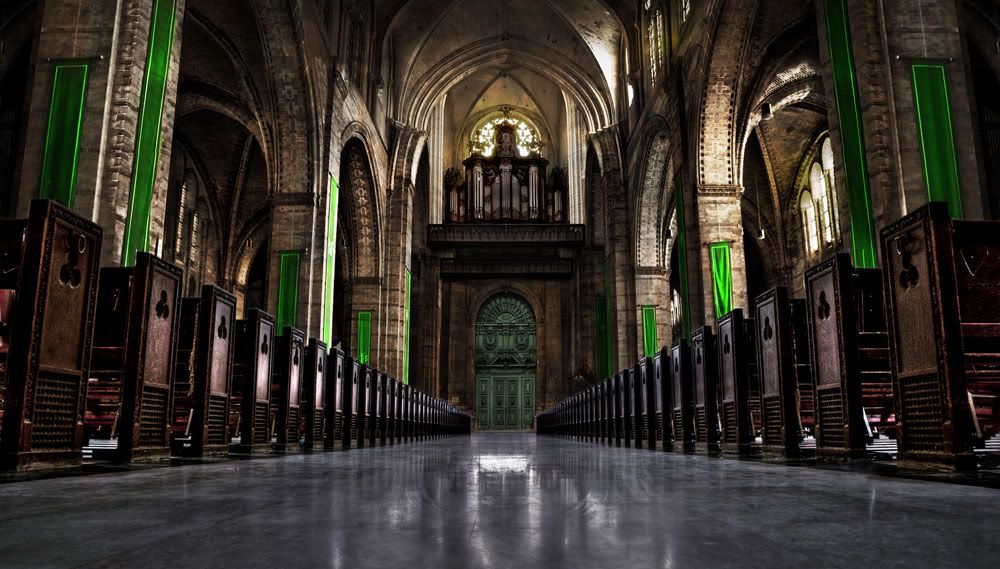
Mattepainting Notre dam Interior
Hey all,
I have to make a mattepainting for school so first time doing this.
Would be great if you could give me some feedback.
Setting :
- Interior
- Notre Dam
- High Class
- Low angle
- Steampunk
Still have to find a good way to integrate the steampunkstyle. And still got to clone some lamps away, hehe

I have to make a mattepainting for school so first time doing this.
Would be great if you could give me some feedback.
Setting :
- Interior
- Notre Dam
- High Class
- Low angle
- Steampunk
Still have to find a good way to integrate the steampunkstyle. And still got to clone some lamps away, hehe

Replies
http://media-cdn.tripadvisor.com/media/photo-s/01/21/17/37/notre-dame-interior.jpg
looks great, how much is photo vs painted?
lol
those hanging banners should be a lot less saturated
also try to incorporate a pattern or logo on them that has something to do with steampunk
try to get more coper and gold tones in there (the door for example)
get some pipes running acros a pilar in the front
maybe a volumetric light from the centre top window would give the entire piece more mood
just trial and error and see what works ^^
@rooster : Thanks
@Ravenslayer : Oh great advice, thanks. Will try out
Your probably right, it just looks like a hell of a lot of pews.
Put piping and speakers throughout the ceiling area that would be used to amplify the sounds of the choir or organ player etc.
If you have a church around you stop by it Sunday and do some research. Even if you're not religous no one will care and just observe. Then think about how a steampunk society would alter things.
Another thing I noticed is that in the ground reflection the door seems to be surrounded with something thats really glowing, although when I look at the actual door its not surrounded with something as light as the reflection is trying to suggest.
Besides my nitpicking, its really awesome!
1.When you paste in stuff always check the lights, extremely important. Now the lamps are more brighter than the scene.
2.Same for the speakers, it shows clearly you have just pasted them in.
The front scene it shows too much details, I have it hard for me focus where I should look at. Ok it is highly detailed everywhere BUT focus only in one point.
The red marked on the floor, dont put too much shadows it looks like it is floating, and same thing the "lights" study more of your scene where the lights bounce, now it seems you have just pasted them in without correct the color,lights and so on. I hope it helps.