The BRAWL² Tournament Challenge has been announced!
It starts May 12, and ends Oct 17. Let's see what you got!
https://polycount.com/discussion/237047/the-brawl²-tournament
It starts May 12, and ends Oct 17. Let's see what you got!
https://polycount.com/discussion/237047/the-brawl²-tournament
Turkey/Fantasy Environment
Wow, that sounds like the most sexually deviant environment ever.
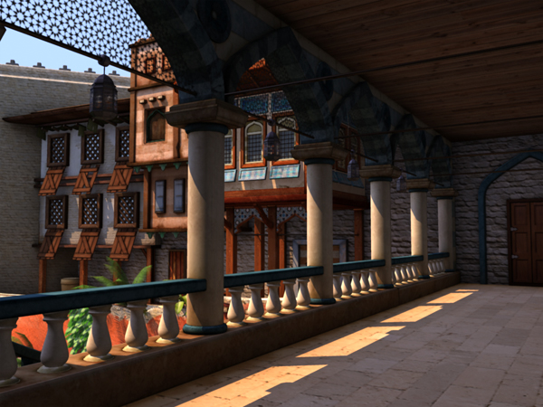
Right now I'm wrapping up the last of an eight month program which is really great, but also geared heavily towards animation for TV and broadcast. We don't cover game engines or much lower poly work in the course, and there are just a handful of people interested in environment art. That said, this is part of my final Maya project which I started a few months ago when I had no real idea of what I was doing.
It's based really loosely off an image from a 200 year old book in the central Vancouver library about Istanbul and Turkey. ...really, really loosely.
Anyway, because Adam says I should post 'er up...


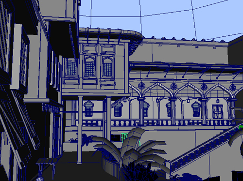
(Ahhh, my wires are the shittiest! Hahaha.)

Hopefully there's time to finish it before the end of the year.
Right now I'm wrapping up the last of an eight month program which is really great, but also geared heavily towards animation for TV and broadcast. We don't cover game engines or much lower poly work in the course, and there are just a handful of people interested in environment art. That said, this is part of my final Maya project which I started a few months ago when I had no real idea of what I was doing.
It's based really loosely off an image from a 200 year old book in the central Vancouver library about Istanbul and Turkey. ...really, really loosely.
Anyway, because Adam says I should post 'er up...


(Ahhh, my wires are the shittiest! Hahaha.)

Hopefully there's time to finish it before the end of the year.
Replies
Only suggestion I have right now is in screenshot 2 on the left you have 6 windows on a building, all with (what would I call those? lol) hanging down. Maybe make a couple of them covering the windows, or have a few windows missing them.
I see you put variation in the (wooden window thingies) themselves, as the top-middle one is missing a plank, so you got the right idea.
this looks great, though. very rich and vibrant.
Drumonman - I believe you can just call them shutters. And having a few of the windows missing them would be a bit odd and might make the place feel more dilapidated than intended...
about half the objects almost have a borderlands look to them, kind of outlined. the shutters and the cart stand out the most. was this intentional? if so, other assets are lacking it and look much more realistic, creating a bit of disharmony between all the assets in the scene.
It wasn't, but now that you mention it I can't unsee it. I think it might've been that I made those parts earlier in the project, and only later in the scene did I start changing the AO from black and white to coloured. I'll go in and fix that today, along with messing with the shutters some more. Hopefully that'll make things real purdy.
Thanks!
So far I just see a nice layout/composition.