Pool Game: Last Call Sharks
Hey guys. Here's a little tidbit I've been working on, would love comments good or bad. I wont go into a huge description of the game here, that can be seen here:
http://www.lastcallsharks.blogspot.com
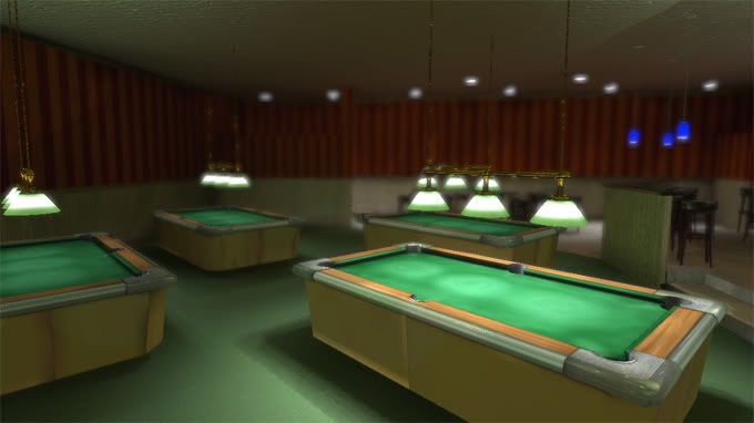
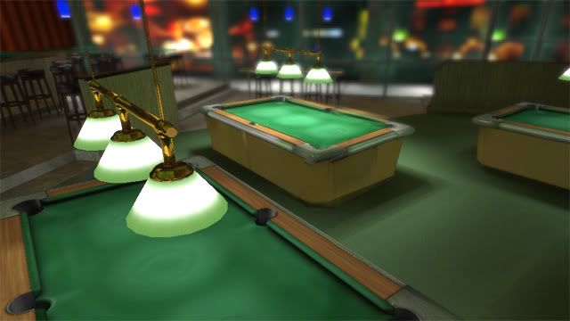
Heres a few screens of the environments as they stand, they definately still need a lot of work. The pool table is still a work in progress, (the sides actually haven't been touched yet) as well as ambient stuff, flatscreens, empty glasses, stuff like that. I really want to create a handpainted look for this one, like your looking at an oil painting, yet with the gloss and bumps of realism. I think that should produce an interesting effect.
All is built in max, and compiled in Unreal.


Replies
For the type of lighting you're depicting, the room seems pretty evenly lit. I would try tightening down the cones of the cast lighting from those hanging lights and softening up the illumination on the walls and ceiling to depict more of a bounced light.
Up to you how much of the room's illumination you want to depict as coming through those windows on the wall. I can't quite tell if that's supposed to be a lounge or the Vegas strip on the other side.
The background is a blured street. I've been debating keeping it or replacing with something else. But if its that ambiguous, I should probably change it.
Here's a panoramic shot from the pool hall that I play league at from our website:
I'd space them off a bit more like that. Actually, you might take a look at the lighting in some of the shots on our photo page:
http://www.houston8ballleague.com/pictures.html
The only place I've ever played pool where the lighting is that even is Vegas :P
Tables look ok, but you're missing the diamond markers, as well as any cubby hole or anything in the front (where you break) to place balls in. Hard to tell from the view, but are those supposed to be 8ft or 9ft tables? In that first shot they look a bit long, even for a 9footer. Also your lights are hanging way too low. They need to be at least another foot up. Don't forgot cue racks, chalk, triangle, etc.
Read your gameplan, sounds interesting. I'm assuming you guys will be doing either 8 ball or 9 ball? BCA rules or APA? Would be cool if you could play as either way. The sharking mode sounds like it could be interesting, but I'd be sure to concentrate more on english, cue ball control and things like that first and foremost.
the sides.. well... yeah, I should get going on those:)
Gameplan for this location is 8ball APA rules. Although with the other locations, rules will differ based on what the locals would play. Sheik pool hall will play BCA, Biker bar will play Straight 8 (bar rules), etc...
Thanks for the crit, its nice to have more eyes on this thing, especially another pool player:)
Ah, Ok, that works then. Yeah I hate meeting up with friends at local pubs or something and they want to play on quarter tables that have like 2 feet apart from the table and other chairs or something.
It's off to a good start dude, I'll definitely be following this. Might be worth noting that theres a pool game on PSN called Hustle Kings that you might want to check out. I haven't played it, but might be worth looking at to see how they did certain things.
Really hard to say. White text up against the pool balls is going to be hard, because unless there's a very harsh outline around the text, the white shapes are going to intermittently read visually as white parts of pool balls - which is the problem right now.
The only thing I can recommend for a sure-fire fix is moving the text below the racked balls so it's not overlapping them.
Looking promising!