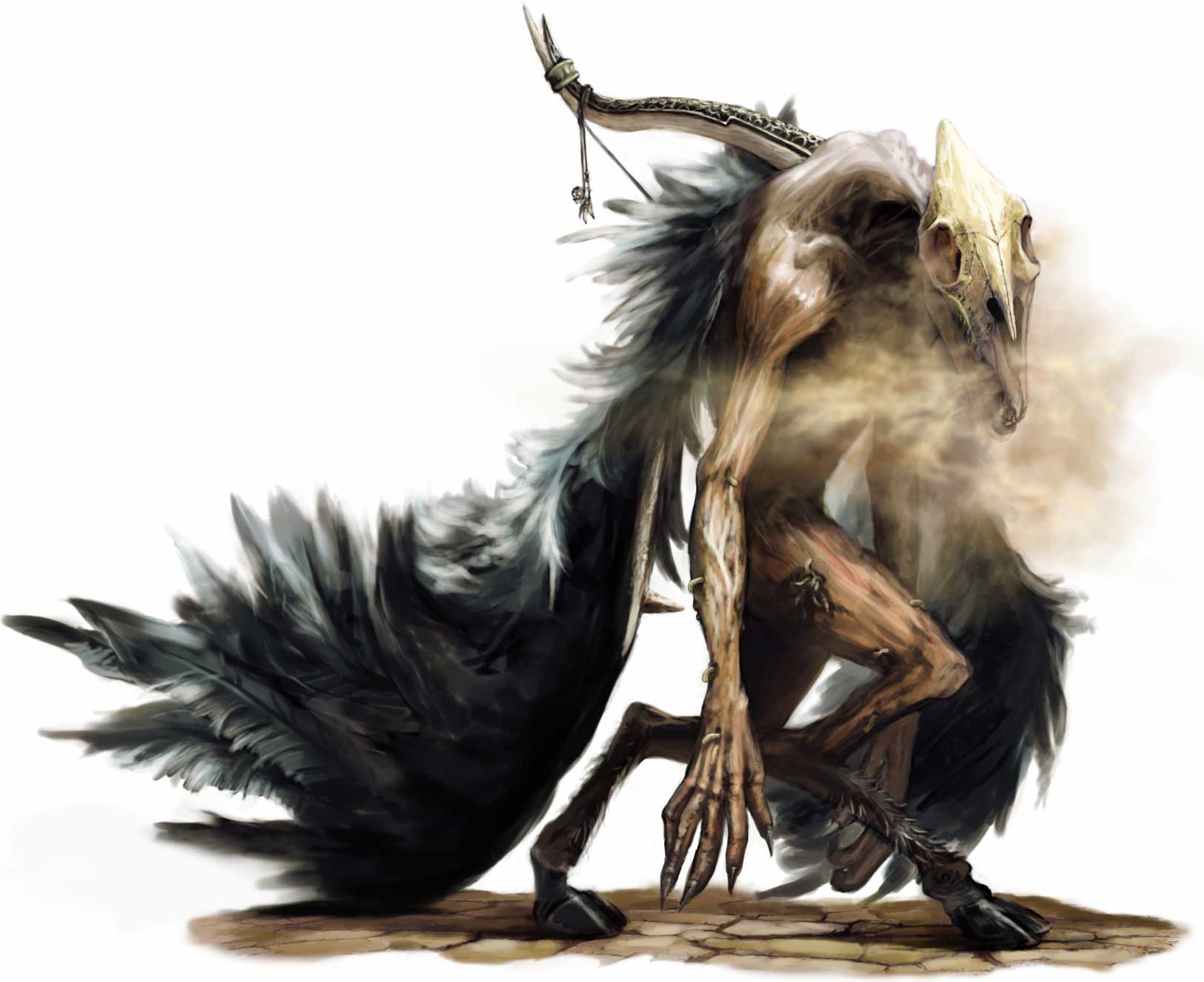
just use an alpha map the way you would any other transparent object. If you want the feathers to be very painterly then just make them that way. You could do them as a big clump of feathers or do a single feather and duplicate it. If you have those kind of concept skills you should have no problem translating that to a texture sheet. Just go with your gut!
I would probably go by having 3 different kind of feathers.
1 is a big bunch of them that can fit on one card, 1 that has just one feather for detail, and 1 that has the bend like you had for more variation. I might even go for 4 and have the wings considered an asset for the character and have 2 textures. It all matters on how lively you want it to feel.
as you can see, there si kinda a line between the hairs of the feather (im talkin abt the very top part) this is because the individual hairs are held together by some sort of membrane so that air doesnt pass through it.
Feathers or not- you gotta the default pose looking right. Currently he looks like he`s falling back. If you dont get that more natural and relaxed looking, your going to be fighting that every step of the way when you get to the rigging/animation stage. Take some time to rock dem transpose tools and get him looking more natrualy weighted.
The issues with weighting come from the fact that the legs aren't proportioned correctly. Each section is too long at this point. At rest, you're going to want the feet underneath the body with the tarsal being pretty vertical. It'd be worth hunting down some reference of satyrs to see how other people have worked the design. Looking at real goat anatomy might be worthwhile too.
Your wings are a bit out of whack too. Shorten the first section and lengthen the second and you'll wind up with something more natural looking.
Jackablade: crap, proportions are very off atm.
Will fix, I think something like this, http://www.newanimal.org/tumnus_faun_satyr.jpg
but more laid down, too vertical and I think the concept will lose that almost crawling look. thanks for pointing that out, some goat studying to do!
and I think the main reason he looks like hes falling backwards is that Ive built him with humans in mind, ribcage and that all strait up, but with these long legs and the extra growth on his back, he ends up lopsided and without anything under him.
Hopefully better?
his chest is abit forward, to off balance the wings and deformations, adjusted the legs like you guys suggested, and hopefully more natural looking, though I haven't touched the wings yet, I think I'll redo them.
Are you planning on working on the legs some more? Right now they don't seem to have much muscle in them- I mean the thighs have mass but I don't know. It just doesn't seem like this creature could support it's own weight on what you have now. It looks less like he's falling back now though, so that's good
you may want to take it into photoshop and lay out a large area. Such as the area directly connected to the wing. Use these individual feathers to make it pop out from the object more. instead of killing yourself trying to shift clone a million feathers.
Yeah, Titus mentioned that. I think I'll be using a few larger cards with maybe 10 or so feathers on each, and then these singular bits on the tips and for detail.
The ones on the right are flight feathers, (for tips) and the left ones are for the back and shoulders. I'll have different ones added into the cards for variation.
Thanks for the tip
and RoosterMAP, that helped a lot with painting these new feathers, thanks!
Edit: also, which feather 'look' do you guys prefer? the left ones have a noise applied to simulate the way feathers reflect light, on the right I left them clean.
I am thinking to model some angel wings for a character design using 3DMax.I am considering using planes with a bitmap of a feather as the reference.Any other best way to carried out this?
It depends on how complicated you want to go, you could get some really good results with sculpting a more compact wing and baking normals off of that.
If you want to have a more next-gen and more complicated look, then alpha'd planes will be the best bet. I haven't done any feathered creatures before, so this is all experimentation for me too.
Allright, a bit of time between updates, but im getting there.
here is a nomal map test, and first pass at texturing for the body. (no specular)
Actual polycount is 5,698 tris, with the wing and horn mirrored over.
I think I'll take it to 6.5-7K including feathers.
also, here is a new feather I painted for the wings, more realistic.
any suggestions on topology or baking stuff is appreciated!
Thanks for the tips guys, I didnt want to reply without progress.:)
I've been messing with those planes too much, without alot of good.
started from a new angle:
Abit more cartoony than I need, Ill be rendering and cleaning it up in a bit.
it's basically a set of planes offset and distorted to look like a lot of unique feathers, when it actually will be using a single 1024x512 map
kind of difficult to explain this late, here's wires:
The proportions are a bit ridiculous even on the concept art. Which is going to make this a challenge as to making it look cool in the end. My suggestion is to pose the low poly now while you work on the textures. A dynamic pose will make him look much better, trust me. Once he is posed keep checking your model against the concept and try to push it in that direction as much as possible. Good luck man!
P.S. Feathers are looking really neat so far, keep pushing that further as well!
Replies
But I guess 2d is a more efficient approach.
anyways, since this is already in pnp, then might as well pimp my progress so far.
just the major forms and such, minor details to come in a bit.
register, scroll down to "sculpting feathers using slash2 brush" and voila.
and the near-final sculpt=
I dont like the hands in the concept, but regular man hands suck, any ideas?
thanks divi, excellent link, but the result that it gives isnt exactly what I was looking for.
I ended up painting this:
its just a few planes with an alpha (top is bent), kind of made it look like fur, but I like it.
1 is a big bunch of them that can fit on one card, 1 that has just one feather for detail, and 1 that has the bend like you had for more variation. I might even go for 4 and have the wings considered an asset for the character and have 2 textures. It all matters on how lively you want it to feel.
as you can see, there si kinda a line between the hairs of the feather (im talkin abt the very top part) this is because the individual hairs are held together by some sort of membrane so that air doesnt pass through it.
also, see this one... remember, the hairs are really thick. this will keep it from looking like fur.
http://upload.wikimedia.org/wikipedia/commons/0/07/Feather_of_%27Dendrocopos_major%27_%28Great_Spotted_Woodpecker%29.jpg
hope this helps.
If he can pull off the style from the concept art then I'd say the arms would look way better on than off.
Your wings are a bit out of whack too. Shorten the first section and lengthen the second and you'll wind up with something more natural looking.
Titus, Excellent Ideas, I really want the wings to have their own life about them, I think Ill try them as an asset.
rooster map, thanks, that helps alot, I will redo the feathers tomorrow.
Tim, I like the akwardness, it has the knuckle dragging without-a-brain look
Konstruct, Ill work on it, I think I'll get my retopo working, then use it to transpose my model into shape. Dunno why I didnt notice that.
Will fix, I think something like this,
http://www.newanimal.org/tumnus_faun_satyr.jpg
but more laid down, too vertical and I think the concept will lose that almost crawling look. thanks for pointing that out, some goat studying to do!
and I think the main reason he looks like hes falling backwards is that Ive built him with humans in mind, ribcage and that all strait up, but with these long legs and the extra growth on his back, he ends up lopsided and without anything under him.
Hopefully better?
his chest is abit forward, to off balance the wings and deformations, adjusted the legs like you guys suggested, and hopefully more natural looking, though I haven't touched the wings yet, I think I'll redo them.
I have beefed up the legs a bit as well as other small updates.
I have also painted some new feathers.
here are shots from maya,
I will be doing cards with multiple feathers on each one,
The ones on the right are flight feathers, (for tips) and the left ones are for the back and shoulders. I'll have different ones added into the cards for variation.
Thanks for the tip
and RoosterMAP, that helped a lot with painting these new feathers, thanks!
Edit: also, which feather 'look' do you guys prefer? the left ones have a noise applied to simulate the way feathers reflect light, on the right I left them clean.
If you want to have a more next-gen and more complicated look, then alpha'd planes will be the best bet. I haven't done any feathered creatures before, so this is all experimentation for me too.
here is a nomal map test, and first pass at texturing for the body. (no specular)
Actual polycount is 5,698 tris, with the wing and horn mirrored over.
I think I'll take it to 6.5-7K including feathers.
also, here is a new feather I painted for the wings, more realistic.
any suggestions on topology or baking stuff is appreciated!
all of the feathers combined are at 68 tris, so lots of room to play with.
I've been messing with those planes too much, without alot of good.
started from a new angle:
Abit more cartoony than I need, Ill be rendering and cleaning it up in a bit.
it's basically a set of planes offset and distorted to look like a lot of unique feathers, when it actually will be using a single 1024x512 map
kind of difficult to explain this late, here's wires:
P.S. Feathers are looking really neat so far, keep pushing that further as well!
Tried to get alpha planes working in marmoset, but they will only display a range of opacity, doesnt look very good XD
And a top and back view:
My main problem now is that he looks too friendly
Any suggestions on textures are welcome.