The BRAWL² Tournament Challenge has been announced!
It starts May 12, and ends Oct 17. Let's see what you got!
https://polycount.com/discussion/237047/the-brawl²-tournament
It starts May 12, and ends Oct 17. Let's see what you got!
https://polycount.com/discussion/237047/the-brawl²-tournament
Hiroshi Updaed: "Dragon Weaver"
The Legend:
In a time long ago, it was believed that ones chosen by the gods were able to "weave" their chi with the ancient spirits of mystical creatures, and harness the creatures power.
They were known as Spirit Weavers, and this is the legend of the greatest one of them all...The Dragon Weaver Hiroshi...
HEY ALL! Just wanted to post up the 2nd pass on the Hiroshi model...its actually in the middle of the 3rd and final pass now...making some tweaks to stay as close to the silhouette of the original design as much as possible...as we all know silhouette is everything...a cool character with a corny sil, will always look corny...esp when animated.
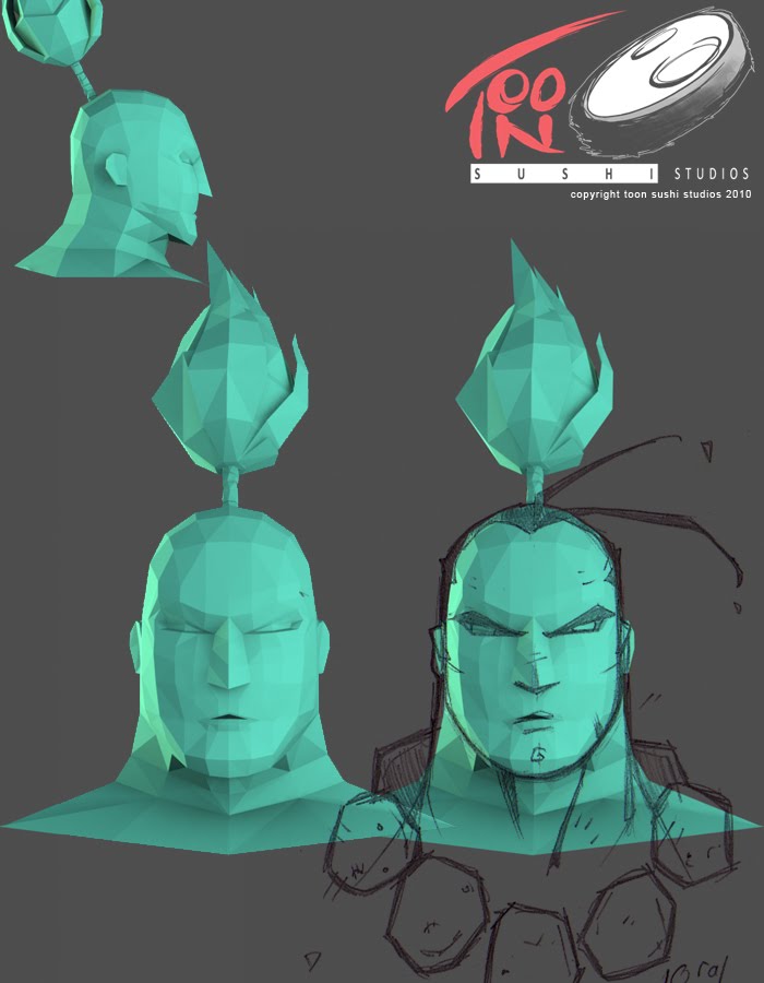
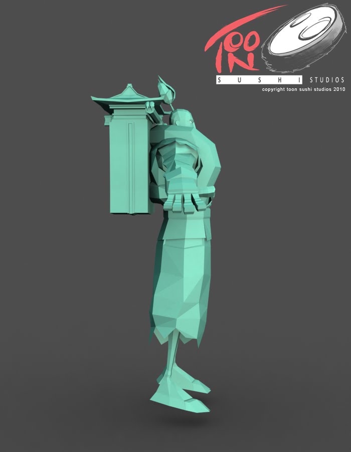
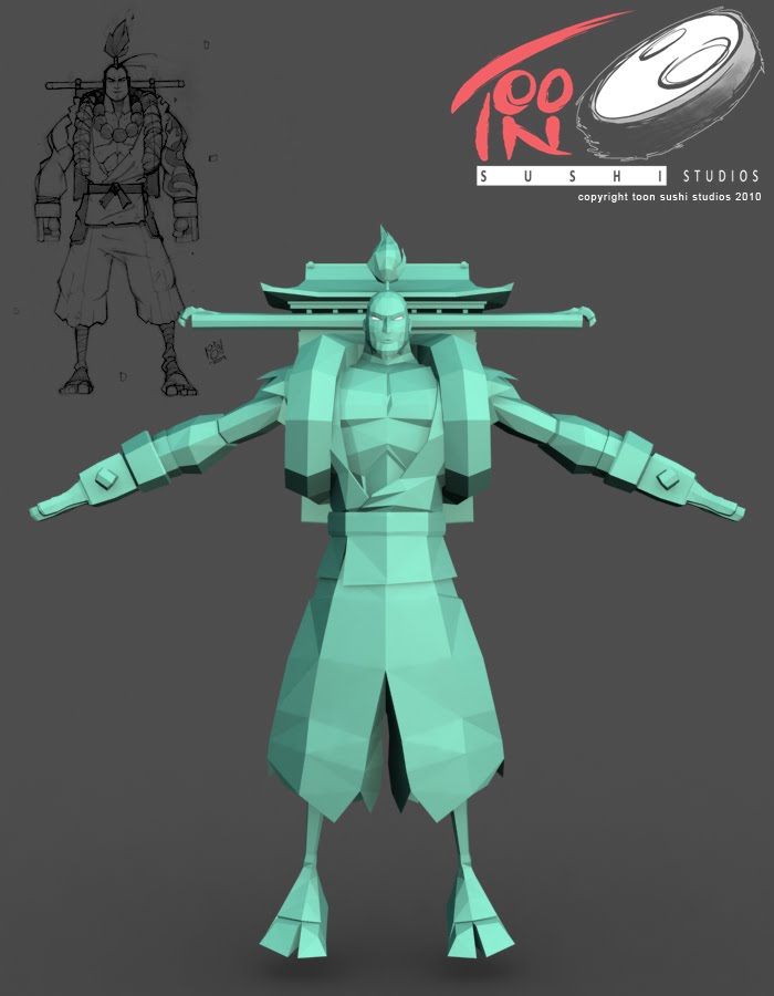
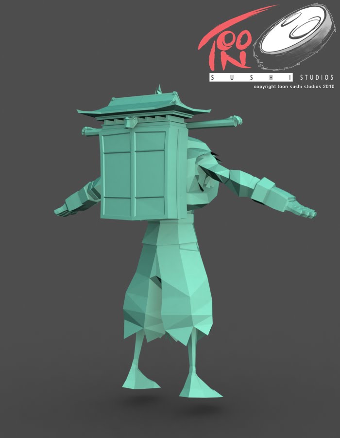
I AM NOT A MODELER...i do love the low poly look, and so i cant wait to nail this, texture it and move on.
I am on the 3rd pass now..the concept changed after this pass was done...i added a bit more of a dynamic shape to Hiroshi.
This was the original design that i started modeling from:

This is the updated Hiroshi...small tweaks makes it a bit more dynamic:

HOPE U ALL LIKE IT! PASS 3 COMING SOON with some of the story!!!

In a time long ago, it was believed that ones chosen by the gods were able to "weave" their chi with the ancient spirits of mystical creatures, and harness the creatures power.
They were known as Spirit Weavers, and this is the legend of the greatest one of them all...The Dragon Weaver Hiroshi...
HEY ALL! Just wanted to post up the 2nd pass on the Hiroshi model...its actually in the middle of the 3rd and final pass now...making some tweaks to stay as close to the silhouette of the original design as much as possible...as we all know silhouette is everything...a cool character with a corny sil, will always look corny...esp when animated.


I AM NOT A MODELER...i do love the low poly look, and so i cant wait to nail this, texture it and move on.
I am on the 3rd pass now..the concept changed after this pass was done...i added a bit more of a dynamic shape to Hiroshi.
This was the original design that i started modeling from:

This is the updated Hiroshi...small tweaks makes it a bit more dynamic:

HOPE U ALL LIKE IT! PASS 3 COMING SOON with some of the story!!!
Replies
only crit i have, the backpack pole-frame part looks a little longer then it does in the concept. maybe bring it back to the shoulder width
other then that it's looking awesome
This.
Cant wait to see your model textured!!
Awsome work!!
THE POLE! Its actually a mystical sword...pull out both ends and its 2 blades, one for each hand...i needed the blades to be as long as the handles....when it was shoulder width the blades were not to long....
So i buffed it a lil bit! the blades can also be flipped around and attached at the ends...those are the paws of a dragon on the end that can be clasped together...making the 2 swords a staff with blades on each end....also when held towards the blade they can be used as claws that can rake things, or to slam into the side of a moutain or tree to scale it!
thats the gamer in me...hahah...
ill post some pics of it in use...
A punch with the spirit energy of a dragon flying around his arm...extends his damage to a huge radius...he of course can only do this for so long before it weakens him to a dangerous state...
Concepts coming soon!
It's too flat in general, the nose badly needs more polygons and the chin could use more as well. The brow has no definition to speak of at the moment whereas the concept looks rather chiseled.
That's the problem with working off only a frontal concept: you're treating the face like a flat object when it really isn't. Even this style should take advantage of depth.
In the end my goal is to get some people who can actually do this stuff and wanna do it so i can direct and animate!!
until then i am all roles....siiighhhh.... hahah...loving it though, and learning alot
As for your future plans. Assuming from your experience and all I'd say its not a goal in the long run and people (including me...maybe) who are interested in working with you should start learning asap so you will have a smooth time recruiting them up.
Good luck.
- Backpack thing seems high poly compared to the rest of him.
- The thumb seems to be coming directly off the side of the hand, but perhaps it should come off at more of an angle because the thumb is attached more on the palm side of the hand. This will give the hand more form and prevent it from looking too flat.
- The head concept is narrow on top and wide on the bottom, but there are some things about the 3d model that is fighting this. Narrowing the front plane of the forehead should help. Looking at your head from top view, the front of the face should be more narrow than the back half of the head with a fairly linear taper in between. It's easy to presume that your model is correct just because you matched the polygons to the lines of your orthographic imageplane references so it may be useful to sometimes ignore the literal silhouette and examine the interior shading of the model.
- The pit of the neck where it meets the clavicle joints should be lower as you have in your concept.
- Looks like you have more divisions for the bicep than the tricep... I think it should be the other way around. If you imagine a cross section of the arm in that area, the bulk of the arm comes from mostly the tricep with the bicep being thinner by comparison.
Cool proportions so far. Should be awesome animated. :thumbup:
myself more limits and let texturinh tAke care of the rest. This way the modeling and mistakes won't overshadow what i'm actually trying to achieve. I might as dramatic as the team fortress 2 low poly stuff I saw here. With just s little more in certain areas for animation.
Hiroshis movement personality is sharp and whispy, but with heavy attitude. He won't be zipping around like a ninja, but more like a heavweight boxer that's agile. Everything he does will follow this form. One thing many animators forget to do is establish the animation personality of the character...u should know who hiroshi is by his walk alone
Thanks all! Keep em coming!