My Life for Auir?
polycounter lvl 11
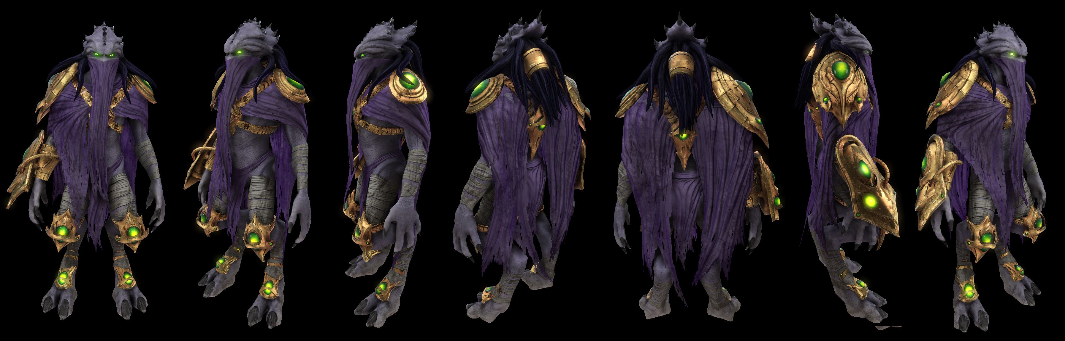
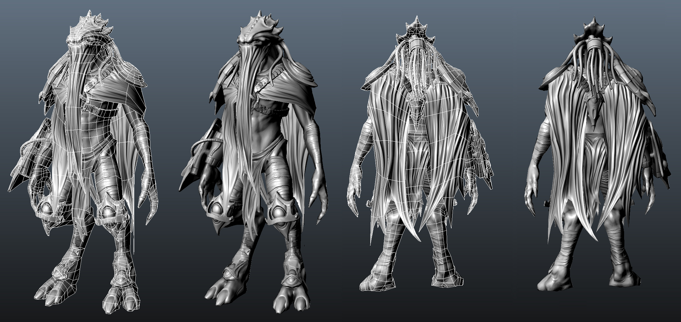
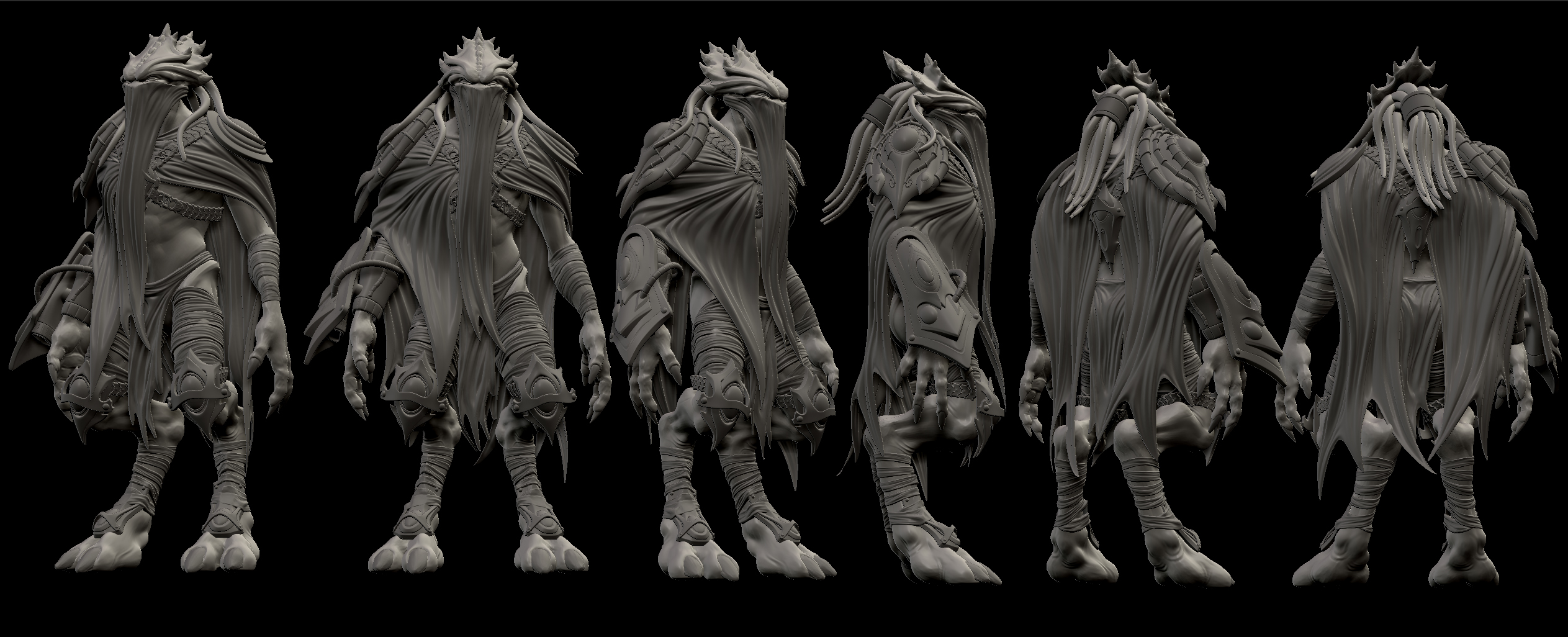
Hello all, Yes I am new here. I got a little excited after I found some cool concept art on Blizzards Starcraft 2 page and this is the result. I am trying to push this guy as far as possible so I am really interested in getting feedback from you guys on what can be improved. This first image and the turntable video are from Unreal. It has 9650 tris.
and the video
http://joshstoker.com/misc/darkTemplar120.mov
Thanks for looking!
Josh Stoker
www.joshstoker.com
and the video
http://joshstoker.com/misc/darkTemplar120.mov
Thanks for looking!
Josh Stoker
www.joshstoker.com
Replies
Its clear however for the texture that you didn't put a lot of thought into the details and just slapped a lot of texture overlays on it. Take the time to hand paint some of those details and clean up the dirt overlays. You've made what was a nice sculpt into a noisy mess with some crappy normal overlays and dirt textures.
Most of your muscle definition is lost because of this. Also there is a fairly evident seam where the hand connect to the forearm because the details scale is off.
This is a great start, you just need to spend some more time texturing.
http://wiki.polycount.net/Normal_Map#BNMT
The bandages on its arms are looking pretty flat. Might be the fault of your normal map combining process?
I think your color textures are very monochromatic, so it's a bit lifeless. If you get some more chromatic variation in there, it won't look so much like one of those colorized b/w postcards.
More contrast (both in material types and in color value) less grey, more speciffic textural quality, less random texture overlaying. variation in each of the colors you are painting and try and get a bit more metalic quality out of those metals. PAintover was quick, but i'm pretty certain some super snappy changes to your diffuse will make this shine.
If you are going to use texture overlays, be sure to break up the draw through. I.E. The bandages you have on the legs? All the texture overlays cross the whole patter as if it were one continuous piece and not wrapped around the leg. The texture overlay on the clothing crosses over folds you've actually modeled and adds noise that breaks the shapes you already put a lot of time into.
ALSO! DROP SHADOWS! Render down occlusion for them or paint them in by hand. In engine things are looking floating which i would presume means shadows are not as saucy in engine as you would hope for.
Looks great, my 2c
That said, I agree it does seem a bit dull and colorless, which I hope I have rectified. So the main things I have worked on are the skin texture and the purple cloth. Also I threw in some progress captures I made while testing.
I seem to have run into a bit of trouble when I added a fresnel to the cloth. On one hand it does give that velvetly look, but the backside of the shader is now bright which looks bad.
There was a comment about relying on my normals to much, and that I need to make my diffuse and spec help the normals along. I am not sure I corrected this totally. So here is a shot of my spec alone.
Next up I plan to tackle the dirt/stains and armor scratches/dings. I did make some tweaks to the metal but tips on making the metal really look like metal are welcome. I really appreciate all the comments so far. Thanks for looking!
Josh
You really nailed that gold, I really like all of it .. well except one thing ..
The purple cloth over-saturation throws me off .. even if the original cloth was like that, the years (which is indicated with all the tear you have) would also wear the color off.
I would definitely try to add an adjustment layer on top to lower the saturation.
Edit: to avoid problems with backside cloth, I usually duplicate geometry, seperate and flip it .. that way it can also get proper shadowing, etc ...
just my 2 cents, good stuff man