Texturing Project, Mr. Smiles: Please Critique!
Hello again everyone. My name is Brice Anderson and I am a recent grad from the Art Institute of Portland, focus in animation.
A while back I made a thread for the creation of my Mr.Smiles character, since then he has been rigged and I have already done several animations using him.
http://www.briceanderson.com/mrsmilesModel.html
I decided I needed cycling attack game style animations both with a firearm and a melee weapon. So I modeled a machete and sheath and replaced his left pistol with it. I am now texturing him so the character is actually finished before I start pumping out animations for my portfolio.
Here is where I need your guys' help!")
While I can texture just fine, I am not specifically a texture artist so I am looking to get some good critiques and advise so my textures turn out as good as possible!
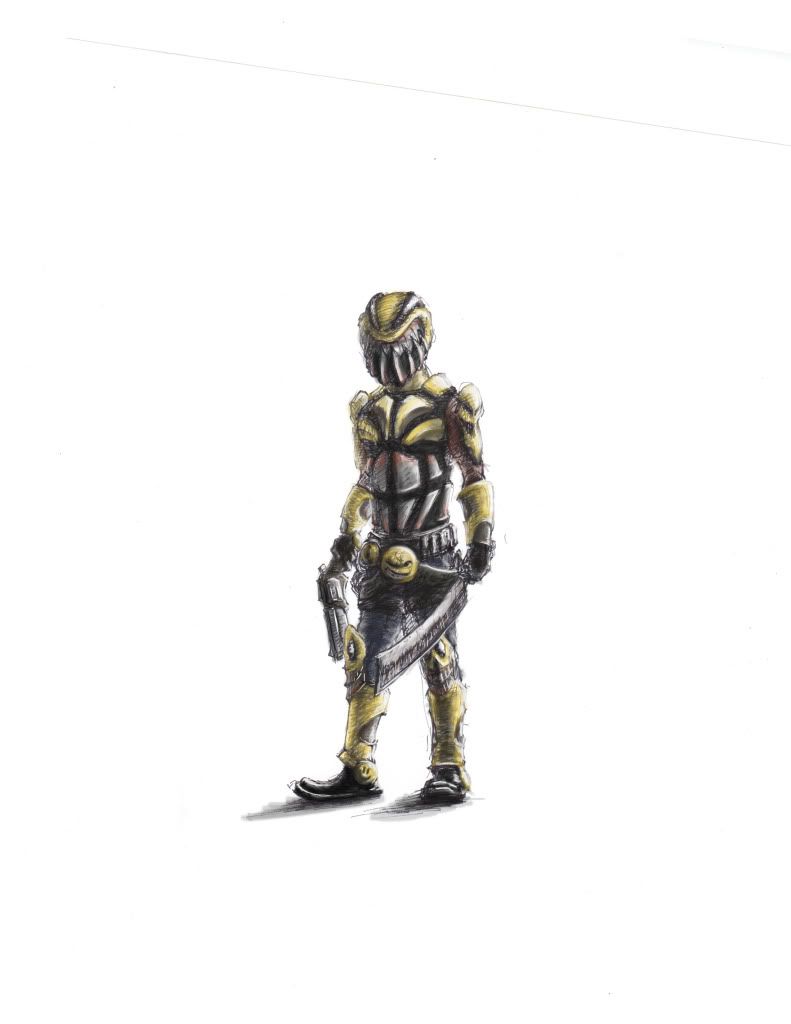
This is just a quick dirty color study sketch of what I have in mind for his textures.
I am going to texture the model with the normal map on it in photoshop cs4's 3d mode.
A while back I made a thread for the creation of my Mr.Smiles character, since then he has been rigged and I have already done several animations using him.
http://www.briceanderson.com/mrsmilesModel.html
I decided I needed cycling attack game style animations both with a firearm and a melee weapon. So I modeled a machete and sheath and replaced his left pistol with it. I am now texturing him so the character is actually finished before I start pumping out animations for my portfolio.
Here is where I need your guys' help!
While I can texture just fine, I am not specifically a texture artist so I am looking to get some good critiques and advise so my textures turn out as good as possible!
This is just a quick dirty color study sketch of what I have in mind for his textures.
I am going to texture the model with the normal map on it in photoshop cs4's 3d mode.
Replies
-Edited the head size, I made the head too large first time I modeled him too hahaha. Thanks for the critiques!
cool concept!
+ what Ged said.
-I plan on the armor to all be painted, and the paint will be chipped off with all the scarring.
On more of a serious critique though, it looks like your going to almost complete black on the dark pieces which will make it harder to paint in a feaux-Ambient Occlusion. I'd say if it is black lighten it up a bit so you can paint some beautiful textures and use a rich black AO to really make the armor pop.
Sorry I have not posted all week, it was a really busy one for me.
Here is an update, I have not touched the black yet.
Grime up the yellow everywhere a bit.
I agree with the reds, Ill do that now.
1st shot = right hard, 2nd shot = left arm, or maybe i'm just out of it this morning
Here is the desaturated reds on the torso.
Just keep painting!
-edit: I am not sure I like the bright silver on the black of the jaw and helmet's eye pieces. I am considering just having those a different material instead of painted(just keep it black on the dents and scratches). Please tell me what you would suggest.
Overlays serve two purposes in my mind.
1- to add grunge that is pretty difficult to paint by hand. (you should still hand paint dirt/dust/rust, just make sure you have some good brushes for it. A grunge map should really just give you your base level of grunge.)
2- to add noise to surfaces- I.E. metal grain/corrosion, fabric texture, etc etc.
*but be weary- sometimes people go nuts with them, and I think they can become crutches for people early on. You`ve come quite a long way without using them so I think your in a good position to start.
and yea- spec maps are a big deal. even bigger still is a gloss map, but in order to really unlock the true power of a gloss map however your going to need a cube map. All surfaces in the world is lit by its surroundings, and that's what a cube map simulates. A lot of game engines, simulate the cube map approach by simply having objects be lit by bright points defined by light placement. While not a bad approach, this doesn't take into account that specular highlights, are actually reflections of the world, and most of the time, those reflections aren't perfectly round points.
I think this is the key reason why people like Marmoset so much. Unfortunately, it doesn't support gloss maps (yet) but you can define global gloss settings on a per object basis, so your metal, and fabric could be two separate objects, with two separate gloss settings. The cube maps are presets, but they get the job done.
Chrome for example would look black in the diffuse, with all the surface information painted in the spec- and the sharpness of the reflections controlled by the gloss map. Chrome is an extreme example (because its basically a mirror) but any and all metals would work via the same principles, where the spec/gloss combo is what makes it truly look like metal, and the diffuse defines what the metal looks like when light hits darker spots in your spec maps (I,E dirt- scratches etc)
black = blurry reflections.
white = crisp reflections.
the brightness of those reflections is controlled by the brightness in the spec map.
To be totally honest I`m sure mental ray is capable utilizing gloss maps- but i`ve never actually set up a material for it. The UDK has a gloss map slot when setting up materials, and the Marmoset engine, has a gloss slider on a per object basis. I`m sure many other engines and apps have gloss features as well, but those are the only ones I know off hand.
Imo- I`d give marmo a go as its probably going to be the most user friendly option for right now. It should help get the concept across so at least you have a baseline understanding that you can then expand from into other applications.
I do have quite a bit of experience in the Unreal3 engine, some in making materials but more in importing animations. However I think you are right, Marmoset will probably be easier and faster.
-What would you suggest I do for the black portions of the helmet?(the jaw and the eyes) I do not really like the way the silver looks on it but am unsure what else to do for the damage on it.
Let me know what you think so far!
Please give me advice! Waiting to learn how to paint in 3D so i can do fading on his shirt and pants, but other then that I am running out of ideas.
Marmoset captures
You may have noticed this in the renders, but marmoset has decided to cut a triangle in either of his lats, and this missing geometry is not actually a face or actually follows my edge flow. At first I thought it could be a reversed normal on a face, but I double checked it in Maya and all the normals are fine. Here is a close up of the botchery.
It looks like you might be pure white/grey with no saturation in the color to paint your highlights. Always remeber there is no pure white, or pure black in life. you always have to use some sort of saturation in your lights and darks in order to convey a believable material.
Also, I would try and unify your tones. you have the warm/cool thing going on, which is cool- but because of the lack of tonality in the highlights, they fight each other. Personally I feel like this guy would do some good, by unifying your pallet a bit, then once thats down- find some key spots for some color accents.
konstruct's color scheme is a nice touch. Even with his color touches, I would still drop the yellows down beyond what he did.
-I really like the colors you did far more then what I have now Konstruck, and the simple texture you put on the cloths adds way more than I expected.
Here are the body and armor diffuse layers... And yes they are separate files, I have learned a lot of things NOT to do throughout this project. : /
http://mcsearcher.files.wordpress.com/2009/03/patrick_wilson_in_watchmen_wallpaper_1_1024.jpg
I think your first pass on the cloth is a good one.