Plague Daddy Character- Class Assignment
Hi everyone. This is my first time posting on the forums. The final assignment for my character modeling class concerns uploading one of our designs for criticism. I have seen a few classmates on here submitting their models as well, so I apologize for adding to the glut of requests for critique.
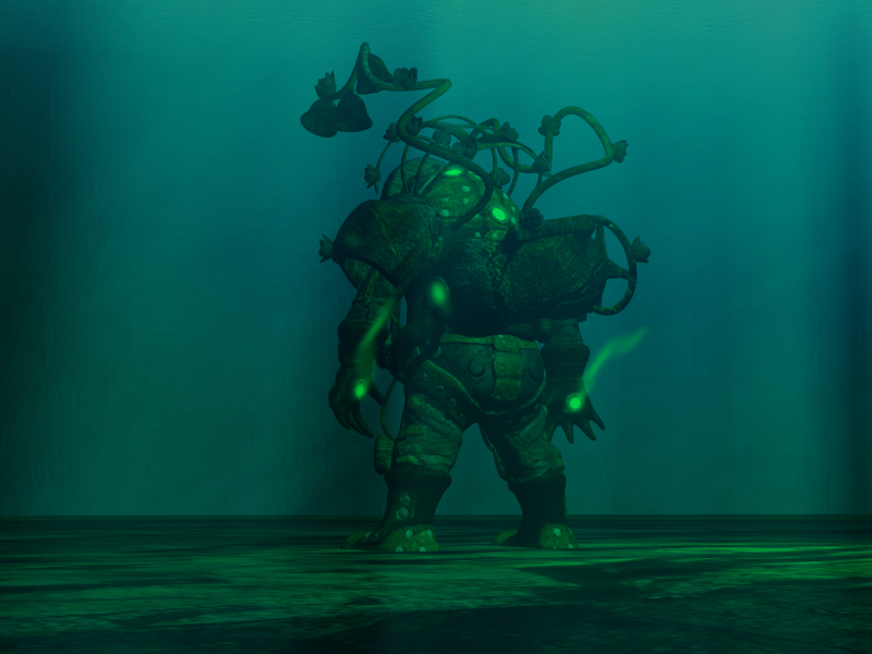
This is my third character for the class. He's a combination of a medieval plague doctor and a Big Daddy from Bioshock. If folks have time, I would really appreciate any feedback. Thanks so much.
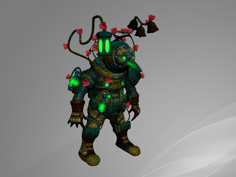
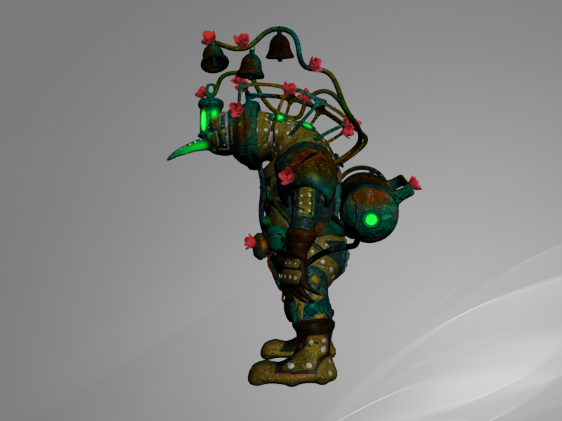
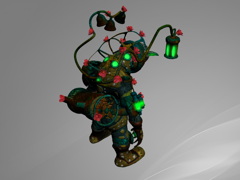
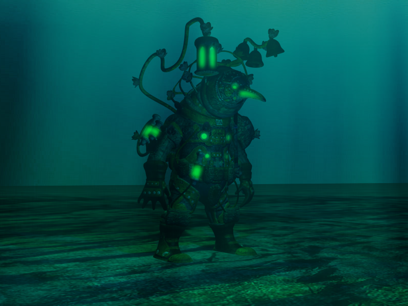
This is my third character for the class. He's a combination of a medieval plague doctor and a Big Daddy from Bioshock. If folks have time, I would really appreciate any feedback. Thanks so much.
Replies
I am not an expert but i think you can make this character way better.
Firstly, his fingers look wrong. Make them less pointy.
The yellow texture doesnt read very well, is it leather?
Maybe give this guy a weapon or something to make him more menacing.I think a big covered in blood weapon will make a cool contrast with those cute flowers.
Anyway, i like the overall design so keep going!
My one major crit (aside from the fingers that were mentioned above) is that there's no major focus for this dude. He's busy all over, and I'm finding myself not knowing where to look first. Use the green glow and other colours to draw the eye to areas of importance, and I'm sure it'll pull the model together nicely.
The fingers are definitely a problem, and I plan to revisit them soon. I was trying to give him huge, basketball-palming mitts, but along the way the fingers became pointy and the palms a bit flat. I will work on that.
I'm entirely okay with harsh criticism as it's the point of the assignment- to send us online and get some criticism outside the vacuum of class. The neck is supposed to be a rigid tube connecting the neck to a jutting faceplate, but I don't think it worked out that way. I think I see how to fix it on the next go around with this guy though.
And I have had some trouble with the textures, pulling them together in a eye-pleasing and directional manner. Originally he was much more muted-looking with a few points of interest, but he came off seeming a bit too plain and simplistic. I will have to play with the palette a bit more.
This is my first time working with Zbrush, Topogun, and other non-3DS Max tools of the 21st century, so I have a ways to go getting the hang of the pipeline.
Thanks everyone, I really appreciate it.
I would redo the whole head to make him look less penguin-ish.