Chubby Rocket Man
Hey everyone, this is my first post! This is the main character for a collaborative side project that I'm starting to work on with a few people. To keep a long story short we are trying to make a side scroller game with the UDK  Please feel free to tear it apart. It's going to be the first character I've done to be rigged and I want to make sure it has the necessary poly flow.
Thanks!
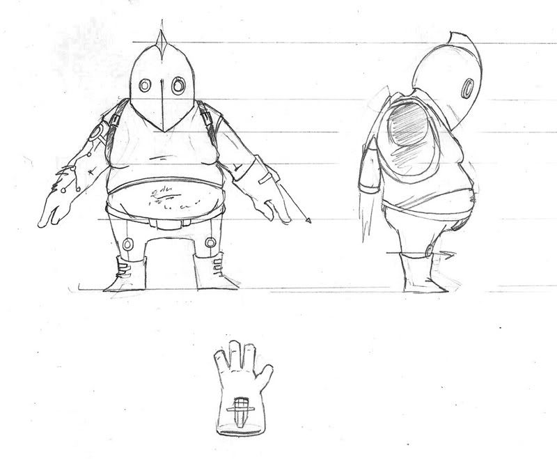
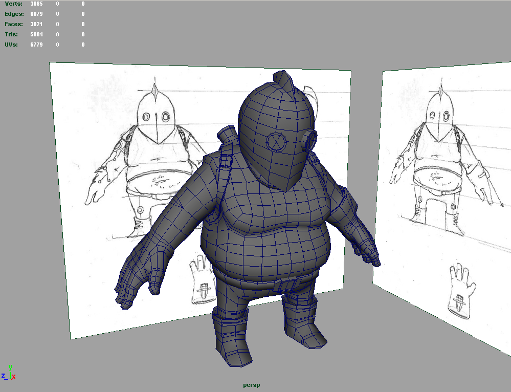
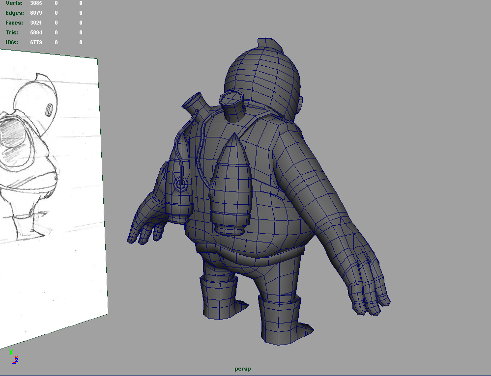
Thanks!


Replies
Is the knee topology right?... won't it stretch the texture like that, being so bunched?
yeah you are probably right, i'm going to experiment with it a little more before i unwrap it so i don't screw up my UV layout later on. haha
@willburforce
haha thank you! I've had a couple of game characters with this sort of joint and haven't had a problem.....yet haha. how would you recommend knee joints?
Consider removing some edgeloops from the helmet, it would probably retain the same silhouette.
I think you could definitely lose some edge loops around the base of the moobs. There won't be any kind of animation that could use those loops properly.
Also, why are the cylinder extrusions sticking straight out of his body? I can't see it in the concept so I'm curious.
The mesh looks good, any adjustments that would need to be made are very small. I have rigged worse and still came out with good deformations.
I had those in the original when i was doodling during that body paint lecture at GDC if you remember, haha.... i just didn't draw them in the orthos. Also i just figured i would stick them in the body rather than spending more polys digging holes for them cause he's gonna be pretty small on the screen. you won't even notice!
yeah i just deleted some, haha looks pretty much the same. I just get too attached to my polys sometimes
alright cool! I'll send you a copy of the model sometime today when i'm done unwrapping him
Although I still feel a bit of "boxiness" on the torso (front and back). Know what I mean? Like you've started of with a cube and not rounded it enough.
i'll try smoothing him a little more
A few comments on your character:
It's a good base, but now it's time to clean up the mesh and and re-distrubute the polygons in areas that need them and remove them from areas that don't.
- Firstly... Triangles ARE okay. Don't be scared of them. Looking at your mesh, I can see you purposely avoided using them in a bunch of areas. Just be careful of the placement (try and avoid heavy deformation areas) and keep your mesh flow clean.
- The helmet has too many edge loops, don't hesitate to collapse a few of those edge rings as it won't affect your silhouette a great deal.
- The arms look like a meaty sausage. Flat, no shape, very boring silhouette, no definitition. Put a bit of shape in there to show some muscle structure. Sure, he's a fatty and isn't some ripped body builder so you don't need to go overboard but take a few liberties to improve the shape a little.
- The chest has too many polygons that aren't really affecting the silhouette of the character nor is it there to improve deformation (unless you're going to rig the man-boobs with wobble bones so they bounce around as he runs :P). Feel free to go in there and clean some of that up without ruining the edge flow.
Also the edge loop right under the boobs can be removed as it really seems to serve no purpose.
- The crotch/thigh area could do with some nicer topology for deformation. It's tough to see from your screengrabs, but it looks like it could do with an extra loop and some cleaning (check paintover below).
Generally model in an underwear type shape and support the thigh with a loop or two to get that extra range of motion without jarring your mesh when it deforms.
- The cables/pipes on the jet back are way too dense. They have more polys in them than the legs. Try using a four or five sided cylinder (worst case three sided) and reduce the number of segments. They don't need to be that dense unless once again you are applying physics or need it there for specific deformation/animation.
- The two inner bevels on the jetpacks aren't really neccessary. I would remove that and just paint it into the texture. The detail is so small that it will be barely affect the silhouette from a distance. If you still want an indent in there, then I would suggest making it a V shape instead of a square U shape, that way you've reduced polys and also maintained a visual bevel.
- The buckles on the boots... Once again, such a small detail that it almost doesn't need the mesh there and a simple texture could do the job. Unless the detail was going to chunkier and more pronounced, I personally wouldn't bother with cutting it in.
- The hands/fingers! Dude! Do they really need to be that dense? For the amount of polys you've thrown at that, it really hasn't benefitted a great deal. Are they eight sided? Don't hesitate to drop them down to six of five... I think you could even half it and go to four sides and let your texture fake the roundness.
- The back has a lot of unneccesary poys as well, you could almost half the tri count at the back without suffering any visual quality and without ruining your deformation. The jetpack occludes a lot of that area, so by putting that many cuts in there totally defeats the purpose.
These are just a few suggestions without going too overboard. If you have MSN or AIM, send me a PM through Polycount with your details and I could give you some more crits as you progress.
Another handy tip. In your viewport menu under Lighting, select Use All Lights (the default hotkey for this is 7). If you have no lights in the scene, this should now render your model as full black (if you have lights, hide them temporarily). This will give you an indication of how strong your silhouette is. Look at different areas (such as the boot buckles) and see how much of an impact the geometry is making. Zoom out of your model as well to smaller res (to simulate how big the character would be seen on screen in-game). Once again, review your silhouette (with and without lights) and check which areas could do with optimisation.
Keep posting your progress, dude.
EDIT: Haha, way to post an update while I was writing all this up.
I do like where this is going Fink, love the under powered looking rocket pack. This guys going to need to get a running start, well maybe an attempt at a brisk walk to take off. The one that that does seem odd to me is the boots. They just seem to flat on the bottom.
@Apophis- He is definitely not going to be able to full on fly,
As for the concept-to-model, I think you've lost some of the charm I'm seeing in the original sketch. For one, your model looks a bit more toned than just fat. The pectorals in particular are looking like they belong to a guy who's built up a good deal of muscle, but hasn't exercised in maybe a few months, while the concept guy looks like he's simply got man titties. The front ortho also is missing the overall pear shape of the concept.
YES.
Add me on steam, same handle as here. I'm usually on as long as I'm at the computer, so drop me a line if you need any thoughts.
I think you are right about the charm lost in translation :[ so i trying to give him the man titties you deserve LoTekk