Home 3D Art Showcase & Critiques

The Coresword

polycounter lvl 14
Offline / Send Message
THE 5 polycounter lvl 14
wip04-1.jpg?t=1268944868
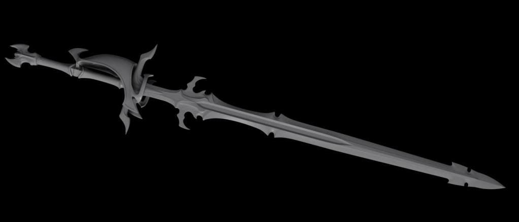
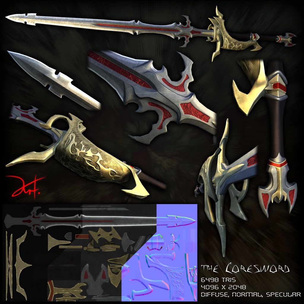
So after my few character basemesh attempts I did some hardsurface modelling aggain. My aim was to rework my old sword design and make it visualy more interesting. I wanted to create a "clean" but used sword, yet not damaged at all (notches in the blade ect.). Besides of the Tribal on the hand guard (which isn't realy turning otu as good as I hoped for) and the engravings on several spots, there is not realy much to see. I realy would like to get some magic and undestroyable look for that sword. So anny ideas on how to enhance the texture without loosing the style are much appreaciated :)

Highpoly:
Kernschwert2highpoly2.jpg

[Are there compression-free image hosting sites aviable for free?]

Replies

  • Lord McMutton
    Offline / Send Message
    Lord McMutton polycounter lvl 17
    Looks nice. The design resembles the sword from X/1999
    113441-129112-sacred-sword_large.JPG
  • Willburforce
    :thumbup: is nice... very nice.. think spec needs more work... can't say how tho... and yes... the way you cut up the shot is confusing me.

    is this a "bastard sword", one or two handed... i think that is the name?
  • Will Faucher
    Offline / Send Message
    Will Faucher polycounter lvl 12
    Looks more like a claymore that can be used single-handedly. Looks good! It seems like the scratches are a little off. Some places are scratches where they technically shouldn't be under normal circumstances. Your spec map needs retouching. It just seems like there is an even (or nearly) even specular across the entire model. Maybe its your lighting though. Some pictures make the sword look like plastic as opposed to metal.
  • THE 5
    Offline / Send Message
    THE 5 polycounter lvl 14
    Thanks for the input guys.
    Looks nice. The design resembles the sword from X/1999
    113441-129112-sacred-sword_large.JPG

    Yeh! that sword was definately a inspiration for the old design.
    But now the only thing they got in common is the handguard I think ;P
    :thumbup: is nice... very nice.. think spec needs more work... can't say how tho... and yes... the way you cut up the shot is confusing me.

    is this a "bastard sword", one or two handed... i think that is the name?

    Gonna arrange the closeups a different way the next time. Thought this would look nice though. It's ment to be two handed one with approx. 180cm overall length.
    Prophecies wrote: »
    Looks more like a claymore that can be used single-handedly.
    I wanted to get a somewhat light feeling comapred to those common two-handed fantasy swords.
    Prophecies wrote: »
    Looks good! It seems like the scratches are a little off. Some places are scratches where they technically shouldn't be under normal circumstances.
    I firstoff placed scratches where they should appear on a sword, but that were to few and it looked uninteresting, so I added more at other places too. Maybe that massed it up :/
    Prophecies wrote: »
    Your spec map needs retouching. It just seems like there is an even (or nearly) even specular across the entire model. Maybe its your lighting though. Some pictures make the sword look like plastic as opposed to metal.
    Gonna practice speculare mapping more i guess, that was already one of the flaws of my first game weapon. I tend to encouter that plastic look :S
Sign In or Register to comment.