The BRAWL² Tournament Challenge has been announced!
It starts May 12, and ends Oct 17. Let's see what you got!
https://polycount.com/discussion/237047/the-brawl²-tournament
It starts May 12, and ends Oct 17. Let's see what you got!
https://polycount.com/discussion/237047/the-brawl²-tournament
Insectoid Concept Painting
Hey everyone,
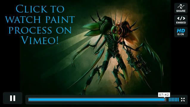
I posted this in the WAYWO thread, but I just got my video all prepped so I figured I've post an actual thread of it.
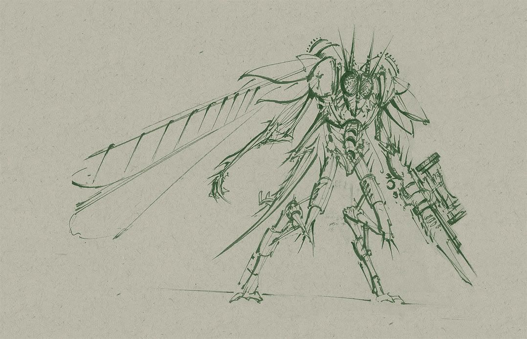
The sketch was done at the sketch jam at GDC with some Polycounter buddies then I went home, scanned it in, and painted it in about 5h40m.
I thought it took me around 9 hours but after calculating the recording it took considerably less time than I thought... probably because I took several breaks.
Make sure you watch the video in HD and full screen, the video quality supports it. Link to the recording:


Replies
he reminds me a mature version of Manny and the "The Chinese Cabinet of Metamorphosis"
If you don't mind me asking a bit about your process, do you give each body part it's own layer or do you just go full force ahead with very few layers? I didn't notice you creating new layers (I don't know if it was the video or not) but I myself am trying to get better painting my scans and have some trouble when I work in so many layers.
I gave your 'folio a visit as well - you've got some very nice stuff!
Great video, thanks for the upload.
doeseph: I used to work with a ton of layers back in the day when I was uncomfortable with painting. The more your practice, the less you rely on layers. For about 80% of this project I was using 2 layers: the lines layer set to multiply and a layer underneath for coloring.
No I did not create an individual layer for all the separate pieces, I just jumped in and started painting on 1 layer.
I didn't increase the amount of layers until I started painting in his other scythe arm, so it went up to 3. I then created another layer on top of the new arm to continue painting, so it went up to 4.
It pretty much stayed at 4 layers. I will not say that layers are good or bad, only that you should find a work flow that best suits you. Hope that helps
Progg: I didn't use any fancy rendering. I pretty much set up some point lights (same as omni in max) and clicked the render button.
Glanced through your portfolio, and i gotta say i really like your concepts. Any insight as to improving or practicing concepting? If you don't my asking, because I've been getting comfortable with things like anatomy, but the second i try designing a character it's just too generic and in a bad way.
Some of my ideas come from flipping my paper upside down, even, and seeing where my thumbnails take me that way.
Try to work abstractly at first, then narrow in your design. Thinking abstractly at first will help you churn out concepts.
P.S: man im slow, just realised that haiasi is isaiah backwards...
I first learned about it from a drawing class that was telling us we should hold our drawings up to the mirror to spot errors, so I thought I would reproduce that in Photoshop and viola
Crasong: Glad I could help, and don't worry about it. It's kind of 50/50 if people will get it or not, and even if they don't I really couldn't care less
but with this lighting we can't really see the color information from his material(is it grey or maybe green?)
Thank you for the insight!
You might want to consider showing more of the screen like he does there- I know you're not trying to make a tutorial, but it's still useful for those situations where you want someone to know how you work (your use of layers)
I'm not sure how I feel about the final result- it seems finished but not polished, I can see it as a painted concept, but agree that its been taken a bit too far in those terms- its a bit dark and I find myself asking the same things ScoobyDoofus is.
I don't think I agree with the use of less layers. Personal choice- but I find using more layers to be more useful and less destructive. When I first started, I worked on maybe 2 or 3 layers, but now I find myself using masks, messing with blend settings, that sort of thing. Then again, I can't say the last time I painted something that wasnt a texture sheet in photoshop
I will try to use less of a dynamic lighting system in the future to better show the local hues that are important to a concept painting.
Organized Chaos: It depends on what I'm doing. If I'm texturing a 3D asset I'll have 30, 40, 50, or more layers to work non-destructively. In painting, it doesn't matter as much.
And thanks for posting that link, I watched it through and paused it here and there and got some new ideas. I've painted in gray scale first a lot, but I've only used Overlay and I didn't like how the colors came out. Next time I paint I'll try to use Color blending mode and see how it comes out.