Home 3D Art Showcase & Critiques

Character: Ted

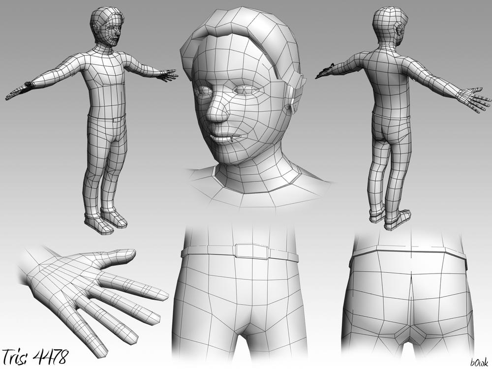
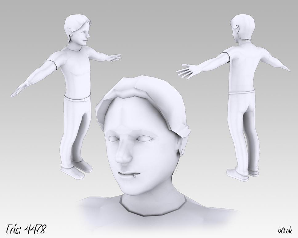
This is the final character for my character modeling class at AIP. It's a huge improvement from my first model this quarter, but I would like to improve it before turning it in. If anyone has any suggestions, I'd appreciate it.

Sorry if the images are too big; this is my first post on polycount.
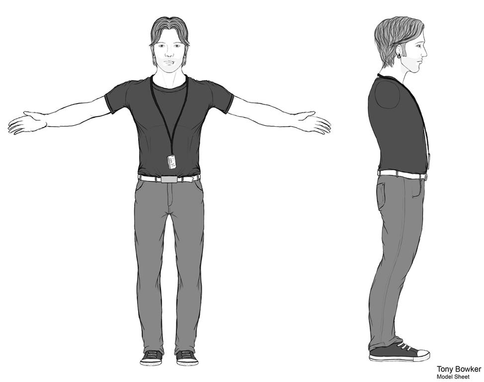
Character_3_Model_Sheet_by_b0wk.jpg
b0wk_Character3Critique_by_b0wk.jpg
b0wk_Character3Critique_shaded_by_b0wk.jpg

Replies

  • b0wk
    Ok, so I've got him unwrapped, and ready to make the high poly. And critiques on my UVs would be cool, as well as the model I've already posted.
    bowkerch3unwrap.jpg
  • Will Faucher
    Offline / Send Message
    Will Faucher polycounter lvl 12
    Your proportions are a bit off if you are trying to make an adult human being. He looks like he is 12-13 years old. You need to check those things before unwrapping imo. Otherwise, it's coming along well. Edge loop around the knees looks a bit weird though.
  • b0wk
    Yeah, I shrunk his head, and fixed some of the geometry already. I should probably post the corrections.
  • rumblesushi
    I agree, the proportions look somewhat childlike, but apart from that, looks like a solid model to me. Are those cuts around the knee for deformation purposes? And did you pelt map your UV's?
  • b0wk
    Our teacher showed us the thing around the knee for deformations, and yeah, a lot of it was pelt mapped. The hands turned out a little goofy.
  • arrangemonk
    Offline / Send Message
    arrangemonk polycounter lvl 17
    bill_and_teds_excellent_adventure.jpg
    the right one is the only ted!
  • raul
    Offline / Send Message
    raul polycounter lvl 11
    Some peeps will argue about this, but your pixel ratio on your uvs is a little off. It would be ideal for you to get the most out of your textures by having everything relatively sized proportionally to the body.

    One thing u could try ( this will mess up your uvs, so dont cry, cuz i told you so ) grab everything, and do a relax. This will shink down some parts, enlarge others, and in the end give you equally scaled uv islands. After this you will have to go back and do some fixing to get your uvs to be as neat as you have them.

    The thing with this is that you are giving more uv space to the shoes and not the shirt. Whatever texture you put into the shoes will come out sharper than anything that you put on the tshirt. the hands, use as much space as the head. Are you going to be painting nail designs on those? a tattoo maybe?
  • poopinmymouth
    Offline / Send Message
    poopinmymouth polycounter lvl 19
    You also have the problem of every joint being modeled completely flat. This will make deformations harder, and will mean you'll get zero anatomical evidence in a game rig once they're bent. Building in slight bends to shoulders, knees, elbows, and fingers, gives you a chance to let a little bone and joint anatomy show through, and will make it easier to keep it through the range of motion. Having a gentle angle also helps with keeping volume in the deformations.
Sign In or Register to comment.