Imperial Quad Launcher (Warhammer 40k) WIP
Started a weapon I found while browsing through 40k references and was hoping to snag some crits/comments.
I'm wrapping up the high poly now and wanted to get some fresh eyes on it before I went any further")
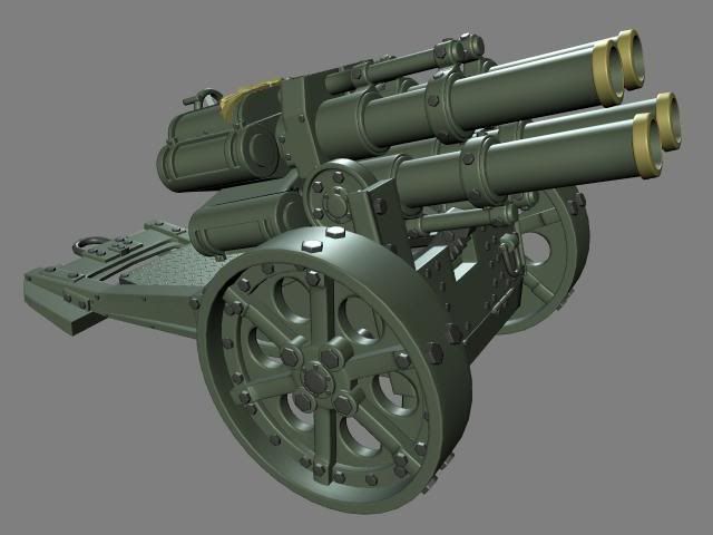
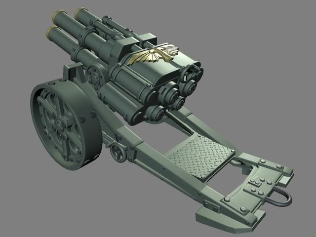
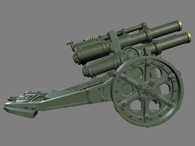
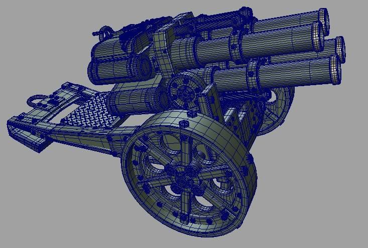
I'm wrapping up the high poly now and wanted to get some fresh eyes on it before I went any further
Replies
I also used the billion photos of the model on this sweet site (great if you want to do a different Warhammer model yourself):
http://www.forgeworld.co.uk/quadl.htm
keep the good work!
I thjink the textures looks ace, though it's kinda hard to see any details when it's so lowres. I say post some bigger pictures and some texture flats
And play with some more contrasts in you spec. I ABSOLUTLY think you should look into adding a gloss map to, (goes in to you spec alpha) that would help you tremendously!
The wobble in you normal could work if you sharpen it up a bit and turn it down slightly. Right now it's pretty much destroying you baked normal. Add normalmap detail with care and thought. And yeah, yellow means inverted normals. Check your bake settings..
Looking forward for a update
The back skid plate is missing its lip, this lip bites into the ground and helps hold the gun in place when it fires, considering the lip is on the reference and it makes sense... it should probably be on the high and the low.
Something seems funky with the normal map, it seems blobby in places and in a few areas there are noticeable seams. The maps also lack padding which could be causing the seams.
There is a lot of lost opportunity to mirror things. If you mirrored you could get the same textel resolution you do now with a quarter of the size. Or if you stick with the same size sheet get an amazingly more high detailed textel density.
Also consider that your texture sheet might be mipmapped, or just flat out down sized to save space and resources. So packing super tiny details into a sheet isn't a good idea, especially when it looks like you shrunk larger details down to pack them in?
Also you should avoid rotating pieces that could otherwise be straight. The reason for this is simple it takes more pixels to get a diagonal line crisp than it does to get a straight row of pixels to look crips.
To be honest I don't really know that much about gloss maps, I checked the wiki but didn't really find much besides a definition. Anyone know of a mini tutorial or some tips for making one?
Updates hopefully soon
The basics of a gloss map is this. The black and white in the texture defines the falloff of the specular.
White, 100% is full throttle highlights. As thigh as it gets. If you want to do a chrome material this is what you seek (with and cube map that is).
And black defines how wide the spec is. (I actually think that black is nothing, and it won't work) Close to black is the choice for something matte.
So, for plastic you would go for something fairly bright. And for metal something fairly dark. But in you case, since you have a lot of shinny metal, i need something that's pretty bright with the right combo in the specular.
As i mentioned in my post above. The gloss goes into the alpha of the specular.