Level Design - Crash Site (UT3)
So after a week of hanging out with polycounters at GDC and being told how I should start posting my stuff up here, I've decided to do just that.
This is my most recent UT3 mapping project that I worked on. The map is a classic deathmatch style arena designed for 12-16 players. I don't recommend playing with many fewer players than this, as the map is on the larger side.
For critiques, I think the best thing to do would be to just play the map a few times in Unreal Tournament 3. I'm looking to improve any issues regarding balancing the map (if there's any cheap spots that are easily campable) and fix potential bugs with any collision. Don't want players to get hung up on a rock and get stuck in the middle of the arena.
All assets used in the creation of the map were provided in the Unreal Tournament 3 editor.
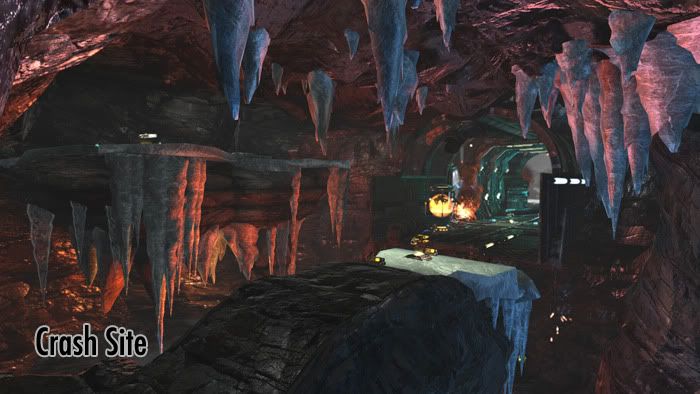
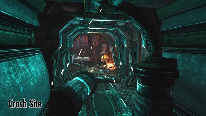
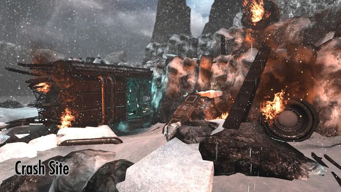
Screenshots:
Installation instructions are included in the download.
Link to download:
http://www.megaupload.com/?d=L5MGRZSP
An installed and up-to-date copy of Unreal Tournament 3 is required to play the map.
This is my most recent UT3 mapping project that I worked on. The map is a classic deathmatch style arena designed for 12-16 players. I don't recommend playing with many fewer players than this, as the map is on the larger side.
For critiques, I think the best thing to do would be to just play the map a few times in Unreal Tournament 3. I'm looking to improve any issues regarding balancing the map (if there's any cheap spots that are easily campable) and fix potential bugs with any collision. Don't want players to get hung up on a rock and get stuck in the middle of the arena.
All assets used in the creation of the map were provided in the Unreal Tournament 3 editor.
Screenshots:


Installation instructions are included in the download.
Link to download:
http://www.megaupload.com/?d=L5MGRZSP
An installed and up-to-date copy of Unreal Tournament 3 is required to play the map.
Replies
Don't have UT3 handy, so no gameplay/balancing crits from me, but from the screenshots, there appear to be readability and contrast issues, especially with the first and third pics. There's nothing to focus on, so my eyes are going all over the place, instead of being drawn to key areas.
Got an overview shot of the level layout?
One thing I would say though from looking at the inside shot on you're second image. The lighting seems to even, the blue goes from floor to ceiling without any level of gradient. The light should fall off abit more around where the floor and wall meet.
You should also really darken up your exterior areas as well. Let the fire glow and flicker make a nice ambience across the snow and rockfaces. That will also make the glowing enterance to your "tunnel" more apparent as a route inside.
On that note though, if its a crash where is this greenish glow coming from? If its a crash I would think most of the lights would be dead. I'm not familiar with what unreal includes in the editor (thats my next project!) but I would recommend finding some sort of portable emergency light, flare, or other prop to use to emit light. But still only use it sparingly where you think you need it and to draw players attention. If theres no purpose then you don't need it (gameplay wise.)
*edit
another thing I just realized is that is a little weird that for being a crash whatever it is managed to lodge itself into the side of a rock and break out into a cave. Realism aside I think that space could be more interesting if you put it at an angle, thus creating some verticle gameplay. Maybe stacking some crates and barrels on the sides would help the player jump down and navigate the tunnel.
(I meant to edit not reply)
The file you are trying to access is temporarily unavailable.
Apophis3d - The file seems to be downloading fine for me and runs fine when I install it. Here's an alternate download link for the map from my portfolio site.
http://tylerlovemark.com/downloads.html
SnowGhost - After reading your comments, I'm considering switching my lighting scheme to reflect a nighttime setting. When I go in and start adjusting the lights I'm gonna see how that impacts the overall play. It will allow me to use the lights to draw players around more and really focus on key areas (such as weapon pickups/high traffic zones).
I've also got to agree with you about the state of the crashed ship being a little too perfect and not including enough angled geometry. Kind of creates a vortex with just a hallway jutting through the cliffside.
There is to much ambient light and just no shadowing though out the level. Even with an overcast there should be some slight shadowing outside and even more shadowing in the cave areas.
I really do like the ability to move up in the level. Using the wreckage to access areas higher up is a nice little design feature. Also the post process blurring out the distance was used very nicely.
Reworked cave area. In my opinion, the strongest area of the level.
The crashed ship and nearby surroundings.
Other points of interest around the map.
High up view of the map.
There's still some areas I'm really unsure how to light. The side tunnel going into the cave is currently lit without an obvious source of the light. I'm gonna try and get something in there that could plausibly light up that region so there's not just "floating" light in there.
Still got some work left to do, so there's not a new build for you guys to run through, but one will be uploaded within a week once I've implemented the rest of the lighting and adjusted some more layout problems which have come to my attention.
Here's some images I've got showing some of the updated areas.
Along with these new images here's an updated map file to install.
http://www.megaupload.com/?d=5SV786D6
Hope you all have fun with this one.