The BRAWL² Tournament Challenge has been announced!
It starts May 12, and ends Oct 17. Let's see what you got!
https://polycount.com/discussion/237047/the-brawl²-tournament
It starts May 12, and ends Oct 17. Let's see what you got!
https://polycount.com/discussion/237047/the-brawl²-tournament
[Portfolio] 2D-3D transitions/LouisGon
Howdy Folks! My name is Louis Gonzalez. Im an AIW 2008 alumni. Majored in animation, focused on game development art. I've recently transitioned from being a strictly 2D artist to focusing on a new 3D light! It was suggested to me by Hyperdivine to join this site. This is my first time looking through the forums and I have to say I'm amazed and inspired. I've def found a new home. I promise to be as insightful and useful for those who ask as much as possible.
In return I'd like to state t hat critiques and comments are welcomed and appreciated.
Recently I've changed my website domain name from 13thskull(people said it sounded like a virus) to ArtofGon....and updated the home page. I thought maybe a blog style front page was a good idea... but now I'm second guessing myself. I've seen alot of portfolios with BAM, big stuff right up front. Please let me know what you think of my site's front page and galleries as a whole.
I Will be posting my most recent works here as well. I've recently been working on my first three full unwrapped/textured character within Maya and Modo. Modeling in Maya is awful... but I've made it a point to learn it in order to better my chances of landing a job in the industry.
Check out muh stuff and drop your 2 cents about it!
thanks mucho.
Higher res at my deviantart
-LouisGon aka BetelGeist ( pronounced beetle guy-st) not betalgeest ;D
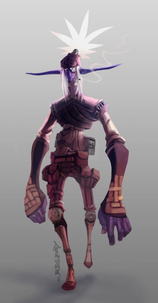
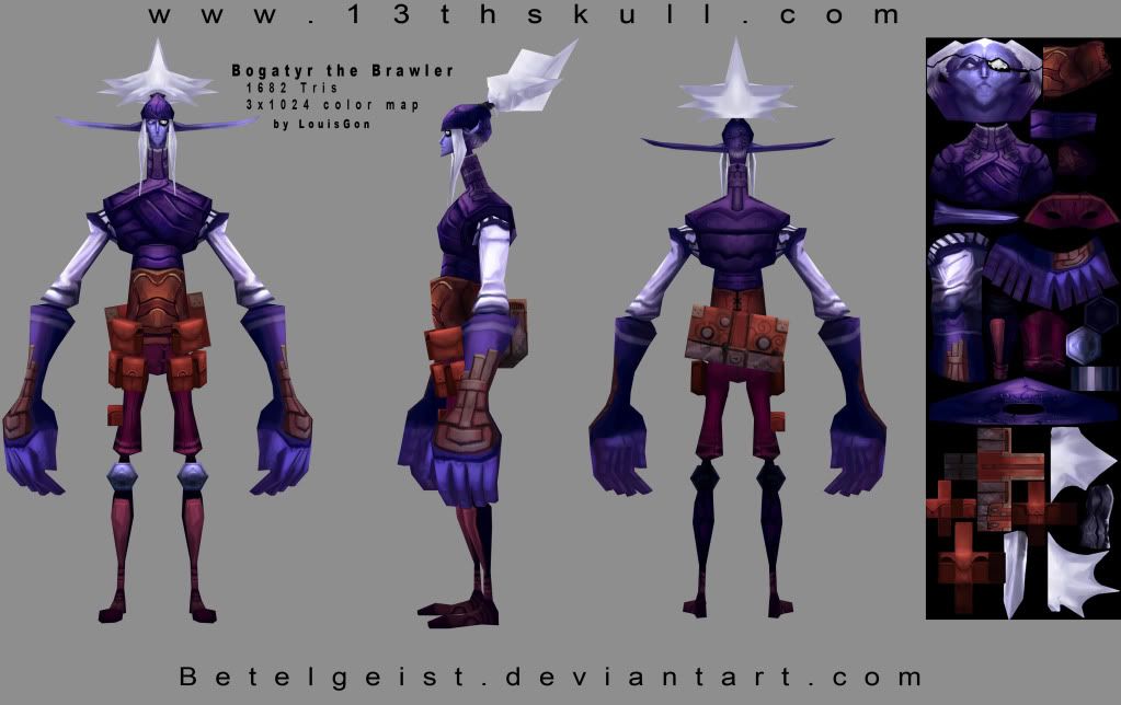
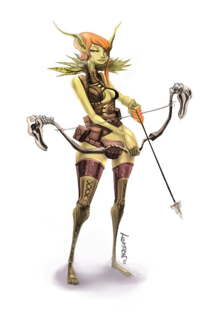
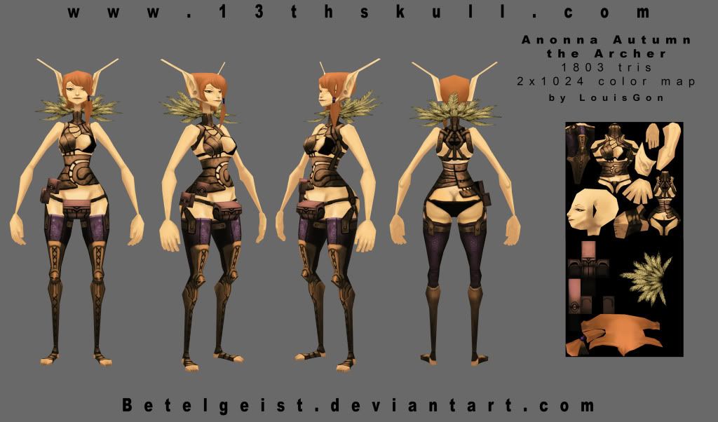
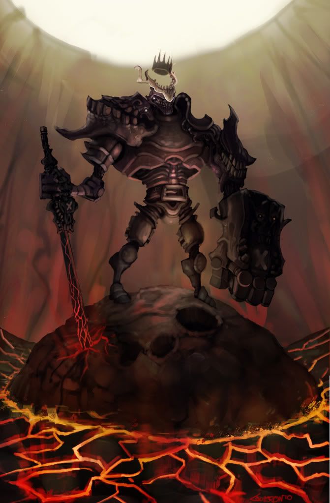
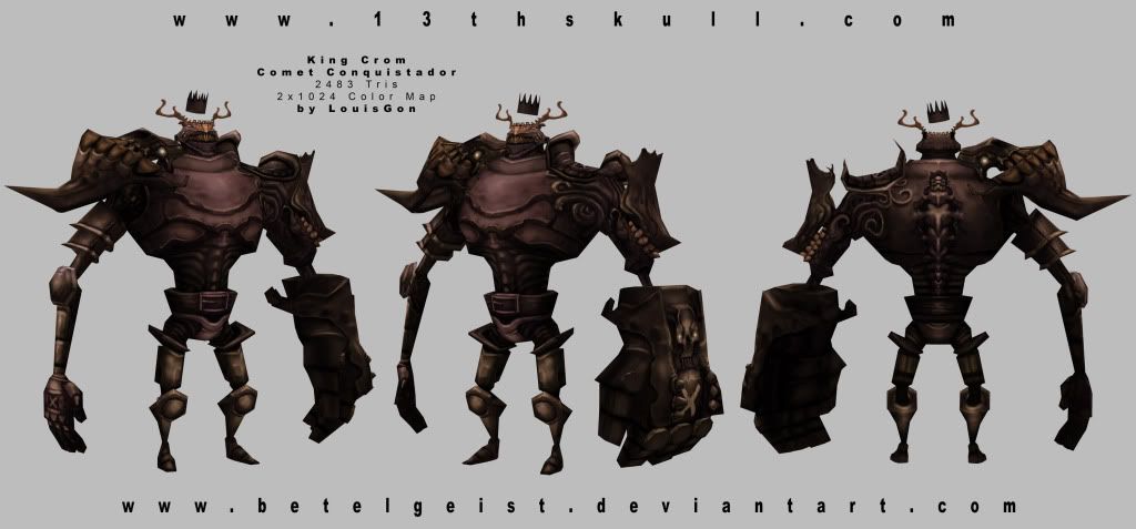
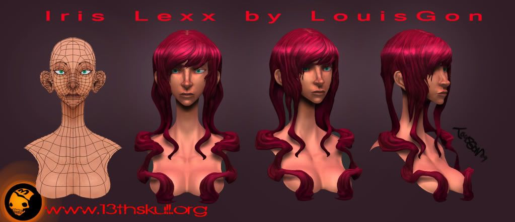
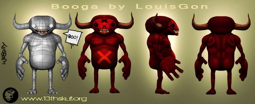
And some polypainted Z Brush sculpts. ase mesh imported from Modo.
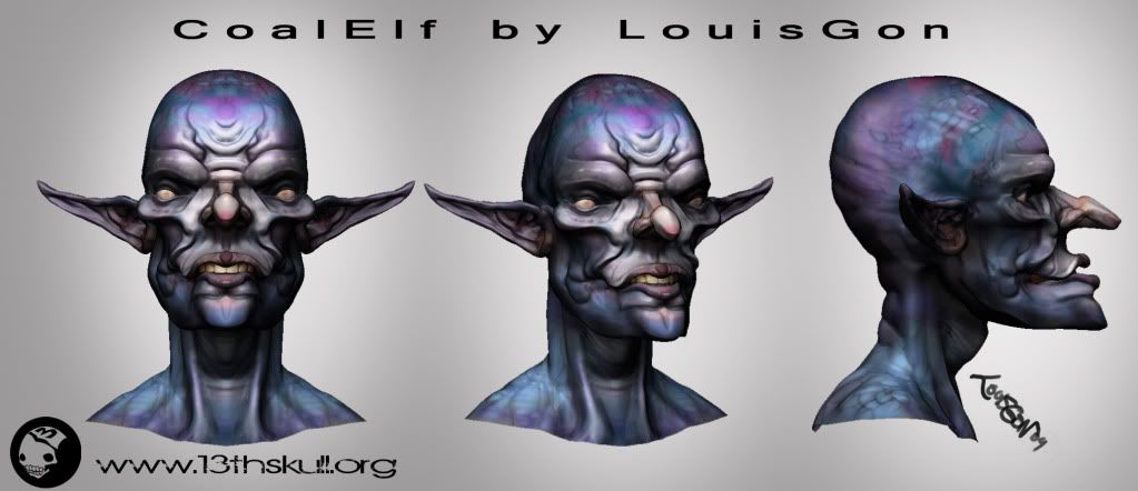
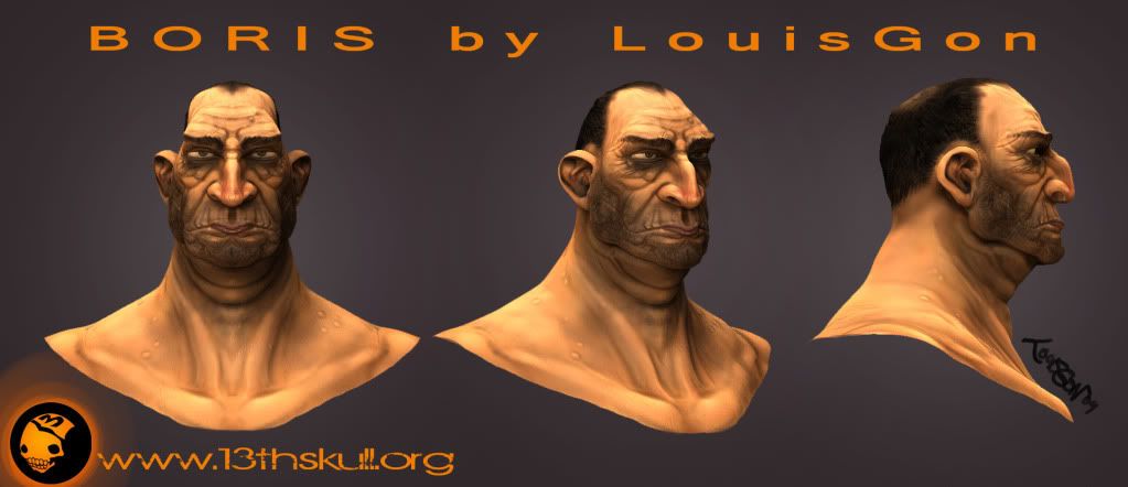
In return I'd like to state t hat critiques and comments are welcomed and appreciated.
Recently I've changed my website domain name from 13thskull(people said it sounded like a virus) to ArtofGon....and updated the home page. I thought maybe a blog style front page was a good idea... but now I'm second guessing myself. I've seen alot of portfolios with BAM, big stuff right up front. Please let me know what you think of my site's front page and galleries as a whole.
I Will be posting my most recent works here as well. I've recently been working on my first three full unwrapped/textured character within Maya and Modo. Modeling in Maya is awful... but I've made it a point to learn it in order to better my chances of landing a job in the industry.
Check out muh stuff and drop your 2 cents about it!
thanks mucho.
Higher res at my deviantart
-LouisGon aka BetelGeist ( pronounced beetle guy-st) not betalgeest ;D


And some polypainted Z Brush sculpts. ase mesh imported from Modo.


Replies
I'm sure I'll love polycount. People seem pretty spiffy and I cant wait to participate in some of the contests!
on the textures i would suggest adding some more color to them to achieve a better effect.
like with the shadows on the last devil don't just use a darker red but try using some purple for example. Your paints look pretty good, great atmosphere in the one with the lava
Be nice to see some of the wires for the other stuff, but other than that, your presentation is nice a clean.
Thanks Raven.
I def hear ya on adding more colors... I have a tendency to use slightly monochromatic color schemes. I will definately add more dynamic schemes on future works. And will rework some of the colors on the red dude. He's kind of on the backburner. Been havin trouble importing uvs from Maya and modo to apply the polypaint to the new uv space.. might just have to use uv master... but i dont really like it...
dkk,sage- thank you both very much
cadyw- thanks! you have already some great animation! concentrate on design and ashion now and you got it!
any comments on how im presenting my work in my website? im not getting any feedback from job applications.. i must be doing something very wrong
its offline?
Try this link ArtofGon
i really hope that site is workin.... i just applied to a few jobs
Good to see you posting here! Make sure you post your wire-frames too, as it is vital for the critiquing process
But ? Where is the rest of Iris body? !
When I do though, I'll probably start by using uv master to unwrap those busts and create a color map from the poly paint and create normals maps from the sculpt. Just to get use to some of the procedure. Luckily I rececntly picked up Scott Spenser's Zbrush book.
Yo Hazard! a hefty dump is a healthy dump ;D
Yo moon! good point.
got some help on the flow from moon on this mesh
Harard and Moon have both been a huge help in my transition from 2D to 3D. they both endured my noobish questioning.
Dado
Great points man. I've been wondering what to do with my blog. Ill cut down on the quantity on my site, make bigger thumbs, and make sure my sig is on everything. All great advise thank yo very much.
Zoffty, I really do want to make the rest of her. She's my digital dream girl ;D im not rushin it though.. im thinkin steam punk for her.
Ill probably get to her after the environment, normal map experiments, and maybe after one more low poly model. thanks for the encouragment!
Ok update. Made suggested changes to my portfolio.
All my work is now on the home page with larger thumbnails and only my best work showing. got rid of half the stuff i had before, but i feel it wasnt realy helping.
let me know whatchu be tinkin mahn.
http://artofgon.com
i love your characters
welcum to the boards)
here are a few speed sculpts and a mid poly character ive been workin on thats rendered in marmoset.
i was wondering if anyone has had any problem working with modo to marmoset? everything seems to be in workin order when i export, but when i bring it into marmoset, the model is sometimes not merged in places where it should be. This cause the smoothing groups to work incorrectly or not at all in some places. The side of his head is a perfect example of the smoothing groups not working
crits and comments are always welcome. thank you
-Betelgesit
I really like how excellent your 2d skills are as well as your 3d skills, really nice folio ^^
A quick mock up:
*I can remove this image if you don't like I post image in your thread~
Personally I like to see the art right in the beginning (aka above the fold). Mouse rollover the image then it will show the color (instead of the orange tint, cus looks like you love orange color heh..), then you click then the lightbox of the actual image appear.
Hope this gives you some idea!
_Revel
YOU NEED TO GIVE MODO A CHANCE... again
thanks guys! I'm really enjoying the transition from concept to production artist.. still need a job though! :wink wink:
thank you Reveal
and thanks for the site layout suggestion and the time youve sepnt making that mock up. i like what youa are think there, but do you think i have too much work to have all those large banner thumbs?
You can change the smoothing angle of the mesh but in modo it is located in the shader tree menu>Base Material> Properties> Smoothing Angle. To get it to mimic max the value is higher but I can't remember the exact number. I think it's 60? Somebody else please chime in.
I have modo open so here is a pic (Bottom)
Anyway with the "above the fold" I mean something like a headline in a newspaper, most of people don't have that much time to browse through all the news that they offer, if the headline above the fold is interesting enough at least they will look for the rest of the first page (aka the bellow the fold content) or on the worst time possible they will remember to come back after they have time when they found some interesting news in the headline. Same with your website, above the fold means before I have to scroll down you put the content right away which make me (and anybody else) interested to scroll down to browse some more.
Just don't waste an opportunity to grab people (possible employer) attention with such a useless (sorry
_Revel
For instance the old bloke and the alienface could be together on "Speed sculpts".
thanks for the info Shaffer, but i think the problem lies within modos vert beveling? ill have a screen cap soon of what i mean. basically where i extruded verts to make hair spikes, the mesh has become detached in marmoset. causing the smoothin groups i have applied to not work at all.
i normally set the smoothing groups to about 84-86 ill try out your number though.
Revel- thanks for the insight. i am def going to add some content above the fold as you put it. very good idea.
Snader i should do this as well. putting multiple speed sculpts together would save a browser alot of time. thanks