Pipe Dream Art Tests
Hello. I've never posted any WIP's or anything on this forum before but of the few that I browse I've seen the best criticisms come from the community here, so I thought I'd post some screenshots of my progress on an art pass for my Source mod, Pipe Dream.
Pipe Dream is a puzzle mod using a chamber based map system (Similar to Portal) but instead of being based on Portals it's based on pipes and liquids. The color of the pipes corresponds to the material and gameplay mechanic it's used for. For example, Blue pipes emit water which floods chambers and raises light crates. Yellow pipes emit steam which can be used to boost you over a gap or catapult you up to a higher area faster than a ladder. Similar gameplay mechanics such as Portal style crates and buttons are used to solve the puzzles along with some new mechanics I'm not ready to reveal yet.
Anyway I've done a few gameplay tests and the puzzles were turning out well so I decided I'd get the art pass out of the way so I can focus on puzzles for the next few months.
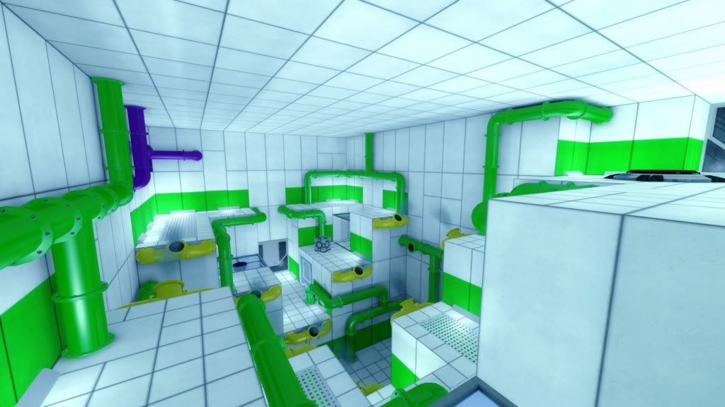
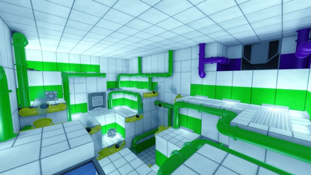
Here are the latest screenshots I've taken.
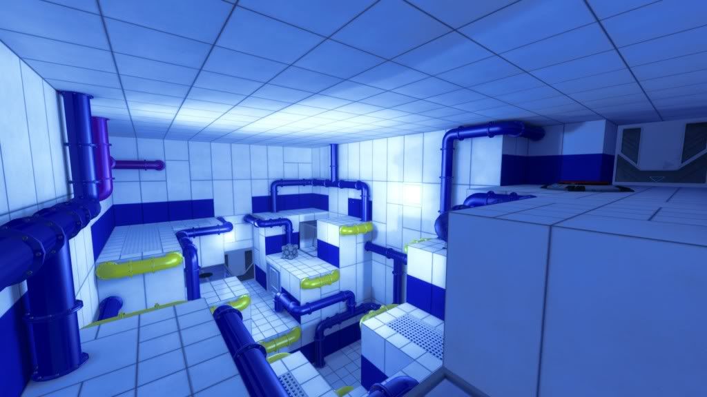
Here are some older tests in the same Chamber.
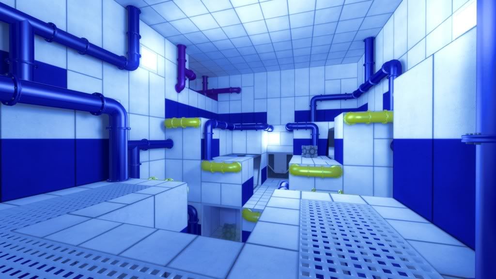
Please ignore the Portal models as they'll be replaced with new models later.
I really need some help coming up with ways to spice up the ceiling and maybe the walls a bit more. I was thinking of adding some large vent/fan openings in the ceiling with a very thin mist coming out.
I also really need some help nailing down a lighting system and tweaking the color correction. I liked the color correction with more of a blue tint but people at another forum I've posted these on didn't like it too much. If you have any other good ideas to make it more interesting I'm willing to try them out.
Thanks!
Pipe Dream is a puzzle mod using a chamber based map system (Similar to Portal) but instead of being based on Portals it's based on pipes and liquids. The color of the pipes corresponds to the material and gameplay mechanic it's used for. For example, Blue pipes emit water which floods chambers and raises light crates. Yellow pipes emit steam which can be used to boost you over a gap or catapult you up to a higher area faster than a ladder. Similar gameplay mechanics such as Portal style crates and buttons are used to solve the puzzles along with some new mechanics I'm not ready to reveal yet.
Anyway I've done a few gameplay tests and the puzzles were turning out well so I decided I'd get the art pass out of the way so I can focus on puzzles for the next few months.
Here are the latest screenshots I've taken.


Here are some older tests in the same Chamber.


Please ignore the Portal models as they'll be replaced with new models later.
I really need some help coming up with ways to spice up the ceiling and maybe the walls a bit more. I was thinking of adding some large vent/fan openings in the ceiling with a very thin mist coming out.
I also really need some help nailing down a lighting system and tweaking the color correction. I liked the color correction with more of a blue tint but people at another forum I've posted these on didn't like it too much. If you have any other good ideas to make it more interesting I'm willing to try them out.
Thanks!

Replies
for ceilings maybe look at carpark or warehouse ceilings,
i like the idea of portal vs mario, maybe concrete painted in mario style murals etc etc
Anyway someone else suggested a Truss system to me but I personally don't think it would fit into the underground chamber type environment I'm going for. If none of the other ceiling details I try look good I'll try it out though.
With the clean white walls people are instantly going to think its a portal rip off.
Obviously you want it to be easy to read and use bold colors. Maybe you should look at some of the mirrors edge underground levels.
Anyway thanks for the Mirror's Edge reference images. That's actually where I got the inspiration for the lighting system in the green pictures. I'll take a closer look at them later and see if there's something I can use in the chambers.
i think i'll watch the progress on this
As for the light sources, those grey angled blocks are brush placeholders. I've got a model made for them but I'm not going to post it until I get a better glowing effect coming from the light source.
Going to try out some ceiling details now.
I'll be uploading pictures of the ceiling tests in a few hours. Been redoing/optimizing some of the models I've made so far but I've decided to save that until the chamber is more completed.
It doesn't look too great right now but I'm going to reskin the models with a chrome-like texture. I think it'll fit in well then.
Could be my Gamma, so forgive if this comes out too much the other way- but a quick adjust in photoshop just to show what I mean :
Anyway here's a picture with new color correction. I'm going to re-texture those fans to be less dirty and see how it looks with 1 fan per 128x128 hole.
Dunno how you'd feel about going over the top, but what if the ceiling was glass, and you'd actually be looking out into water:
would help bring the whole concept together.
I'm sure there are plenty of water shaders you could get your hands on and just throw it in there, not sure how easy it'd be to find one meant to be viewed from the bottom of water though, but the effect is close enough either way you look at it.
Currently it's 588 Tris but I'll make a LOD model to take out the small beveled details around the window parts. Glass will be added into those holes using a brush in engine.
I think the middle still needs something but I'm not sure what. Anyone have any suggestions?
Time to UV and texture.
If you look at similar environments:
You see that though they're minimalistic, and pretty clean, they're still worn and lived in.
You also seem to have plates placed quite randomly, instead of on a grid, and every surface looks about the same material.
Somehow I feel you skipped research and concepting and went straight to modeling.
especially the blue levels, blue wall bits, blue pipes, blue lighting and then yellow.
though I think it needs something more, maybe some more colors that are just part of the environment? just to break it up a bit.
good work
I've decided to restart everything though. I need to gather more references and plan things out a bit more so I don't end up redoing things multiple times. I have a clear vision of where I want this to go now and while it may get rid of some of the things you guys like now such as the colored walls I think it's the best decision.
I'll post some simple concepts in a week or so after I've studied some reference shots a bit.
i fancy throwing something together...
I've already decided to restart all of the assets anyway. I've already got a fairly good design document in the works.
also i would suggest getting a fairly decent 1st pass on the lighting while at this point, if you get something good it can really help everthing else, far too often i see lighting bunged in last, get it right or nearly right early on and actually it can carry the scene
I'll start messing around with lighting for this new chamber system because you're right that I should be doing the lighting a bit earlier. Plus doing lighting tests while it's still one solid color will help.
Well can you comment on the picture I posted above his? I'm testing out some other styles and it'd be good to know which you guys like better. The new one I posted may look a bit too complex for a puzzle mod, but the floor plan is still very simple and I'll be sure to block the player from being able to access any strange parts such as underneath the scaffolding. I think it's much more interesting to the eye and it opens up more possibilities for ways to detail the chambers a bit without making it too complex.
Anyway I agree that the scaffolding may seem a bit clunky at first glance, but it makes the environment much more interesting and open. Once there are pipes and tanks that match the style of them along with proper lighting I think they'll enhance the environment much more.
Also Portal required very simple geometry with a low amount of detail because of the Portal gun. If it were any other way you'd have barely any places to place portals on all of the walls and the ceilings and such. The puzzles in my mod mostly require the floor and parts of the walls which is why I'm going to keep the path of the floor very clear and simple. If you compare the pictures the new test is the same puzzle layout as the last one. The floor layouts are nearly exactly the same which is nearly all that matters for the puzzle, but the new one is much more interesting in my opinion and it doesn't look as much like a copy of Portal (Although it's moving a bit close to the ME look now).
It's Source
Without textures it'd kinda hard to read Zip.
Going to start doing some more lighting tests now. I like the way these angled lights look and how they attract attention to important puzzle elements but it needs more lighting overall.