The BRAWL² Tournament Challenge has been announced!
It starts May 12, and ends Oct 17. Let's see what you got!
https://polycount.com/discussion/237047/the-brawl²-tournament
It starts May 12, and ends Oct 17. Let's see what you got!
https://polycount.com/discussion/237047/the-brawl²-tournament
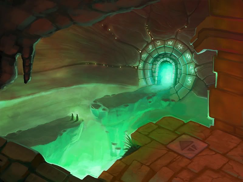
Fantasy environment concept. wip
Hey polycounters 
I'm working on this concept and I need some crits and comments, so I can make it really good. I don't need the exact solutions, but I would like to hear about weak spots, troubles with lighting, etc. So I can work out a solution myself.
I understand this is mostly 3d forums, but still, some great people here, hopefully can provide some feedback. Please

p.s. I hope I didn't broke any rule by creating new thread, instead of posting in wip thread. I was afraid it will go unnoticed, besides, who knows, maybe it will turn into something bigger later?
I'm working on this concept and I need some crits and comments, so I can make it really good. I don't need the exact solutions, but I would like to hear about weak spots, troubles with lighting, etc. So I can work out a solution myself.
I understand this is mostly 3d forums, but still, some great people here, hopefully can provide some feedback. Please

p.s. I hope I didn't broke any rule by creating new thread, instead of posting in wip thread. I was afraid it will go unnoticed, besides, who knows, maybe it will turn into something bigger later?
Replies
After that I kind off noticed everything else around, like the big part to the lower right that isn't particularly interesting to see. It feels like it covers the epicness of the rest of the pictures. However I do not have an idea as to what to draw there instead.
However my overall impression of the art is positive, I think it's really nice.
I asked myself about it too, here is the answer
Joking. Honestly, while I was drawing it,.. I think I can write a book by now about whats going on there
Actually, it covers the epic nothingness of the rest of the picture. Initially, there was nothing and few people who saw the early version, pointed me to the fact that it feels empty. I agreed, but instead of adding more details to background and middleground, I decided to go with foreground and add some context to whats going on here.
I'll leave it for viewers to imagine possible things, but the overall mood I'd like to achieve is a feeling of abandonment with signs of life coming back to this place.
Anyway, here is a small update.