Sketchbook: Robat
Here's something I have been working on recently. Its the beginnings of a Maori Warrior. My intent for this guy is to rig him and animate him performing a Haka, which is one of the traditional dances that the Maori perform for greetings, celebrations, and even war. But I thought it would be a good place for me to start practicing my character modeling since the maori's traditional dress is essentially a loin covering and cape, so this would be a nice anatomy study.
But anyway, this is my first experience with zsketch, and I made some significant mistakes when applying the skin, seeing how I wound up with a base mesh of over 800,000 polys. :poly122: Other than that tho, I would say i worked pretty well with them and look forward to refining my skills.
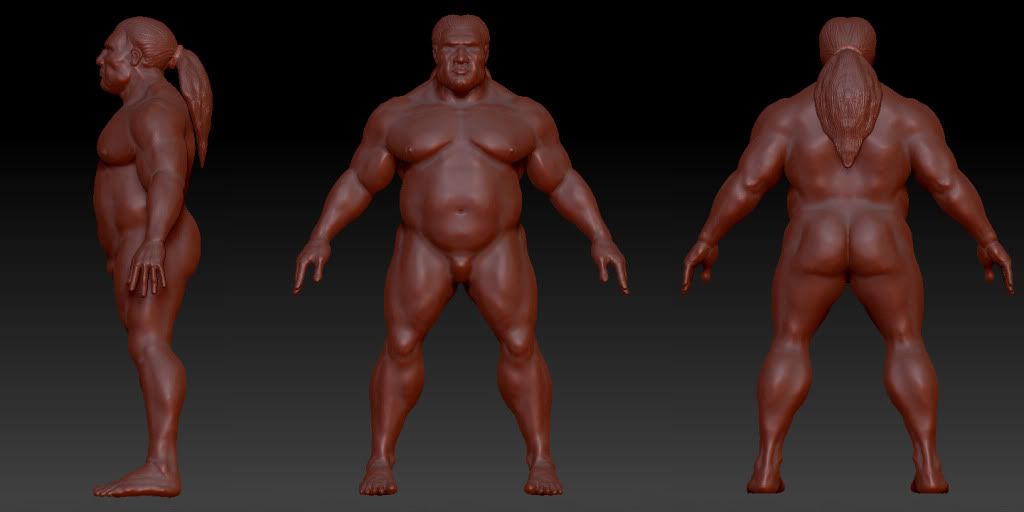
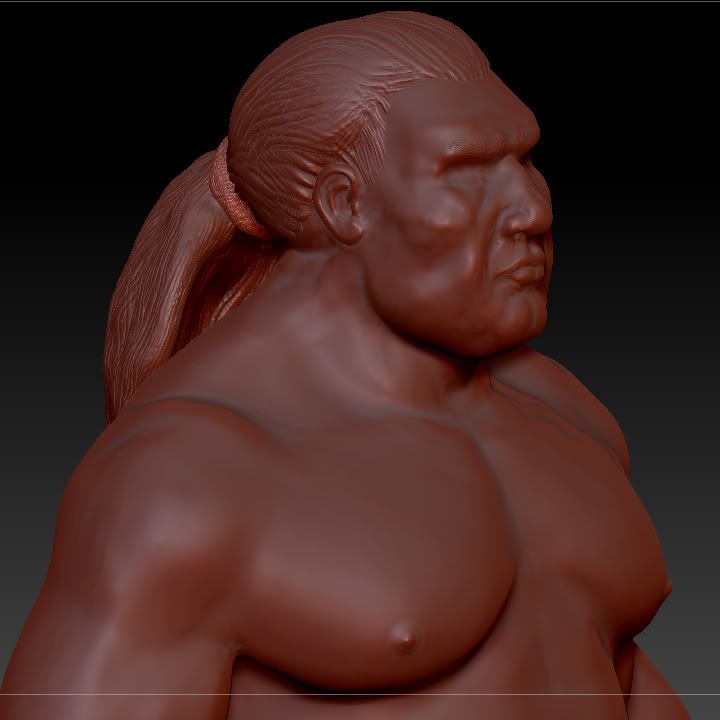
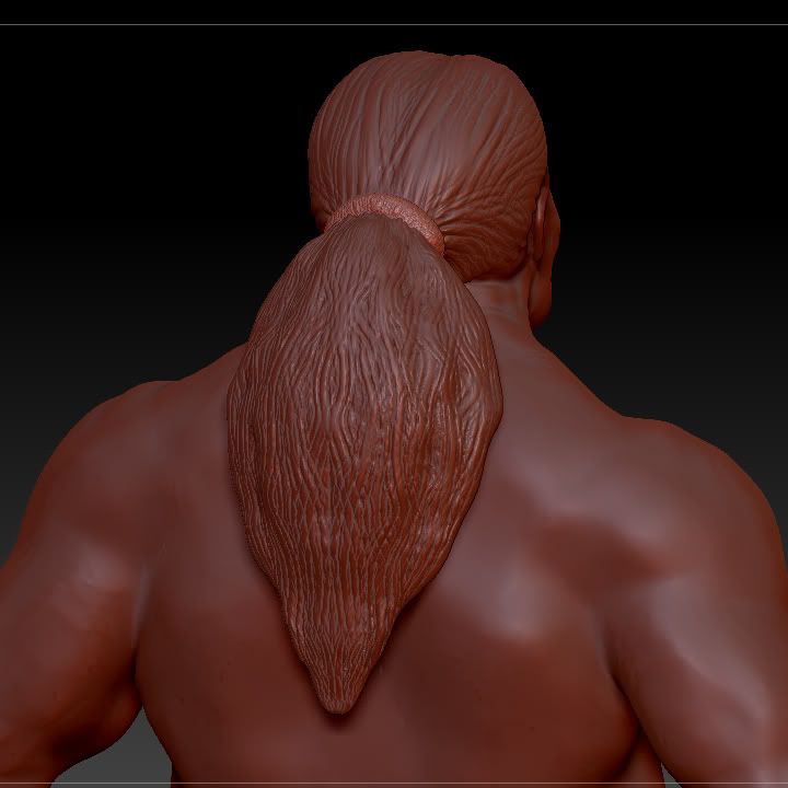
But anyway, this is my first experience with zsketch, and I made some significant mistakes when applying the skin, seeing how I wound up with a base mesh of over 800,000 polys. :poly122: Other than that tho, I would say i worked pretty well with them and look forward to refining my skills.


Replies
I always liked Richard Williams' The Thief and the Cobbler (it was released with a few different titles, but that was the one I knew it as) and wanted to have some fun with one of the supporting characters - the thief.
original context
also heres a gangster little grey
[ame]
Good stuff
You can never go wrong with anatomy studies, so keep popping those out. What are you using as reference for these? Both direct anatomical refs and drawn instruction are important-- for the latter Loomis, Bridgeman and Hogarth are all great illustrators with extensive instructional books, in case you're not already familiar with them.
For the Maori Warrior, it's very rare for someone of that girth and proportion to be just lean muscle-- typically you're going to see a little more fat, so you wouldn't have quite as much definition in areas like the small of his back or around the pelvis. That's not always the case, so it's more your prerogative, but I thought I'd bring it up anyway.
You do have a couple of small anatomical issues though. For one, I think you've defined the pectoral muscles a little too sharply, particularly as they recede toward the sternum. Soften that curve just a bit, and you don't need quite as severe a space between the pecs and the abs-- there's this awkward space between them currently. A great example to look at is Bob Sapp; he's a very muscular guy but doesn't have perfect definition because of the nature of his size and proportion.
The hands and feet need a little tweaking. With the feet, the length is good but they could go a little wider I think (though that may just be my perspective as I have suuper wide feet). On the hands, they could stand to be a little bigger but more importantly they need to be thicker. We're talkin about some beasty guy who fights for a living, and here he has these delicate fingers. I want to see big fat sausage fingers on this guy, like this-- it's more reflective of his occupation.
Lastly, the definition around the shin is odd. Specifically, you're over-exaggerating the tibialis anterior or receding the tibia too much. The main bulge along the shin should curve into the knee, with some extra width on the outward side where the tibialis anterior lies. Right now the muscle is the most prominent part of the shin and you can't really see the bone at all. (ref)
For the face, it's a fun piece but for how much his face is straining you haven't quite sold it. The tendons along the neck should be more taught and pulling out more from the skin. Also, they should be plugging in closer to the jaw-- when flexed those tendons run just inside of the jawbone. And I think you could throw in a more severe bulging vein, particularly along the brow, as well as more creases overall in that area. These aren't the greatest resolution photos but you get the idea: (1) (2)
Nice work man.
With the anatomy studies, I've been using a variety of references. The man thing I have been studying is a book by Fritz Schider called "An Atlas of Anatomy for Artists." It has some awesome photographs and breakdowns of both skeletal and muscular structure. I also default to google images too if I can find a particular angle on something. And if all else fails, I just try and look at myself in the mirror and figure it out... which doesn't always go so well lol.
Thanks for the references too tho. I actually have a couple of Loomis' books in PDF, but to be honest I haven't really sat down to look through them thoroughly, so i definitely have to do that. I also have a book on dynamic wrinkles and drapery by Hogarth which was very helpful, but i haven't picked up any of his anatomy stuff yet.
And thanks for the advice on the models. I must admit, I've had trouble when sculpting/drawing bigger bulkier guys, so these pointers are much appreciated. If you are interested, I have a thread for the project I'm currently working on linked in my signature. The character is also a bulkier dude, so I'd be interested to see how you think the proportions and anatomy are working out. heres the link if your interested: http://www.polycount.com/forum/showthread.php?t=80485
But your reply was above and beyond tho, so thanks again for such an in-depth response!
I'm not familiar with Schider's atlas, though I'll check it out next time I hit up a bookstore. I've been really happy with a probably similar book, "Atlas of Human Anatomy for the Artist" by Stephen Rogers Peck. It's old, but I particularly like how it deals with different body types.
Those are all good books to use. If you're looking to expand that collection there's a great 3 book set called "Best of Bridgman"-- it's affordable and does a great breakdown of the human body. I have some Hogarth stuff as well, and his method of instruction is different in a good way from the others.
As for the other thread, I'm lookin at it now-- i'll have a post up soon.
I'm more proud of some of these, than of others, but they are what they are lol. Each of these represent a mythological creature. just Google their names and you'll see. But the premise of the game revolved around these guys, so it was fun to crank them out.
Here is the game if anyone is interested : All Aboard. It was produced from scratch in a 48-hour period by a team of 4 guys, including myself. There are still some bugs in the game, but nothing one can't double-click their way through
I was at that game jam as well, we were the team working across the desks from you , working on the tofu game. Your sculpts are looking nice most definatly the head entry,
for the cloth on the thief it might help to identify the type of fold to get cleaner forms, is it bunching? layering? or doing a zig zaggy folding pattern.
Thanks again.
Heres the link the original thread if anyone is interested in some of the progress shots up to this point. I'd love to hear any thoughts on this, either here or in the original thread. Thanks for looking, regardless
Playing around with zsketch. I didn't really give zsketching a fair trial when it was first introduced, and wrote it off pretty quickly. I still greatly prefer working from a basemesh, but I was able to get some nice forms in this last doodle after a little trial and error.
The start of some Hard-surface practice to be used in an environment myself and 4 friends are working on.
But seriously, after looking at it more, I think you need to exaggerate some of your edges and angles,the rectangles at the base for instance, for baking purposes.
and damn you entry for eat 3D is just WOW
keep them up
The majority of the session was made up of relative quickies, like 3 min poses. Here's a handful of the more successful ones, believe it or not.
They're pretty cruddy, heh, but since I never posted them, I'll do so now. I'm working on a few other projects, but none of those are really in a state to be shown quite yet. I'll be back with updates soon!