Home 3D Art Showcase & Critiques

Arm Chair - GET IT?!?! LOL

polycounter lvl 15
Offline / Send Message
Cody polycounter lvl 15
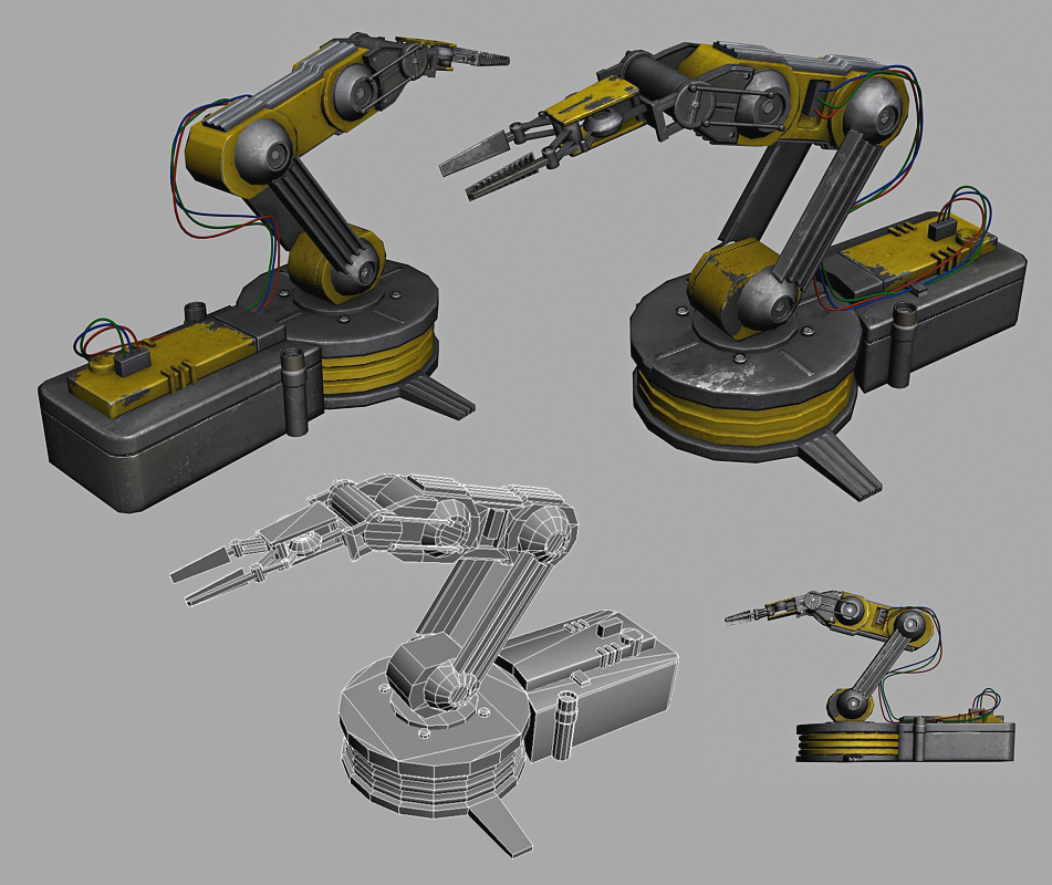
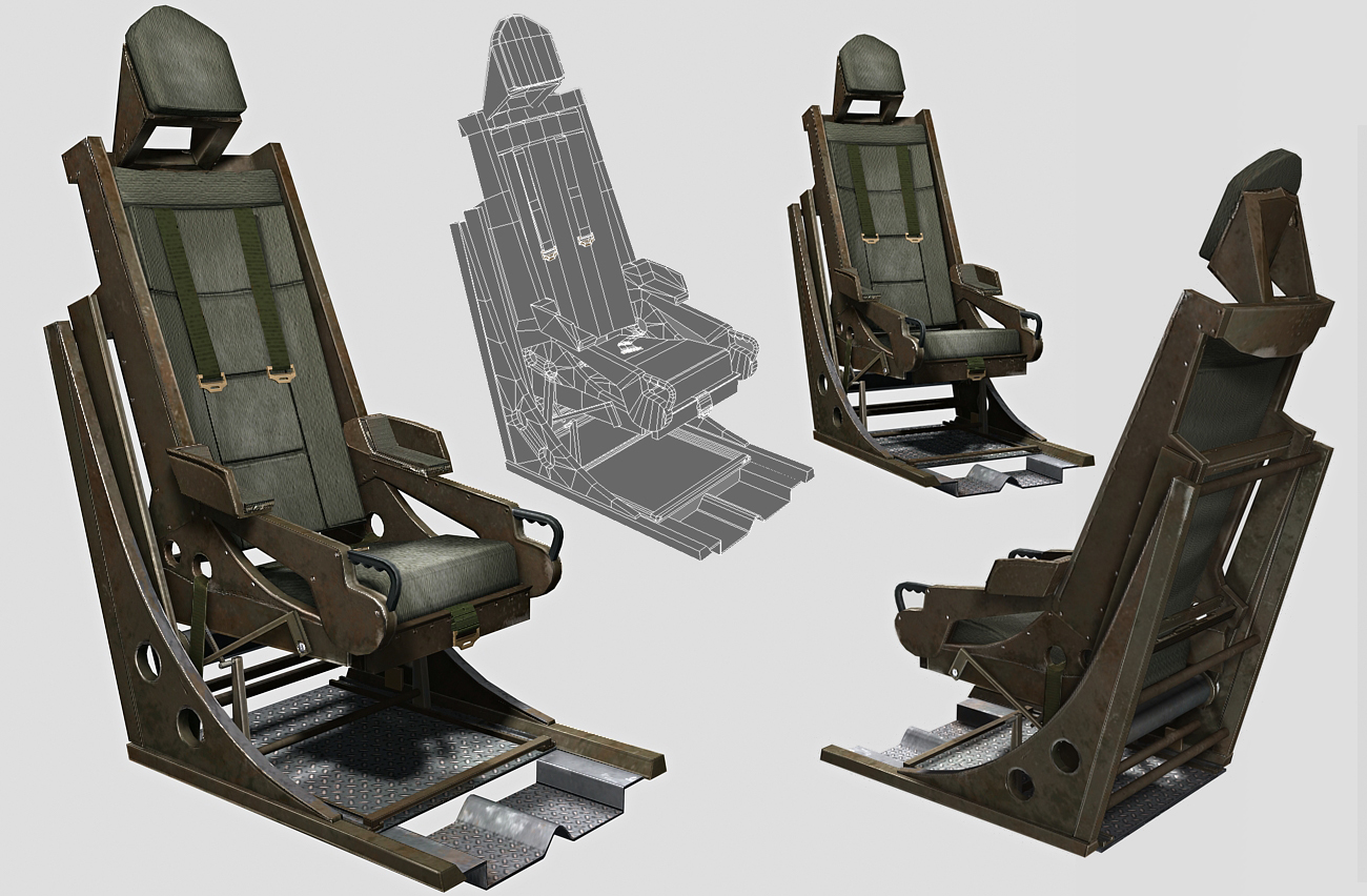
So here are two props I banged out this week. Tryin to step my game up. Whatcha think?

04-CW-RobotArm.jpg
05-CW-RobotArm.jpg

and

06-CW-OldFlightChair.jpg
07-CW-OldFlightChir.jpg

GET IT? It's a robot arm and a chair. ARM CHAIR!

Replies

  • SouthpawSid
    Offline / Send Message
    SouthpawSid polycounter lvl 7
    looking pretty cool to me! I especially like the chair. However, on the arm, if there is that much wear and tear on the bot, the paint would be such a new bright color. Try de-saturating the yellow a good bit. I like you spec painting very much as well but try adding some color into your spec. The spec of everything IRL is not black and white. Nice job overall!
  • Cody
    Offline / Send Message
    Cody polycounter lvl 15
    Ya, good call. Need to go back and make the spec color. Just liked the way it turned out, so I didn't mess with it.
  • ivars
    Offline / Send Message
    ivars polycounter lvl 17
    However, on the arm, if there is that much wear and tear on the bot, the paint would be such a new bright color. Try de-saturating the yellow a good bit.

    To this I do not agree. Colors don't fade just because the thing has been used. If it had been sitting out in the sun for a very long time maybe, or it could be covered in dust, but old doesn't equal desaturated.

    here's a photo to illustrate:
    http://farm1.static.flickr.com/200/487086321_e549bd1a3d.jpg
    http://www.generationcedar.com/main/wp-content/uploads/2009/06/decor-1.jpg
  • AnimeAngel
    Ya have to agree with ivars. I think the yellow could actually be brightened a bit, but overall very solid pieces. Nicely done!
  • roosterMAP
    Offline / Send Message
    roosterMAP polycounter lvl 14
    yup. make yellow bridgter. and add "warning: high voltage" stickers and such.
  • Spug
    Offline / Send Message
    Spug polycounter lvl 12
    I would try to add some more color variations on the arm, it seems flat in your unwrap and in your render as well. Give it a little orange gradients/blue/whatever works (Just like you did in the chair)

    Play around with it. I like the design of the chair, but the pads don't look to comfortable. I would maybe try to add some more padding to convey that you might actually want to sit in it. But if that isn't what you were going for, and this is what the design/concept called for, then your good to go. They look great, but I would add a little more different color variations to the models. Keep up the good work Cody. :)
  • Cody
    Offline / Send Message
    Cody polycounter lvl 15
    The chair is from this military plane from the 50's I found. The pads did sort of look like that, but I could cush them up to see how it looks, thanks. Ya the chair was done second which I think is kind of obvious, haha. I will go back and give it some more random color.

    High voltage stickers, nice. Didn't think of that.
Sign In or Register to comment.