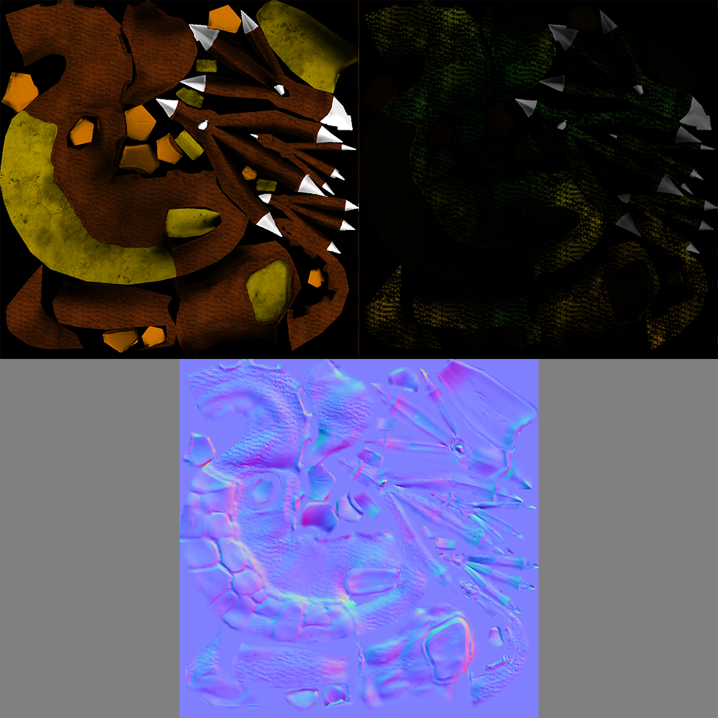
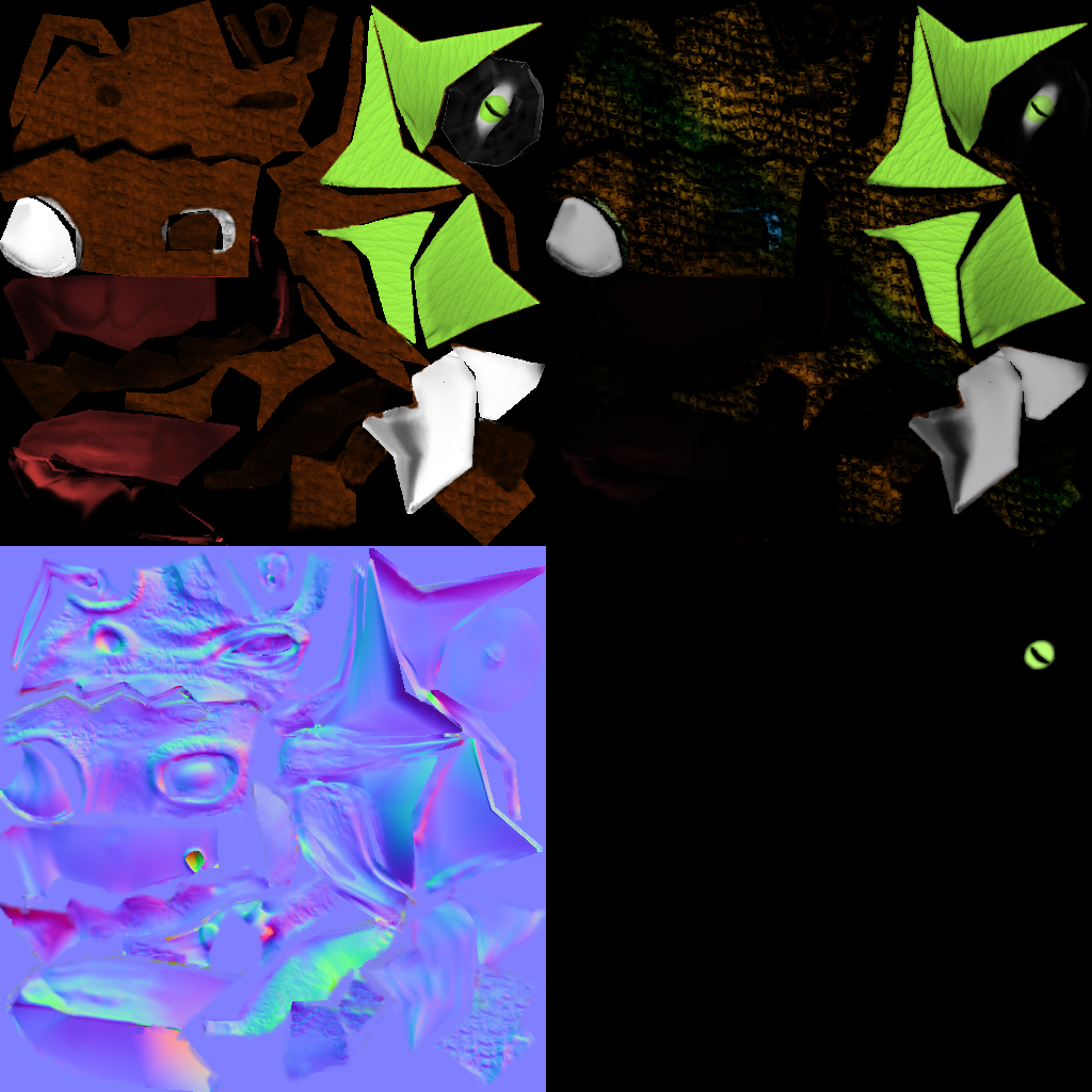
Don't make a normal map by just running a crazybump/nvidia filter over your diffuse. This simply doesn't work that well for characters. Maybe only to add in small details that you add to the highpoly-generated normalmap.
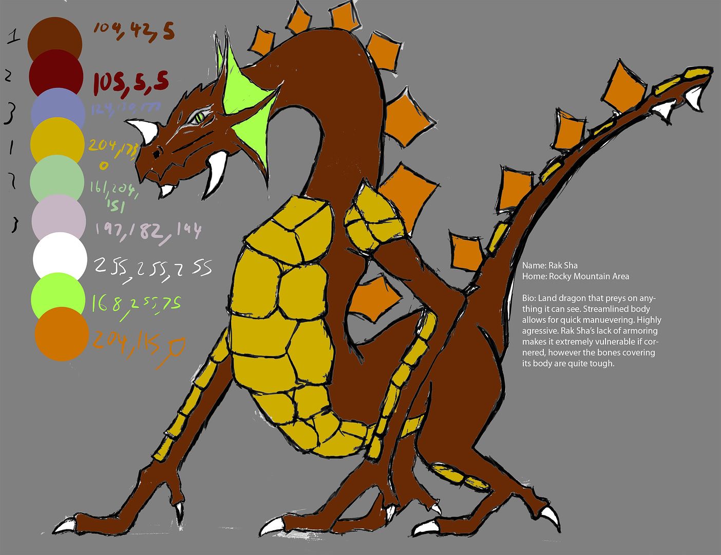
The design is actually pretty cool! the colors could use some work, but the shape and style are fun.
good luck!
EDIT: oh wait, now that I look at it again it doesn't seem to be generated from the diffuse... sorry about that . Then I guess it's important to work on the high poly some more. Maybe you could show the model without diffuse and specular? and add in a wireframe view while your at it.
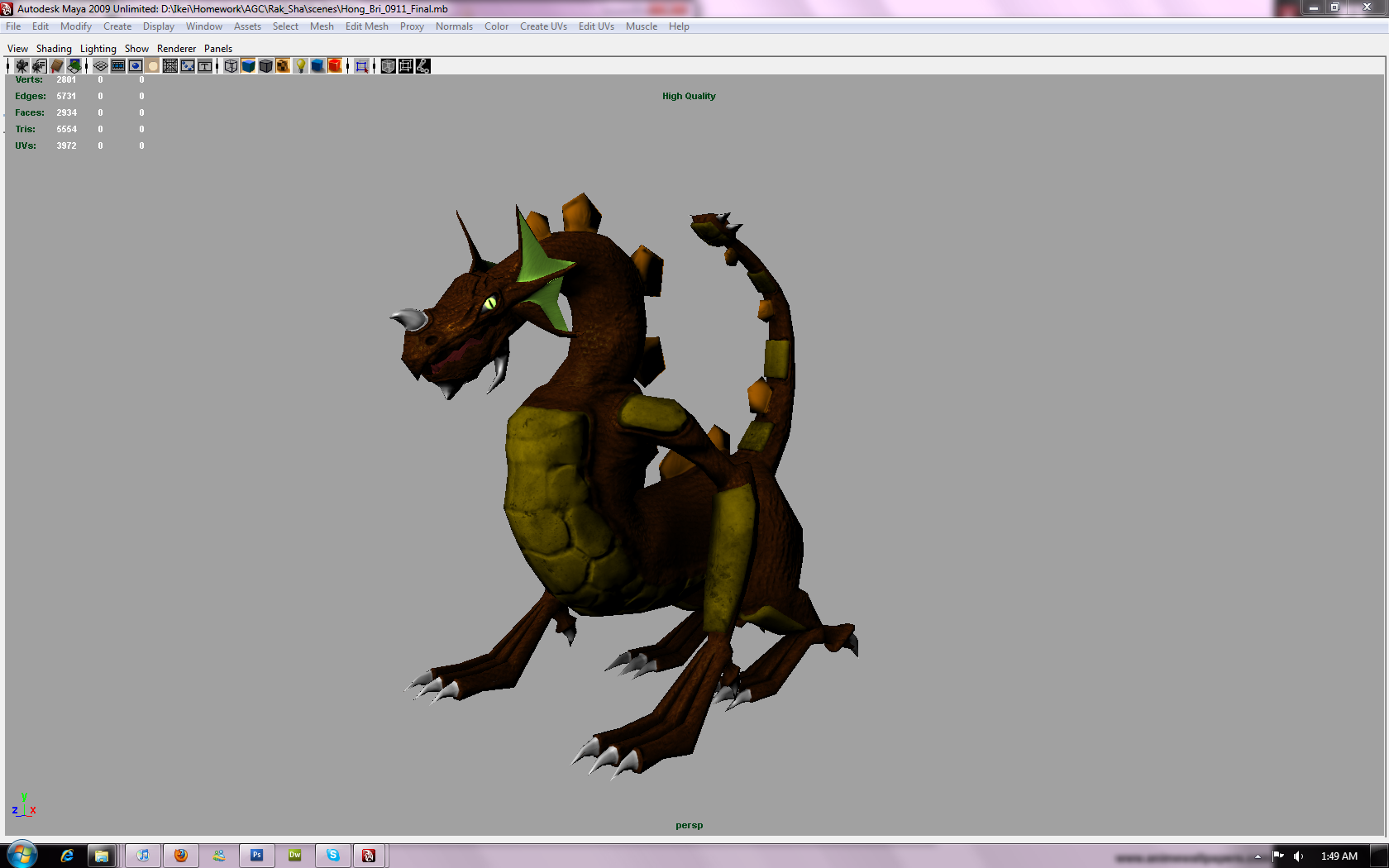
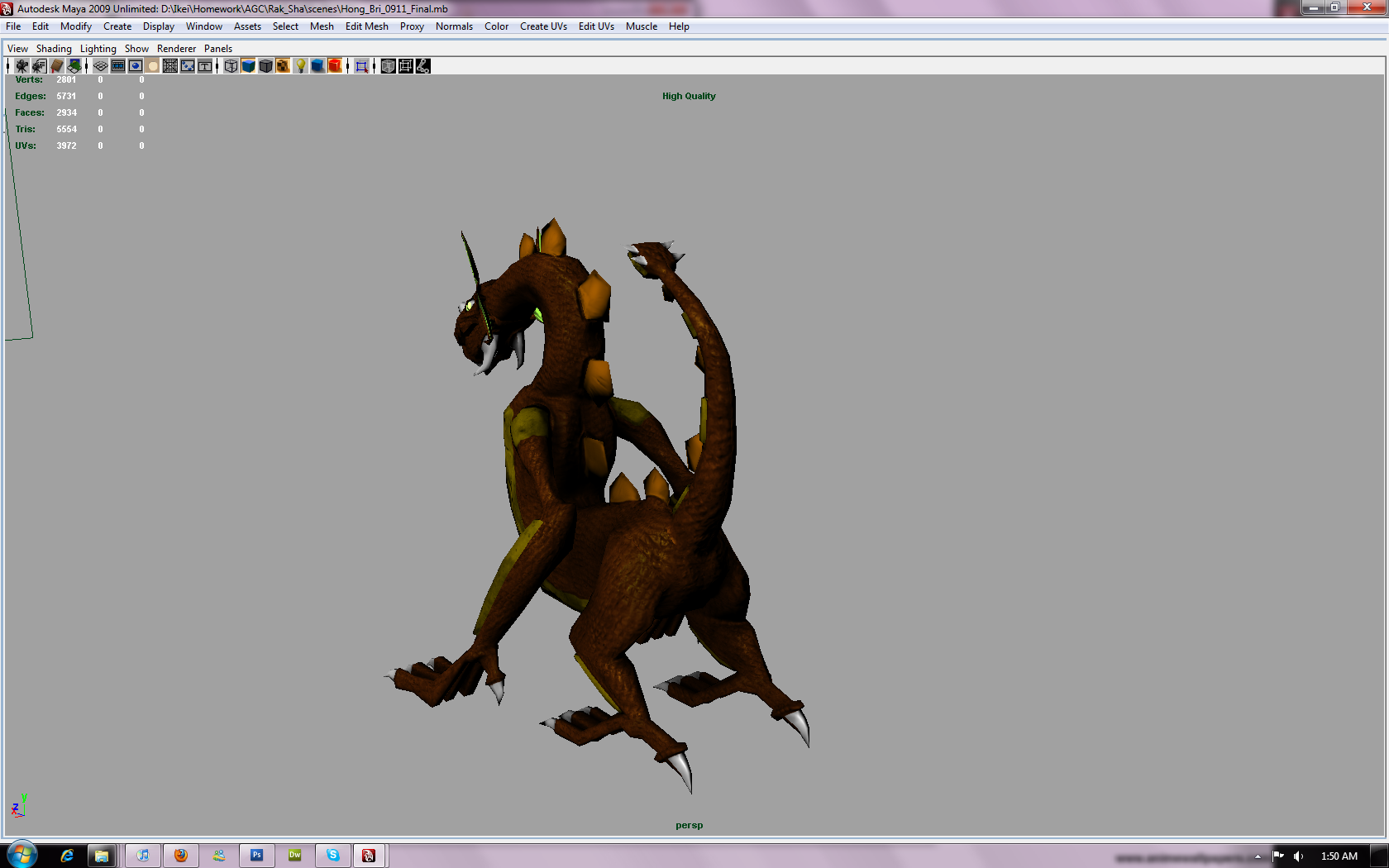
For the normals I sculpted up the main forms in zbrush and then used mask by intensity to get the scale and bone detail. As requested some wires and just normal shots.
For some reason the one with normal map+wireframe doesn't want to link correctly. Its on my photobucket if you want to see though.
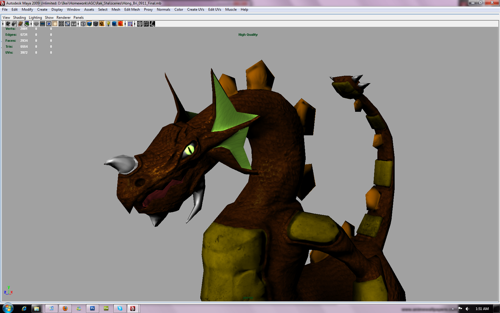
It looks like this was quickly put together. I would give some more thought into your design, for instance, the scales look like you found "random scale texture" online and overlayed it on your texture map. You should really put some thought into how scales really look. For insance- check out how they are on this iguana.
Lots of varying sizes and different paths (they circle around the eye and mouth for example)
The spikes look really weird and the color is very "one tone with the burn tool"- once again, something you could work out by looking at reference
You should definitely look up some more reference for your dragon. For the brownish tone you're trying to accomplish, I'd refer to some of the more desert lizards which spend a lot of time on the ground.
You might want to re-evaluate your UVs as well. Right now, the ear flaps are taking up a major portion of your UVs, while they aren't very huge (or detailed) on the model itself.
Hey everyone, quick update right now as redoing the scales is taking quite a while. Textures are where I feel I'm weakest at the moment. Here's a quick shot at how the scales are now running on the body. They actually flow with the shape for one. I noticed that generally the scales on the body are smaller with limbs being larger and claws going back to small on the Komodos so I tried to imitate that pattern. For the head I plan to try and get an effect similar to the brown lizard Organized Chaos posted. Any critques so far? Am I on the right track?
On the right track? I'm trying to get zbrush's mask by intensity to redo the scale normals the way I did it before but can't remember how I set it up for the life of me.
Replies
The design is actually pretty cool! the colors could use some work, but the shape and style are fun.
good luck!
EDIT: oh wait, now that I look at it again it doesn't seem to be generated from the diffuse... sorry about that . Then I guess it's important to work on the high poly some more. Maybe you could show the model without diffuse and specular? and add in a wireframe view while your at it.
For some reason the one with normal map+wireframe doesn't want to link correctly. Its on my photobucket if you want to see though.
Lots of varying sizes and different paths (they circle around the eye and mouth for example)
The spikes look really weird and the color is very "one tone with the burn tool"- once again, something you could work out by looking at reference
You should definitely look up some more reference for your dragon. For the brownish tone you're trying to accomplish, I'd refer to some of the more desert lizards which spend a lot of time on the ground.
You might want to re-evaluate your UVs as well. Right now, the ear flaps are taking up a major portion of your UVs, while they aren't very huge (or detailed) on the model itself.
http://www.darkroastedblend.com/2009/04/komodo-dragons-they-eat-meat.html
Some nice photos for scale reference too.
Diffuse Only Shot with no lights:
Ack, just noticed some scales bled onto the horn, ignore that its fixed.