Here's a head I've been working on over the weekend, this is my current progress. I still need to model his mohican and I would like some of your views on whether you think the edge flow needs changing. Obviously I still need to texture as well.
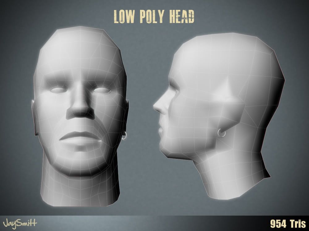
954 Tris, Overall I think I have massively improved from my previous heads, although I'm not liking the chin and jaw area.
- edit - I know very little rendering techniques so the surface looks crap
seems pretty good, but i can't tell what's going on because of the weird render setup. I think it'd be better to just printscreen one of the viewports with the wires turned on.
First time I've tried baking textures and I'm semi-happy with the overall outcome, I also tried making a normal map within Maya but it came out wrong and looked too tacky. In the end I just made a spec and bump map in Photoshop. Any crits?
-Edit- I also modified the shape of the head and added a few more polygons which has now got 1192 tris.
Not bad at all for under 1000 tris. One thing that's always a giveaway on heads/faces is the nose. Maybe try deleting a handful of polys elsewhere, then adding a few more to the end of the nose?
Also, if you could shave a few more off and give him a simple, somewhat angular haircut (even a rectangular mohawk) it could take the attention away from the poly silhouette of the top of his head.
His ears also seem a bit too low. The top of the ear should be level with the eyes, and the lower part of the ear should be level with the bottom of the nose.
I've been having second thoughts on the mohawk, I couldn't quite think of how I could make it look seamless since I haven't modeled or textured hair before. But now you've mentioned the deterrent from the poly silhouette I'm really tempted to make it work. Yeah the nose was a nightmare, I think I could maybe cancel out some of the edges near the neck, I tried to make the sternocleidomastoid muscle stand out more with the extra geometry but I think it's a little unnecessary since I should concentrate on the main features of the face.
Anyway I really appreciate your comment rumblesushi, I'll see if I can get this head looking better.
Jay, I'm a complete nub to modelling, so I can't answer the 5 pointed star question. Possibly ctrl+backspace one of the lower right edges? Or Maya's equivalent of ctrl+backspace, which deletes an edge, but auto bridges.
And absolutely, the main features of the face, and the head silhouette are more noticable/important than the neck area, which you're not really going to look at unless it looks particularly bad to bring your attention to the area.
So a few more polys on the nose, and a mohawk, taken away from the neck/shoulder area - this would look a lot better.
By the way that's just the sort of mohawk I was thinking of, a chunky little Travis Bickle style hawk.
If you could sort of manually weld it onto the 1st and 3rd of those top 3 edge loops, it would look make the silhouette much better. It would perhaps be a bit wide though, but it might look alright.
I don't quite understand what you mean by baking lighting, If you mean the spec map I just save out the colour map in photoshop and make some level adjustments and paint areas white which are shiny such as the forehead due to greasy skin. For the lighting scene I just set up 3 point lighting set up one with a slight red hue and the other slightly blue.
I don't know if that answers your question but if you explain what you mean a little more I'll try my best to answer.
Replies
First time I've tried baking textures and I'm semi-happy with the overall outcome, I also tried making a normal map within Maya but it came out wrong and looked too tacky. In the end I just made a spec and bump map in Photoshop. Any crits?
-Edit- I also modified the shape of the head and added a few more polygons which has now got 1192 tris.
Also, if you could shave a few more off and give him a simple, somewhat angular haircut (even a rectangular mohawk) it could take the attention away from the poly silhouette of the top of his head.
Anyway I really appreciate your comment rumblesushi, I'll see if I can get this head looking better.
And absolutely, the main features of the face, and the head silhouette are more noticable/important than the neck area, which you're not really going to look at unless it looks particularly bad to bring your attention to the area.
So a few more polys on the nose, and a mohawk, taken away from the neck/shoulder area - this would look a lot better.
By the way that's just the sort of mohawk I was thinking of, a chunky little Travis Bickle style hawk.
If you could sort of manually weld it onto the 1st and 3rd of those top 3 edge loops, it would look make the silhouette much better. It would perhaps be a bit wide though, but it might look alright.
How did you bake the lighting by the way?
I don't know if that answers your question but if you explain what you mean a little more I'll try my best to answer.