Home 3D Art Showcase & Critiques

Female Dancer

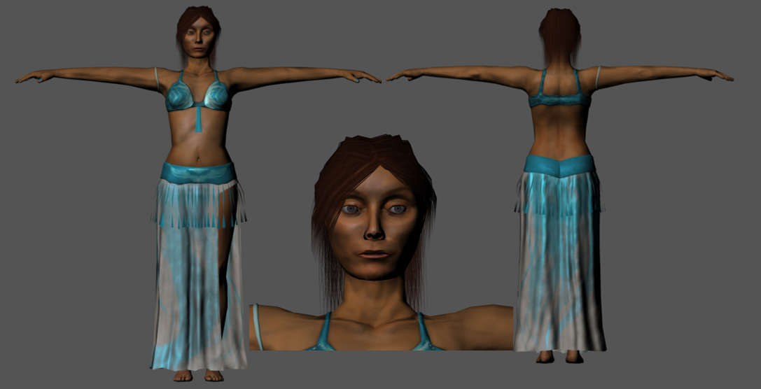
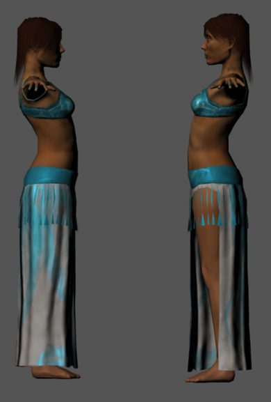
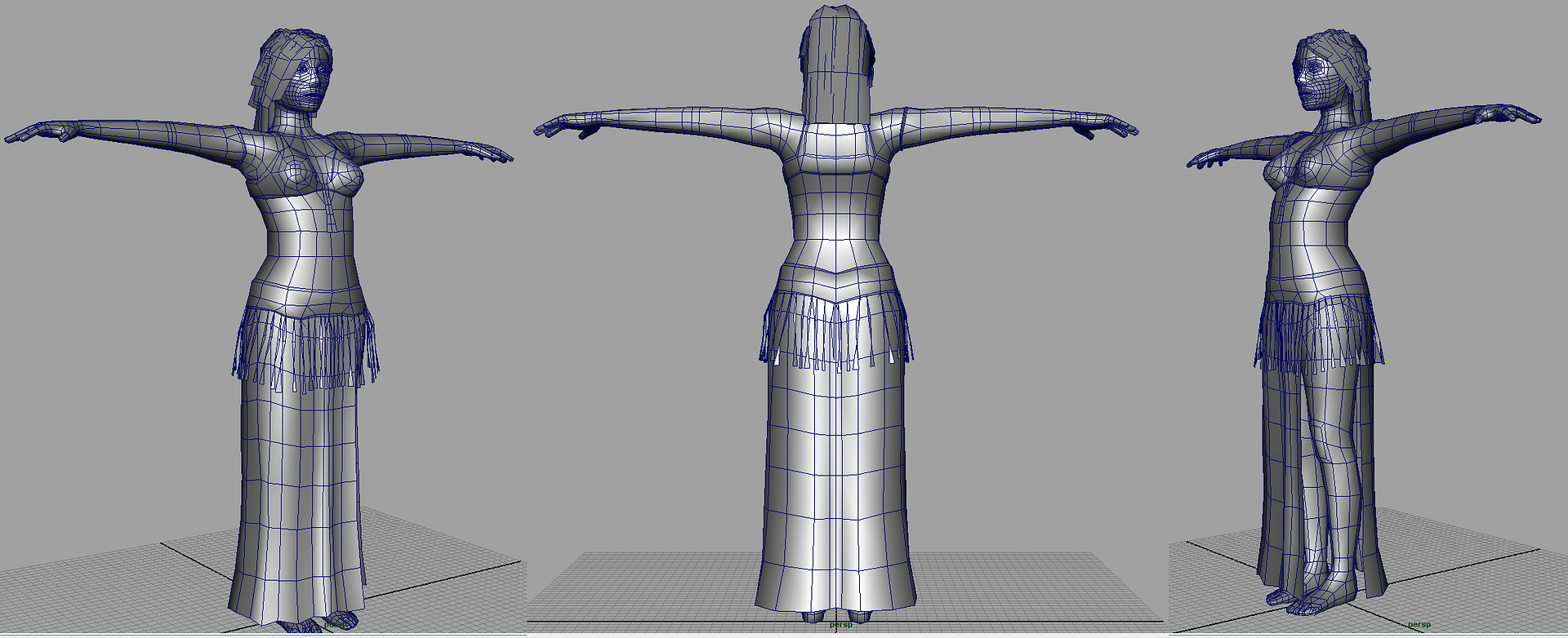
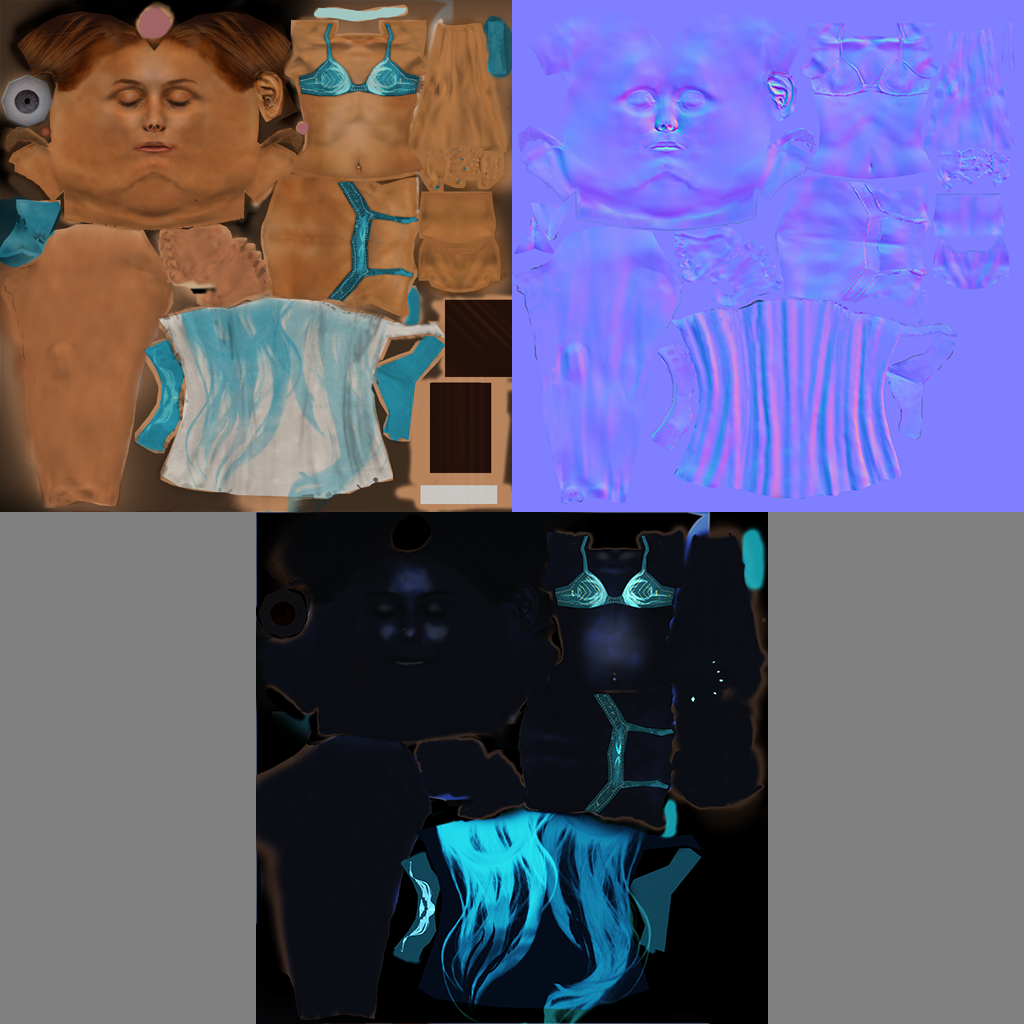
Hi guys first post here and looking for some critiques. Its a game model at 5176 tris that I did 2 months back for my class that I'm fixing up. I'm posting some renders I'm going to put on my portfolio before GDC next month and was hoping for some constructive feedback. :) 2048x2048 maps.

FrontBackFace.png

Sides.png

WiresAll.png

Maps.png

Replies

  • Giacomo X
    Offline / Send Message
    Giacomo X polycounter lvl 6
    Looks pretty good.

    If it were me I'd add some luminosity to her flesh tones. Right now those black shadows are just killing it.
  • raul
    Offline / Send Message
    raul polycounter lvl 11
    Perhaps you do some of the hair as actual geometry rather than just alpha planes to add more thickness to it. The specular also needs a bit more work. Looking a bit too plastic there. You should try rendering this on the marmoset engine. Im sure it will look nicer!
  • keizza
    Offline / Send Message
    keizza polycounter lvl 18
    UV layout looks fine...but i think the overall structure and aesthetics need to be worked out ie: mainly....the face. the silouhette is not bad at all. the arms could use more shape. and once again....i'd get on the internet and find some face ref to make her more attracticve.
  • bhong
    Ok, so I decided to attack the face first because its pretty critical and spec maps confuse the heck outta me. I can never seem to get them right. My friend gave me some tips so I"m going to tackle those next. I'm currently figuring out how to Redo the normals as my proportions were all off initially and it messed up the normals pretty heavily in the areas I had to fix.

    Some tips if you will again. Thanks guys. :)

    Edit: Oh, and if anyone could give me some advice on how to clean up the edge in her nostril area that would be awesome. That's the best I could get it so far and am stumped on how to get a better flow.

    HeadRedo.png
  • bhong
    Another update. Fixed the face some more and attempted to fix up the spec. Still too plasticy? And thoughts on the appeal of the face now? I know I've still got a weird shadow on the upper lip thanks to my normal map. I like how it looks far away but there's still something off. The reference I"m using is in my previous post.

    Rendered it using a 3 point light setup in maya this time.

    2Face.png

    2FrontFull.png

    2FrontLeft.png

    2FrontRIght.png
  • garriola83
    Offline / Send Message
    garriola83 greentooth
    you shoulda photoshopped that face to be symmetrical first of all. youre edge loops are uneven and doesnt flow with the topology of the face very well. looks like you focused on the front and side views only becuz the face it looks flat to me.
    if this is your first, kudos, but you need to amp your observation skills better for next time. good luck
  • bhong
    Ok, thanks for the tips guys. I'll remember them on the next model. Calling this one done for now unless anyone else has some last minute tips. I'll start redoing her again after GDC. Expect my next revamp project soon.
Sign In or Register to comment.