Repair Bay -- (new member)
So, this is my first post on here. I can't wait to see what kind of CC I'll get from the members here at Polycount.
Just to give you guys a small background on my project: It's my Senior Project and the scene that I am doing is a Hover Bike Repair Bay. It's supposed to be in the near future with some technologically advanced equipment.
So far, I've been doing some props. I have a WIP of my scene (missing a few things) but just so you guys can get a general idea of where I'm going with this.
Let me know what you guys think so far!
**Please note these are all Max Renders so far with basic lighting. I will be putting them into UDK as soon as I can with a more completed scene and better lighting.**
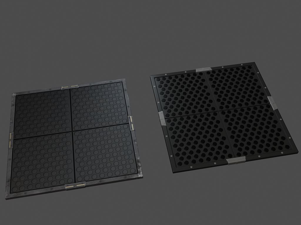
This is my Tileable Floor (low and high poly). The Low Poly is at 66 Tris. The textures are 512.
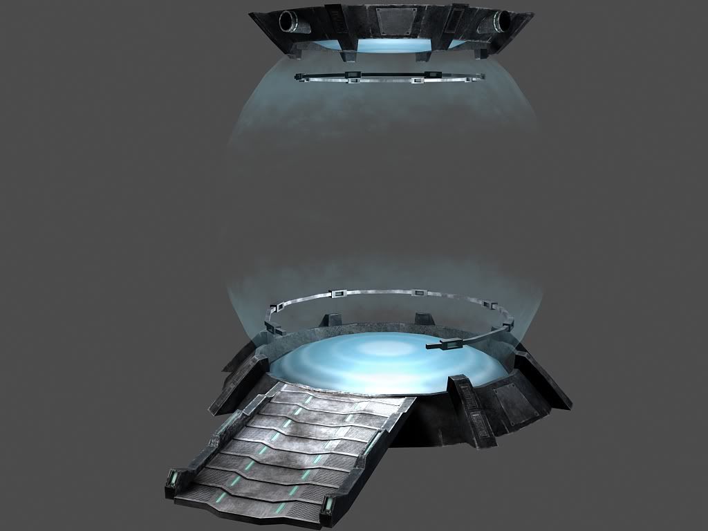
This is my Energy Lift for raising the bikes up into the air and getting repaired.
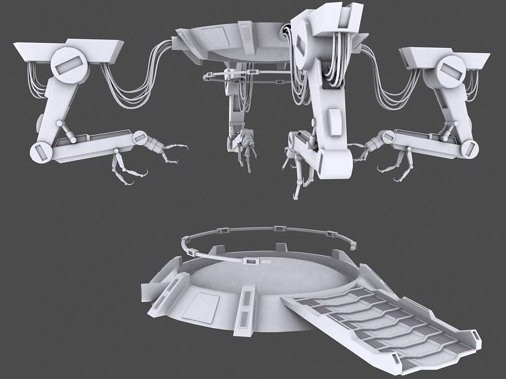
This is the Low Poly (without the robotic arms). It's at 3322 Tris. Textures are at 2048.
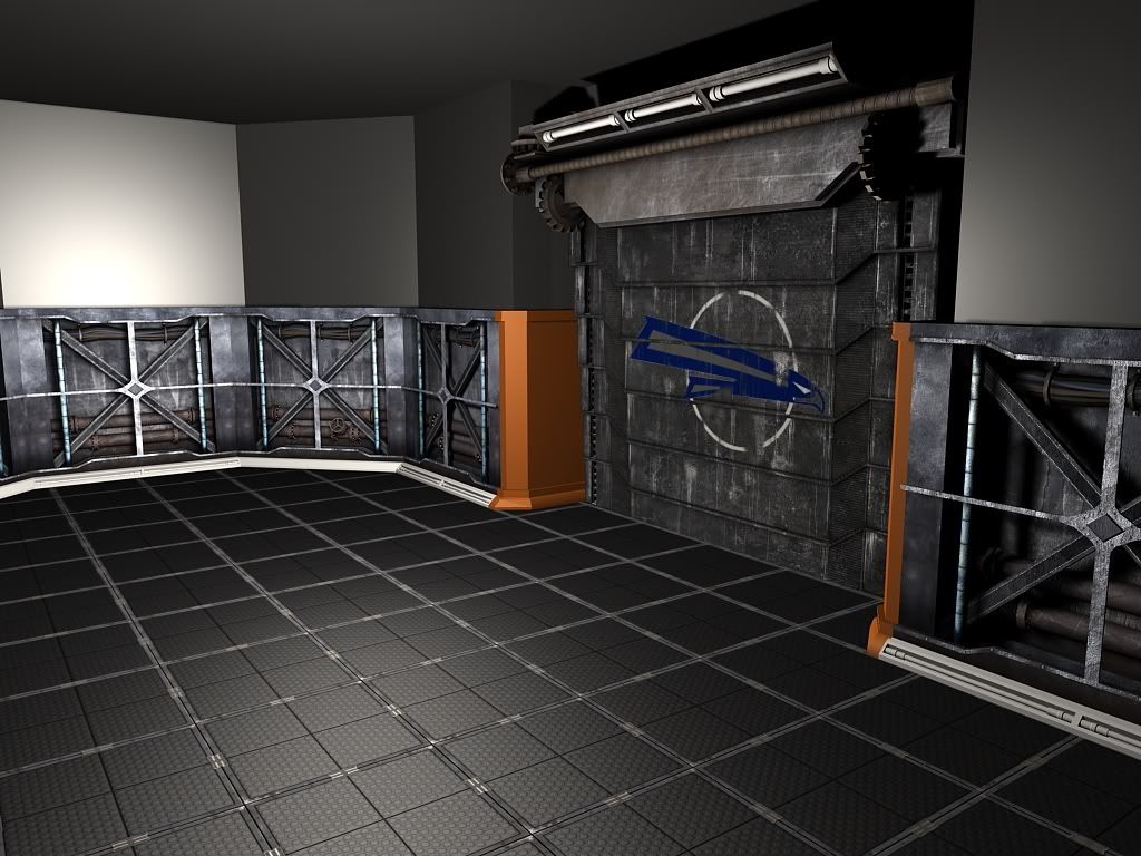
This is my WIP of my scene (missing a few assets)
Let me know what you guys think! Thanks for checking this out! More to come soon!
Just to give you guys a small background on my project: It's my Senior Project and the scene that I am doing is a Hover Bike Repair Bay. It's supposed to be in the near future with some technologically advanced equipment.
So far, I've been doing some props. I have a WIP of my scene (missing a few things) but just so you guys can get a general idea of where I'm going with this.
Let me know what you guys think so far!
**Please note these are all Max Renders so far with basic lighting. I will be putting them into UDK as soon as I can with a more completed scene and better lighting.**
This is my Tileable Floor (low and high poly). The Low Poly is at 66 Tris. The textures are 512.

This is my Energy Lift for raising the bikes up into the air and getting repaired.

This is the Low Poly (without the robotic arms). It's at 3322 Tris. Textures are at 2048.

This is my WIP of my scene (missing a few assets)

Let me know what you guys think! Thanks for checking this out! More to come soon!
Replies
could you post wires?
off note:
what school are you attending?
The floor, have you done a bump and spec map for it yet? It seems pretty flat.
The logo on the door looks a lot like the US Postal Service logo...
@Baj Singh: That's a really good idea. Thanks for that. I'll try to add that in as soon as I can.
@Vig: The floor does have bump and spec. I would say it's the basic lighting setup I have in Max that's making it look like that. And the logo is actually a cropped/edited team logo for a high school football team. I just wanted something to represent speed lol
I agree with a lot of what was already said for things like the logo and what not.
As for crits of my own. Your HP's have to many 90 degree angles on things, this will not produce proper normal maps, you need to give them a bit of an angle. Rays are cast from the face of the polygon and if there is something with a 90 degree angle its not going to pick up any of that depth information.
The floor texture you made should just be tiled on the floor. You shouldnt have a bunch of cube modeled out shapes to make up for the floor.
The energy lift looks very basic and dosnt have a ton of detailing too it. I know doing HP work is something new for you but even if you modeled in more cool and interesting shapes I think that could help out a lot more. I would suggest browsing concept.org and just start stealing cool looking concepts and try an incorporated some of the sci fi shapes and designs they make into your own.
The arms themselves also look very very basic blockout. I think you can do a much more complex design then the circles and blocks you have as arms now. Here is a good idea of what you should shoot for and use to steal parts/ideas from.
http://us.media.blizzard.com/starcraft2/images/artwork/ss39-hires.jpg
Finally ditch using max to do anything but model, get your stuff in Unreal, set up the scene and quickly set up the basic lighting style you want so when you are texturing stuff you can see how the lights effect the look of things. Also so you can see proper spec/normal.
Hope this info helps Aaron and you can make your scene kick ass!
Also, I'll be adding some detail the cables and the mantis arms.
Thanks!
I'm really digging the your hp work. :thumbup:
well, here's my robotic arm fully textured! let me know what you guys think!
and here is my full environment! this is what i have so far. still working on a lot of things, but any CC would be much appreciated!
The emissive bits, the flat grey bits, and the walls all look like they need alot of work, something to break up the flat colors, but like your post says, im assuming there are a lot of wip bits.
speaking of bits, your room looks very low, very claustrophobic, and seemingly cluttered with all of the arms going in different directions, yet when you take a look, it looks empty.
I would raise the roof around the energy lift, or add some lights, toolboxes, or something to take the eye upwards.
looking around the room, it looks like a single entity without anything connecting this tiny room to anything else. an obvious door, vent shafts, or shafts leading to light sources in the roof would give a more based feeling to this.
I think all of the items look very good and promising, but the composition of your final shots should be taken into consideration.
Keep updating!
thanks for taking the time to look at my stuff and giving me some feedback! much appreciated
The tiles and works look good, but I think if you add some discoloration and tone/color variations in the metal it would help sell the the look.
I'd like to see that arm thing animated if possible.