Overgrown Mine Wip
I'm making an overgrown mine for my portfolio. I am making a futuristic mine inspired by Metroid Prime and Halo as well. I want to mix organic shapes with the hard shapes created by man. Right now I feel that this scene is really lacking visual interest and a real focal point. I also need to work on my storytelling elements as well.
I want to put this in engine as well. I will be using UDK for the first time and want to use this to learn the engine. I want to keep the scene generally small due to time constraints (it must be done in 5 weeks) but I am willing to expand in scale slightly.
I really am looking for some hard critiques for this as I focus on finding a real direction for this piece.
Scene
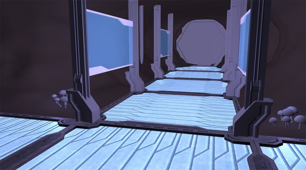
Layout
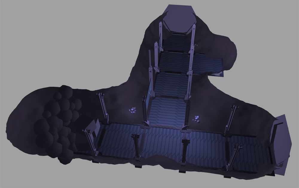
Textures
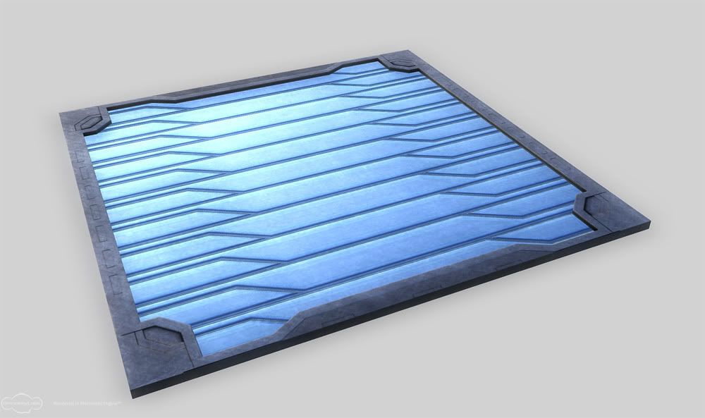
I want to put this in engine as well. I will be using UDK for the first time and want to use this to learn the engine. I want to keep the scene generally small due to time constraints (it must be done in 5 weeks) but I am willing to expand in scale slightly.
I really am looking for some hard critiques for this as I focus on finding a real direction for this piece.
Scene

Layout

Textures

Replies
- Textures - You're textures are very bland and lack any sort of detail. You need to research hard surface texturing and see how to properly create metal textures. There seems to be no specular at all on anything. Add some color to objects too!
- Lighting - The scene lacks any sort of shadows, which is making it feel very flat. Add some colored lights and shadows to give the tunnel and scene as a whole some depth.
- Models - The models are also very flat and basic. They lack the detail that most sci-fi pieces have. I would also add some props in the piece like crates, barrels, guns, etc...
Here are some examples:
http://boards.polycount.net/showthread.php?t=70135&highlight=sci+fi - look at how much the lighting added to the depth of the scene.
http://boards.polycount.net/showthread.php?t=62114 - Can't talk about hard surface hi poly modeling without looking here :P
http://forums.cgsociety.org/showthread.php?t=373024 - great texturing tut.
http://cg.tutsplus.com/tutorials/3d-art/how-to-hand-paint-convincing-metal-textures/ - another good texturing tut.
Besides the visual detail on the models themselves and the textures, what types of things could help the overall scene. What could really help me create the mood and give it a focal point as well.
Duffuse
Specular
Normal
think of how the floor would get used - it would be much more worn in the center where all the traffic is. yes it could be scratched to hell, but the scratches would have been polished down by use. Personally, I'd leave the scratches and wear out of the normal map, unless you wanted some particularly deep scratches.
is this a stamped piece of metal, or is each panel created out of these strips that are then fitted together? currently, it looks like that pattern is stamped in. if that wasn't the goal, try mixing it up a bit. make some slightly darker, slightly lighter, more red, more green, etc.
the noise on the diffuse is too high contrast, instead of pocked metal, it's coming across like compression artifacts and brings down the resolution of the piece.
if this is overgrown, there should be water stains, dirt in the cracks and building up around the edges, lichen and moss growing over spots. the way these are made, with the high rim all around it, they would be impossible to clean even when in use.
The more efficient way to work is to work the whole level out as a whole, Get all the props in, strong sillouettes, good composition, decent lighting and decent textures
Floor looks good enough for me get the rest of the stuff in. Save the polish for last
I'd probably get even crazier than this with it all, and some atmosphere with light beams, dripping water cause I'm a wild man.
Thanks for the paintover cholden, I'm gonna add even more vines and leaves soon but I need to finish the base modeling and textures first.
I've made a few changes and I've done the sculpting for the cave itself. It has base textures on it now.
Don't be afraid to get crazy with the vines and such, and if you're looking for more props to add, some warn out, vine covered machinery wouldn't be bad. The roots could open up some cracks with sun beams for more atmosphere.
Right now there is nothing offensive about your lighting/colour choices, but it doesn't seem to have a direction either. I could be totally wrong here, but if you do want to make some adjustments, it would be as simple as hue changes on you diffuse maps or light colour adjustments.
I would add more lumpy stone shapes to the ceiling. Not stalactites. The large chunks of rock that would fall out after the giant tunnel carving machine cleared the original path.
The out-of-place appearance of the crates is them sharing the walkway material. It tricks the brain into thinking we should be walking on them or possibly that the 2nd shot you posted is looking down and they are a platform. Anyway, it's a crate. You can spend more than two seconds on it making it look nice.
Stains, everywhere.
Default
Broken
One other thing I just noticed are the pillars. The way that the middle of your pillar meets with the base of the pillar (where the light part meets the dark part) looks a bit strange. To me it looks like you did the boolean thing in Maya, which is fine but I'm not sure if the pillars would look like that if they were real, if you get what I mean?
Your lighting needs work. In this situation, you need to sit back and think for a second where lights would make sense. There are 2 things that catch my attention.
1: You have hanging lights that don't have actual lights.
2: Plants...need light to glow. This could go in a few different directions. First off, with the plants having a bio-luminescent glow, you could let them be and just say they are space plants...or whatever. Or you could make some lights that shine on the lights..maybe like fluorescent lamps that sit on the sidewalks and face the lights. Dunno, it could go either way, but its something to think about.
Keep going with it..I like it
A quick note about blood and its use as a story device.
You need to be part CSI guy when introducing stuff like blood to your environments.
This would need to be a fresh stain, blood doesn't stay bright red for long. It starts to separate within a few hours. You get a clear liquid (plasma?) and the red blood cells. If you check out crime scene photos (hopefully you have a stomach for the ref if you're putting it in your scene) you will notice most blood stains have a red part then past that extends a clear liquid that leaches out of the blood as it breaks down. Then it dries and turns brown-black. On some level everyone knows this even if they can't articulate it. Its a cue to whats been going on and how long ago it happened.
Also know that bright red blood is kind of a newbie hallmark for detail, its kind of the first tool in the bag most people reach for when they want " a focal point", "oh I know blood stains!" Well... you need to make sure you do them right and you need to use other tricks because blood as a focal point, gets pretty old.
Vig, I am no longer going to have blood in this scene. It just doesn't fit the style I'm trying to go for and even though it's useful as a focal point it just doesn't work here.
gsokol, I always wanted these plants to be bio-luminescent, I always felt this was an alien world so to me it makes sense.
SasoChickenand The ferns and mushrooms are on the same map right now but I see what you mean, I'll work on the glow and hopefully fix it soon and I'll add the veins in, thanks for the feedback
I see the star wars lol, now that you mention it
More progress for your eyes!
Only crits i have are; the lips on the walkways, someone is going to trip over those! lol, I would lessen those a bit.
and also, maybe your planning to do this in the near future, but place those mushrooms and ferns all over the place! Why are they only in the corners?
keep the updates coming