Yet another newcomer arrived, Hooray!
Hello everybody!
I've been following the polycount board since quite a while now an I think it's time for me to join this beautyfull community.
I got into 3D modeling aproximately 1 year aggo, creating various scenes during my sparetime from uni. I can not say that I am realy good yet, but I tought myself a fundamental knowledge now, that I hope to improve with the help of all the wise and experianced people in here
To my shame I have to admit that among my creatiosn there is only one single game ready asset so far.
So, bevore I loose the last kind reader, I'll go with the mantra
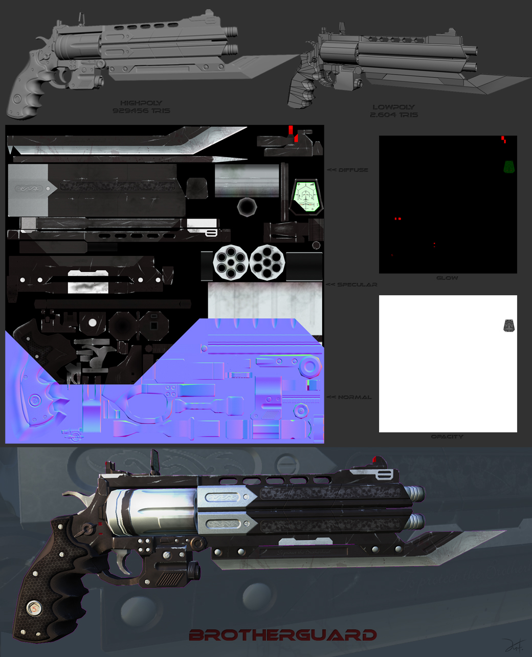
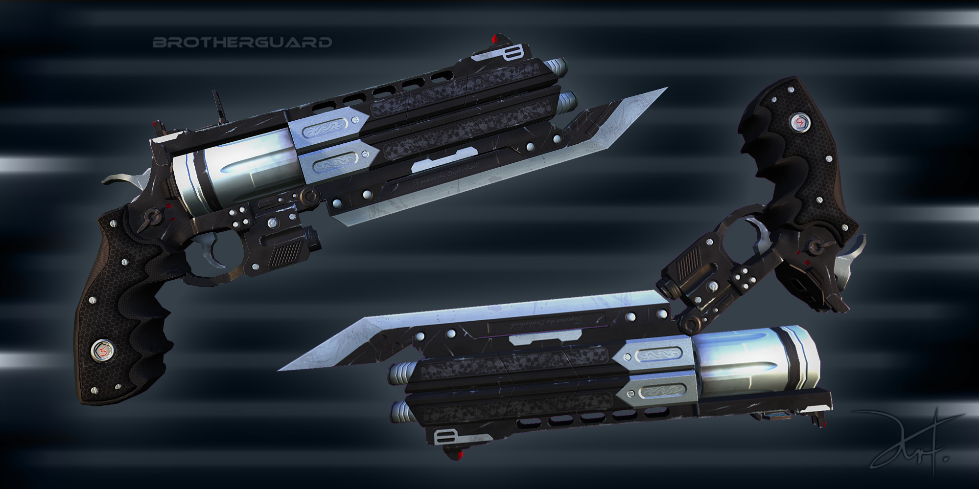
The Brotherguard (my first, game ready, lowpoly asset put into Fallout3)


Here a screenshot in showing the gun in Fallout3 http://fc09.deviantart.net/fs70/f/2010/029/0/f/The_Brotherguard_in_FAllout_3_by_The_5.jpg
I am not entirely shure if it is OK to post non-game art too and I don't want to abuse this thread for showcase, so if you would like to see my other works to get an overview of my "skills" just check this link to DeviantArt http://the-5.deviantart.com/gallery/
I am aware of the fact that "Polycount is not my blog" but I think such a welcome thread schould not upset anybody (hopefully), and obviously I won't start one ever day, hehe
And yes, this is not the Forum to showcase art, but that was not my intention for this thread anyway.
I've been following the polycount board since quite a while now an I think it's time for me to join this beautyfull community.
I got into 3D modeling aproximately 1 year aggo, creating various scenes during my sparetime from uni. I can not say that I am realy good yet, but I tought myself a fundamental knowledge now, that I hope to improve with the help of all the wise and experianced people in here
To my shame I have to admit that among my creatiosn there is only one single game ready asset so far.
So, bevore I loose the last kind reader, I'll go with the mantra
and let my "art" speak.adam wrote:"More art, less words"
The Brotherguard (my first, game ready, lowpoly asset put into Fallout3)


Here a screenshot in showing the gun in Fallout3 http://fc09.deviantart.net/fs70/f/2010/029/0/f/The_Brotherguard_in_FAllout_3_by_The_5.jpg
I am not entirely shure if it is OK to post non-game art too and I don't want to abuse this thread for showcase, so if you would like to see my other works to get an overview of my "skills" just check this link to DeviantArt http://the-5.deviantart.com/gallery/
I am aware of the fact that "Polycount is not my blog" but I think such a welcome thread schould not upset anybody (hopefully), and obviously I won't start one ever day, hehe
And yes, this is not the Forum to showcase art, but that was not my intention for this thread anyway.
Replies
2d art is more than welcome, you'll see plenty.
Also, this isnt exactly the forum for crits, but i see one big beginner mistake in an otherwise solid model/texture -- your specular is not doing its job at all. If the base color of your spec is darker than the base color of your diffuse in metal areas you are not going to represent metal convincingly.
Lets say a mental ray rendered max scene.
Hope thats ok in this forum too, I won't overdose it
Thanks a lot! Thats exaclty why I am here, to get real constructive criticism
Feels great to have helpful pros arround one
And yes, future works will ofcouse go to PNP.
I just picked the edges that should naturaly wear of the most and added those scratches there.
I had no idea what material the handle should be made of, my first idea was solid black rubber, but then I went with the hexagon stuff. Wood just seems not to fit to the gun IMO. But you are right, it could need some variation.
EDIT:
I got a question how to proceed with my current model (overdone muscular character subD model), what would be the correct forum to post?
PAP or Technical talk?
My fault for not expanding the image to full size, I see that edge scratching now, it looks a bit harsh actually but strangely enough it wasn't immediately visible.
Maybe if I do you a paintover it would be better than making a list of stuff?
Well, you can just tell me what to do better next time, I wont re-create this textures. That model was my first practice, no need to change it.
But tips for the future can't harm
Edit:
I still need to know where I should post my "problem", PAP or TT?
That:
Well that's a problem because general tips cannot be given out unless there's a technical issue like avoiding ngons for instance, in this case I see no technical errors. However there are a few issues with the design and textures that are too long to list imo and pictures are better than words.
btw I think this is a very good model and with a few changes could really shine in a portfolio, therefore I do not understand why you are not willing to experiment seeing as you stated this is for practise anyway.
You said you wanted real crits and opinions on your work so here's a paintover that a reasonable amount of time was spent on, maybe this might change your mind?
ps: I hope you don't feel I am being pushy, it's just because a while ago I was the same, wanting to move onto completely new things without much regard to progressing in one particular field: like prop vs character art - two vastly different subjects.
I just moved your thread over to Pimping and Previews.
For your current problem.. I'd honestly say you would be best off starting again and building your model up in all 3 dimensions! Extrude edges by shift dragging, but don't be afraid about working in the perspective viewport. You shouldnt need to work in such detail right away either. Build up the large shapes, then add in more edges to create more detail. Theres a great example of this earlier in WAYWO:
Thanks in advance, Mop!
I just think that going back to that one and tweaking it is less of a practice than just finishing my new dragon project here, but yes, I see your point.
More practice is more practice, does'n matter wether it's a new project or a old one, huh?
Now that looks realy like a eyecatcher (would fit better into Fallout too).
That paintover looks damn good, I thought you gonna mark wrong parts with a red circle or something, but that's awesome, thanks!
It would require me to change the UV setup since the barrels are "mirror-mapped" [correct term here?], souldn't be a problem though.
No no! Youre not pushy at all. Thats just the attitude I want to encounter in here. Honnest advices.
But jet I hope you understand, your paintover makes me want to change the textures, it looks realy way more interesting, but first I finaly want to get a character done. (so I can finaly put that weapons I do in someones hand for some lil animations.)
Also I already planed a weapon for that character too.
Gatling + Sniper + Railgun,sounds like i jsut randomly picked cool guns, but I already got some nice ideas how it should look like, though no concepts yet, first the character.
It's that I just don't want to go back right now and let my current inspiration "die" while it's still fresh.
Afterwards I'll make shure take another look at my revolver, seeing howmuch time you spent on the paintover
Or I'll do it while we are findign a sollution for my character modeling problem.
Already thought so, but I wanted confiramtion first. I don't know what gave me the idea to start like this, is it even a common technique for characters?
Hmmm... That .gif sequence already starts with a basic, body-like shape.
How should I possibly start? Creatign a 4x4x4 steps box and pulling it into the torsos shape? Or probably stat with a cylinder or cone without caps?
I still got some problems with edge-draging in perspective, the Max pivot tends to go creazy for me, movign at y = -9999.. when I drag in XY plane
Also most tutorials on the web only show how to create default human characters, I have never seen anythign abbout such overdone musculature.
After I would have formed the base shape and proboprtons how would I create the muscles while maintaining a natural edgeflow?
Can somebody provide wireframes or more of those (verry usefull) .gifs?
And another short question that I might post in the GD too:
Is it a good investion to purcase a space navigaror for polygonal modelling?
In CAD it's the hardware of choice, but how abbout modelling, does it help?
EDIT:
I shall start a sperate thread for my problem as intended bevore,
this title does not quite fit.
http://boards.polycount.net/showthread.php?p=1084398#post1084398