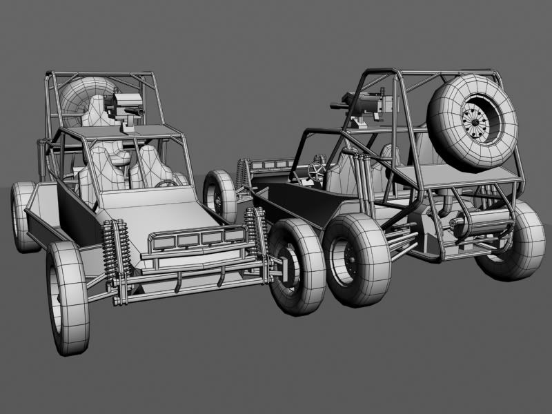
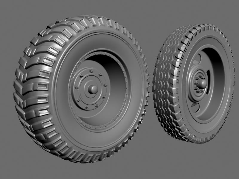
Last project to get done before GDC! I plan on turning this into a mini environment in the UDK but i'll get into environment stuff that later once I'm done with the main asset. I am doing a chenowth inspired fast attack vehicle. Here is where I am at so far, most of the LP is done and some HP tires. I still want to detail the Mark 19 on top a little bit more and add a machine gun to the passenger seat. Any and all help appreciated!
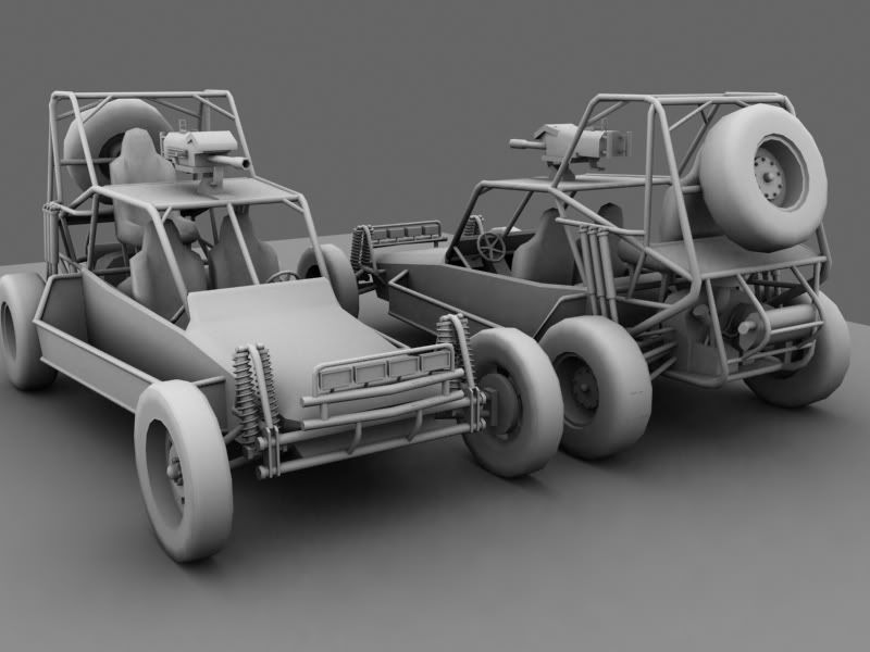
Looks great, especially the sub-d tires. One thing I notice, is your engine is a little lacking. There is no definition to really suggest that it is an engine. I know it is in back and below the upper gunner, but I feel that the engine deserves more detail.
@Electro: Thanks! I will have to play rage when it comes out, but it looks like fun! Looks like Borderlands with vehicles, haha.
@Rang3r1: I added some detail to the engine to make it look like is has more working components by playing with some shapes and extruding along splines. Hope nit's convincing enough now.
Now to finish up some LP detailing on the Mark 19 up top as well as get a machine gun into the passenger seat!
Another update with the machine gun in the passenger seat. Should have this baby unwrapped tomorrow since I have all class period to finish it. Then onto the HP modeling. I know I am new to PC and I am trying my best to keep current on the newer threads and chime in when I feel I can say something intelligent or beneficial to the OP, haha. Looking forward to any and all crits.
bit of an update. Baked normals and a diffuse. Touching up engine componentes and more dryed mud on the diffuse tomorrow, as well as kicking out some details in the normals map and then a spec. I'm really going to be cranking on this project for the next 2 days so I can print it by Saturday afternoon when I have class.
Asteric, in that render, no. I just have the spec and level and gloss cranked up a little under spec highlights to make the baked out normals pop against the light set up I've got.
Thanks for the recent comments and critiques all. I dusted it up a bit and threw it into UDK. I always have a terrible time lighting in th engine. he terrain lightmaps resolution is overridden and set to 62. So i'll for sure have to bump that up a bit more to get some nicer shadows on the ground. And I have a second UV channel for both asses in the scene so far set at 2048, yet the tent isn't casting shadows when using lightmaps. When not using lightmass it casts a solid shadow not showing alpha light showing through, so I'm not sure, i'm going to have to play with it a bit more. I'll also be adding a couple small props like a gas can and possibly something else. Any idea? Should I even keep the tent?
In that case carlo_c, I hope it's the spec! haha. I am in class with some friend who will be helping me out with lighting all day today so I will for sure best address the issue. Thanks for commenting!
Ive spent today material editing and baking out lights. Also toying around with the tent as well. Now I just need to throw in a couple speed props. I'm thinking 2 different crate types, and a military grade gas can. Anyone else have any good ideas about what to put in the scene to give it a little more.
My suggestion would be:
if the project was focused on the vehicle i would make the "presentation stage" more clean. Right now the r hills behind it and a tent that distract a lot from looking at the vehicle. Especially if the surrounding environment is quite bad (sry, but i guess u would agree, since your vehicle has way better quality than surrounding) :P
Tent gives the dotted shadow which makes it hard to read rear part of the vehicle.
Hills make other stuff blend with them, which does not help either.
Having a ground base is ok. But important is not to overdo it. The silhouette and depth of your primary object should be on the first place.
I like plain colors and gradients, but thats my preference. I saw great presentation done using a small base (kinda collectors' item, u know like those WH collectable figures for example).
Right now i have hard times reading your vehicle.
Now just one minor comment about the actual car
It looks great, but the silencer and exhaust look like flesh (probably because of some pale skin tone). Pay more attention of rusty pipes refs right now it does not feel like that.
Hey Matroskin, thanks a lot for the input! Of course the mains piece of the project is the vehicle, but the thing is is that for the class I am doing this project in we are supposed to have it in engine into a sort of mini environment. And yes I for sure agree that the vehicle is better than the surroundings. I am planning on creating my own sand/dirt texture and finding a less cloudy sky down as well as the two different crates and a gas can. Is there anything you think that could improve the tent? Ditch the tent completely? As fr as the vehicle goes, what silencer are you talking about. Are you referring to the muffler? I think you are, lol. I will update the diffuse and try and improve the rusty pipes look on the back for sure. Should hopefully be a quick fix.
roosterMAP: I'll probably throw some sort of text on the vehicles side. I wanted to avoiding any logos or text a the beginning of texturing simply because most of these vehicles are black ops vehicles and have nothing on them, but yeah, it could for sure add some characters.
EDIT* Just realized I want to make the tent a bit bigger like i had it when the lighting wasn't working.
i think the main issue with the tent is that it is too straight, and at some point i even thought it was a shrinked building :P
Some sort of ropes which create the tension to fix the metal frame would be good. Some hanging patches of camo net would be nice as well. Basicly u could add more "tentish" elements. Plus the texture is too shiny i think. I thought about a shrinked building before also because it looked like a glowing stucco/plaster wall
Make sure that from inside the net is more dark
As my personal choise though i would replace the tent by a ruined wall for example. Something that "sells" better
great looking doom buggy man, did a great job in your use of geometry. I don't see any waist at all. The render with the tent... there does seem like something is wrong with the tent and its throwing me off... maybe to tight and flat looking? not sure.
thanks JohnathanF! After GDC I got a lot of good feedback on this set up and later one for my portfolio I will b showcasing this asset not in an environment but just by itself. The tent was a big part of t. Too distracting and taking away from the FAV itself. I'll be re using some of the small assets form this scene in the new thing I am working on! Which i;ll be making a WIP thread within a week or so XD
If you want to make this thing actually drivable http://dandwire.com/vidtut/ut3vehicle1.htm
I've made a tutorial on a simple drivable vehicle using Unreal 3's vehicle code.
If you want to make this thing actually drivable http://dandwire.com/vidtut/ut3vehicle1.htm
I've made a tutorial on a simple drivable vehicle using Unreal 3's vehicle code.
hey, that is pretty awesome! Thanks much and I will for sure have to take a stab at that sometime! Again, thanks for sharing doublemint!
I really would love to work on a military buggy but never stumbled across enough solid reference.
Guess I just should just challenge myself and work without any orthographic images because you have definately proved that it would be a worth while project to work on.
which reference did you work from and did you stumble across a ortho?
Thanks Andy! Yeah it was a slight challenge with proportions since i didn't have any direct orthos to work off of. For reference, I just used just about every picture on th first 3 pages when you google image search "fast attack vehicle".
Replies
keep going! belongs in rage methinks :P
@Rang3r1: I added some detail to the engine to make it look like is has more working components by playing with some shapes and extruding along splines. Hope nit's convincing enough now.
Now to finish up some LP detailing on the Mark 19 up top as well as get a machine gun into the passenger seat!
Looks good, more mud as suggested, also, I would throw in light dust in every nook and cranny.
Its all looking a bit matte at the moment, not sure if that's the lighting but I'd get some more contrasting spec in there within the vehicle
lol Michael! :poly124:
My suggestion would be:
if the project was focused on the vehicle i would make the "presentation stage" more clean. Right now the r hills behind it and a tent that distract a lot from looking at the vehicle. Especially if the surrounding environment is quite bad (sry, but i guess u would agree, since your vehicle has way better quality than surrounding) :P
Tent gives the dotted shadow which makes it hard to read rear part of the vehicle.
Hills make other stuff blend with them, which does not help either.
Having a ground base is ok. But important is not to overdo it. The silhouette and depth of your primary object should be on the first place.
I like plain colors and gradients, but thats my preference. I saw great presentation done using a small base (kinda collectors' item, u know like those WH collectable figures for example).
Right now i have hard times reading your vehicle.
Now just one minor comment about the actual car
It looks great, but the silencer and exhaust look like flesh (probably because of some pale skin tone). Pay more attention of rusty pipes refs right now it does not feel like that.
roosterMAP: I'll probably throw some sort of text on the vehicles side. I wanted to avoiding any logos or text a the beginning of texturing simply because most of these vehicles are black ops vehicles and have nothing on them, but yeah, it could for sure add some characters.
EDIT* Just realized I want to make the tent a bit bigger like i had it when the lighting wasn't working.
Some sort of ropes which create the tension to fix the metal frame would be good. Some hanging patches of camo net would be nice as well. Basicly u could add more "tentish" elements. Plus the texture is too shiny i think. I thought about a shrinked building before also because it looked like a glowing stucco/plaster wall
Make sure that from inside the net is more dark
As my personal choise though i would replace the tent by a ruined wall for example. Something that "sells" better
http://dandwire.com/vidtut/ut3vehicle1.htm
I've made a tutorial on a simple drivable vehicle using Unreal 3's vehicle code.
hey, that is pretty awesome! Thanks much and I will for sure have to take a stab at that sometime! Again, thanks for sharing doublemint!
I really would love to work on a military buggy but never stumbled across enough solid reference.
Guess I just should just challenge myself and work without any orthographic images because you have definately proved that it would be a worth while project to work on.
which reference did you work from and did you stumble across a ortho?
Inspired man!
keep it up.
there is tonns more reference when you google fast attack vehicle.
Originally I was googling, military buggy, military dune buggy etc
EPIC FAIL, eh? lol
cheers mate!