WIP Thundercats Liono
Hi all-
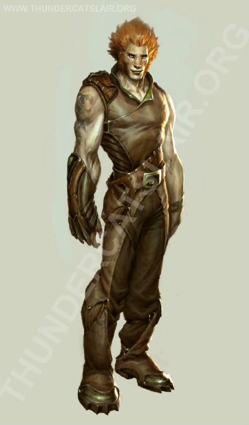
this is something I started a while back before a LONG break to settle into a new job. I've decided to complete it though I'm not totally happy with it. It's my first shot at developing something from another person's concept art. I've taken quite a few liberties along the way and like I say, not happy with it but I'm determined to finish it.
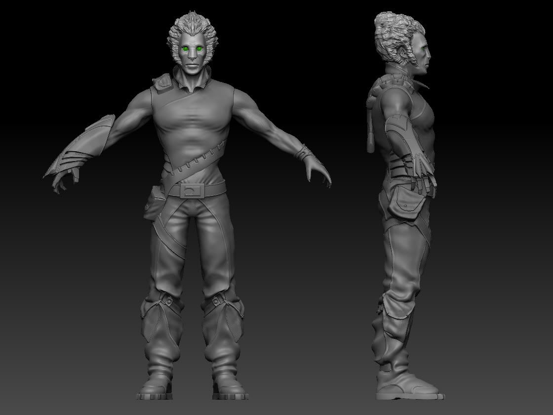
The concept is from the (unproduced) Thundercats CG movie. The low poly is about done at 6.5k polys; I'll show when I've got some maps baked. Please ignore the hair, it's a placeholder as the realtime hair will be alpha planes. This hair just makes him look like Akuma's gay cousin.
Here it all is:


Working on unwrapping for the low poly. And yes, he does have the sword of omens, it's just not in this pic
comments welcome
~P~
this is something I started a while back before a LONG break to settle into a new job. I've decided to complete it though I'm not totally happy with it. It's my first shot at developing something from another person's concept art. I've taken quite a few liberties along the way and like I say, not happy with it but I'm determined to finish it.
The concept is from the (unproduced) Thundercats CG movie. The low poly is about done at 6.5k polys; I'll show when I've got some maps baked. Please ignore the hair, it's a placeholder as the realtime hair will be alpha planes. This hair just makes him look like Akuma's gay cousin.
Here it all is:


Working on unwrapping for the low poly. And yes, he does have the sword of omens, it's just not in this pic
comments welcome
~P~
Replies
thanks!
~P~
i would go back to the body and really focus on the anatomy. make this guy look as real as possible on the basic shapes and forms without going into hyper detail. it would be a good practice for anyone, so i say take this route, then go back to the other pieces that you already have modeled out, and form them around and resculpt areas that need it. i really think you will see a HUGE benefit from the final piece if you step back and really be self critical of the body without any clothing or props added.
-Woog
Regards the proportions, I've bulked him out on the arms some, which has worked a treat. I'll update shortly with that. I think I can better adjust his height and general body size in the low poly without it affecting the texture over-much. I'll investigate both this and using some transposing to get his height up. Thanks to firebert for pointing out about realism versus stylism. I'd like to claim it was a stylistic choice- I guess my anatomy isn't that great yet (it's only my 3rd human model). I Zsphere'd the nase but used a ref- either my ref or my observation are't up there! I'll see what I can do but TBH I'm more likely to focus on the next peice as this guy is getting old real fast!
Well noted about the glove, Woog- I didn't spot that at all! I'll flip the low poly to compensate
And yes, the hair is crap!
~P~
~P~
Cool though, looks good. Jealous