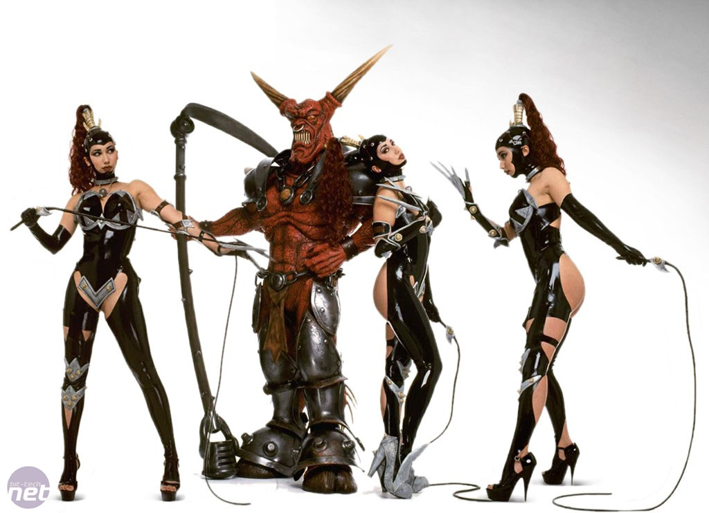
The BRAWL² Tournament Challenge has been announced!
It starts May 12, and ends Oct 17. Let's see what you got!
https://polycount.com/discussion/237047/the-brawl²-tournament
It starts May 12, and ends Oct 17. Let's see what you got!
https://polycount.com/discussion/237047/the-brawl²-tournament
Horned Reaper
Hello,
My newest work (4 days) - I am looking to improve so please ruin it as much as possible.
It is a new take on an old game 'dungeon keeper' one of the boss monsters was a 'horned reaper', which is amazing cool. I'd like to change the concept a little and include some hard-surface armour sculpting.
I was thinking about a sycthe as a weapon.
I have not detailed yet.. blocking in armour and accessories before detailing his skin and refining muscle flow - but always crits are welcome on anything.


Most Recent update:


My newest work (4 days) - I am looking to improve so please ruin it as much as possible.
It is a new take on an old game 'dungeon keeper' one of the boss monsters was a 'horned reaper', which is amazing cool. I'd like to change the concept a little and include some hard-surface armour sculpting.
I was thinking about a sycthe as a weapon.
I have not detailed yet.. blocking in armour and accessories before detailing his skin and refining muscle flow - but always crits are welcome on anything.


Most Recent update:


Replies
-Woog
Im honestly not a fan of your design of the face, it looks more like something that would fit on a small mean troll to me. The chin/neck area is also very hard to read and looks weird. I would also think about how he could be able to open that mouth.
Other design looks good but you need to work more on the anatomy. the abs look just wrong and the lower arm need better definition of muscles and bones. Most muscles look also more carved in, at the current state, instead of really flowing with the body.
Its really a hard subject haveing to make such a build up exagerated muscles anatomy. I suggest getting a lot of bodybuilder reference pictures for it.
My personal feeling is that you've drifted a little too far from the original design. Horny is a pretty iconic character and changing his face so much along with switching his hooves for feet has removed most of what made him recognisable. It's up to you. There's no harm in having a big cool demon of your own design in your portfolio, but my thinking is if you're going to say it's based off the Horned Reaper then it'd be good if it looked at least a bit like him.
As I see it you reduced the most unique elements and got a charakter which is much mor generic than it should be.
So think you should keep close to the orignal anatomy of the charakter. Get the horns and the hooves and the unique shape of the body and face into your model.
Also notice, that The main weight of the reapers body is at its torso and shoulders, while your model has a more of less equally distributed mass (front view) and is lacking mass at the shoulders / head (in the side view)
So first do the Reapers body unitl you are totally happy with it and you've captured its essence. Then give your version a unique touch by dooing armor and equip.
Nothing more fun than slapping the shit out of your imps. Always been a big fan of Peter Molyneux games.
Just a simple front autho for today.
I made his waist slightly smaller, I think this version is more delightfully evil..which is 'good' (Pun intended)
All you need to do is type in bodybuilder abs in google to see what I'm talking about... but here is a reference anyways
Notice where the abs flow to... they are wider too covering more of his torso.
I mean he is a demon so you can take some artistic liberty, and the average person might not notice, but if you're using this as a nice portfolio piece I'd base it a bit more on reality since he looks pretty proportionate otherwise.
My next update will include adjustments to anatomy.
:thumbup:
Thank-you!
I so wanna be able to sculpt real detail.. everytime I hit 5 mill polys my PC goes into mad-mode.
Next to sculpt : Armour + Damage, HS sytche ( CANT SPELL IT ), and refine anatomy (hopefully some skin definition (thick leather, hide, etc)
I'm going to try and get from the generic ripped body to something a little more professional... stay tuned..
I took the model back to basics to get good anatomy first, also I took the time to learn zbrush (previously a mudbox user), must say that it is a fine peice of a software and I'm upset to of previously used mudbox
Here is a current shot, not finished by any means - I think it would be interesting if I had some of his bones showing, while this isn't nessacery correct according to the old concept, in the current generation texturing allows for such small details.
The forearms look a bit wierd, like its twisted or connected wrong, may just be the viewing angle.
The head, needs more work. There doesn't seem to be much room for a skull or supporting structure for the teeth. The upper lip especially, it looks like it came from a frog and would have a lot of trouble supporting the teeth let alone being ferocious in any way.
Part of what makes the demon in your ref so badass, is his huge square jaw and over developed trapezius that flows up behind his ears. Your demon has a slightly awkward trapezius transition making his neck appear a little weaker and skinnier than it should be for someone of that bulk.
See how it flows up into the base of the skull. its kind of hard to develop a bump like what you have on your model, not impossible but pretty unusual.
Proper anatomy!
Keep it up you're making good progress.
blocked in head and feet.
Not worthy of a full turn around.
Learning zbrush, subtools etc. Have learned alot past few days.
Thank-you and crits always welcome.
http://babyhatchetblog.wordpress.com/2006/09/20/whats-wrong-with-tom-cruises-smile/
Because you've departed so much facially , you may as well have not mentioned he's the horned reaper, as right now, aside from the horns maybe, there's little to compare.
There was a guy who made a high-poly render in SoftImage which got quite close, and was still recognisable, even without the giant toothy grin.
Here's a rough paintover, if you pulled out, stretched the chin, gave him a stronger jawline, a brow ridge, pronounced cheek bones and adjusted the horns so they appeared to grow straight out of the skull ( rather than what appears to be curling around first, then going straight ) then you'll be onto a winner.
Note how the softimage version and the cartoon version still captured the essense of the character without departing from it so much you couldn't recognise it.
My zbrush crashes everytime i try and save the tool, fing annoying.
http://www.youtube.com/watch?v=616PgQCUcp0&feature=player_embedded#
The hands have great style and character, I really like em.
Wow! Didn't see the update, has improved a lot, really like the shape of the head now, fits better with the rest of the character.
Not sure how hard it is for you to adjust the horns, their line is a little off, seemingly originating from the centre of the skull rather than the top - only a minor thing, the whole head has come on leaps and bounds.
Looking forward to the cloven hooves.
I'll post an update later today as i am having troble making progress since zbrush always crashes when i try save my progress.
anyway have same trouble?
[ame]
realized I was missed alot of stuff to blockin,
will do that now and give screenies.