Home 3D Art Showcase & Critiques

Head base mesh

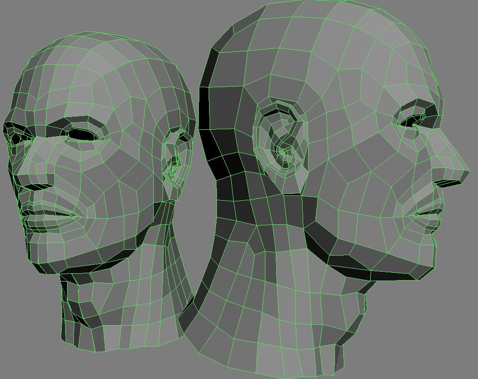
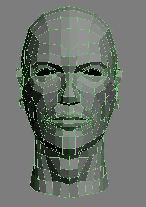
Hi, I'm trying to get back in to modeling as I haven't had the chance to do much for the last 12 months, looking for advice and comments on a few things. Had a go at a base mesh for a male head anyone see anything that's a bad practice or some ways that I could make it more impressive/useful as a base mesh for sculpting/further modeling?? C&C very much welcome!
Untitled-1.jpg

base_mesh_front.jpg


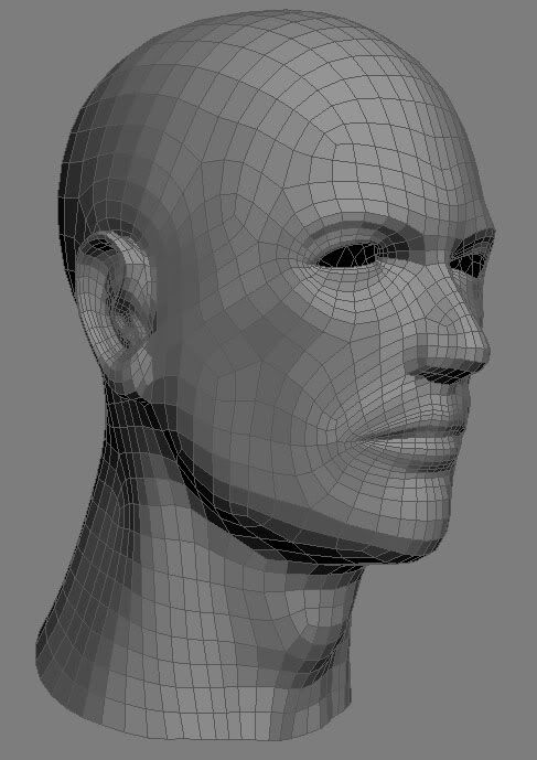
smoothed version, mesh smooth, no isoline, no smooth result
smooth_head.jpg

Replies

  • woogity
    hi Banzai, id say the mesh looks pretty good at the moment. no tris at a glance and it seems to smooth out pretty well. if i had to nitpick id say watch the rectangular faces around the mouth, depending on what you wanna do with the high poly they could be bothersome, but on the whole it looks pretty clean to me. O and just a personal preference, i dont like head bases with open eye holes like that, you are gonna get a lot of wasted polys at higher sub-d levels on the inner edge of the eyelid and such, i also hate fixing eyes into sockets hat have holes through them, just me though. gl on the progression!

    -Woog
  • Blackstone69
    Offline / Send Message
    Blackstone69 polycounter lvl 13
    I would have to say that mostly seems nice overall but id work a little more on anatomy a little bit more the positioning of the ears is a little bit off
  • DarthNater
    Offline / Send Message
    DarthNater polycounter lvl 10
    Looks good, but what is going on in the adam's apple area? it looks like you have a tiny sliver of a face :) Get rid of those (unless it was just something weird going on in the screenshot).
  • Mark Dygert
    Looks pretty good, looks really good actually.

    I'd be tempted to dig in some nostrils.
    I'm also not so sure about the adams apple, personally I would rather sclupt that out rather than have to push it back in.
  • throttlekitty
    Offline / Send Message
    throttlekitty ngon master
    Nater: looks like the vert doesn't come all the way in for the symmetry.

    At first glance, the adams apple does look a bit off to me too. Looking again at the cage suggests you're setting up for an older face, maybe a bit of saggy skin?
  • Piflik
    Offline / Send Message
    Piflik polycounter lvl 12
    You might want to find a way around the two poles on the cheek...they could get annoying on animating...other than that good.
  • DrunkShaman
    Offline / Send Message
    DrunkShaman polycounter lvl 14
    Are you planning on moving lips around (animation wise)? If so, you might want to extendmouth inwards so it would actually look like it could speak. Another thing, Nostrils needed to be extruded (like Vig stated)

    If you were relying on the smooth mesh for the forehead, than it is ok but usually there 2 lines running on top of his eyebrow line. It has to be straight (unless you have this as an initial setup).

    Eye sockets looks good just need to move them inwords abit if the person is not skinny. (or I am not sure what ref image you are following)

    Awsome job on ears.

    Overall Amezing work. You still got skills after 12 months!!
  • ZacD
    Offline / Send Message
    ZacD ngon master
    The edge loops around the eyes and mouth look good, but the jaw line and rest of the face need some cleaning up.

    2z4murt.jpg

    You want to limit 3 and 5 vertex poles, the ones I circled can cause issues while animating (ignore the one circled on the middle left, I got circle happy)

    The cheeks edge flow should be similar to what I drew.
  • bbob
    You have some very long rectangular polygons especially around the mouth, which is going to be a pain if you want to sculpt fine detail.

    What you should be looking for is as even quads as possible..
  • Banzai421
    Thanks for the replies people, working on your suggestions now.

    Woogity - about the eye holes, how should i fill them in? Just fill in the polys on the mesh and shape them to look like the surface of the eye, or put a sphere behind the eye as a seperate element of the mesh?
  • Michael Knubben
    ZacD; It's a basemesh, animation doesn't even enter into it. Most important is to keep things evenly spaced quads, as Bbob mentioned.
  • ZacD
    Offline / Send Message
    ZacD ngon master
    Poles can cause smoothing issues, and its never a bad idea to practice good topology.
  • Banzai421
    Thanks for all the input, I've had a go at pretty much overhauling the topology for a better flow (thx ZacD) and also to minimize the longer rectangles.

    head_resculpt.jpg


    Managed to get a good basic sculpt out of it quite quickly too

    head_trio.jpg

    Any more comments etc welcome, I'll continue posting progress with portfolio work etc here and in the latest work thread.
  • Banzai421
    Used the same loops from the second topology but added a better curve to the face, and re-jigged a lot of the features.


    THREE_HEADS.jpg

    Again this is just working towards a good base mesh, but will post some of the sculpts soon
  • Michael Knubben
    Please, do something else with the ears. With your ears like this, you're not really at much of an advantage when compared to just sculpting from a sphere. Pull them out more, and make sure there's enough topology behind it to be able to work on them at a low subdivision.
  • woogity
    agreed on the ears. as for the eyes, id just fill them in. also avoid sculpting the eyes from the face mesh as you kinda alluded to, append some z spheres in there instead. i use the clay tubes brush in frame mode to push the filled in part to the back of the eye socket, then the clay tubes brush to make the eyelids at higher sub d lvl. that brush is exceptional for eyelids. if you choose to do it like this make sure you switch back and forth with frame mode, so you dont mess up your distribution too much.
  • Banzai421
    head seems good now moving on to torso.

    torso_and_head_trio.jpg

    tuo_wire.jpg
  • Gallows
    Offline / Send Message
    Gallows polycounter lvl 9
    The face looks kind of expressive right now. I'd say just go back and relax the side of the lips to a neutral position. It sort of looks like a smile right now. It's not really a HUGE deal if you don't plan on rigging but it's always a good idea to keep that in your workflow. Another thing is you may be able to take out some of those loops for now and work a little lower res on the torso and neck, then just subdivide it a bit later. Looking good though, keep it up!
Sign In or Register to comment.