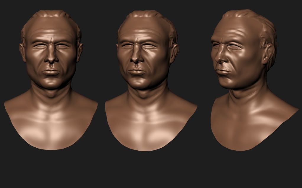
Nice start there. Proportions look good to me
The mouth seems a bit weird yet and the folds on the neck need some work as well as the ears of course. Maybe there are slightly too strong in parts (over the mouth)
The fold on the chin seems to far up.
Get the detail in there...looking forward to see more.
Looking good! His eyes look too close together, and ditto on the neck folds.
Also, I think he's a little pouty right now, maybe move the upper chin forward, or the lips back.
That's a great nose!
Nice work so far man!
I'm not exactly sure what is going on in that last one, is it still really early WIP?
Anyways, my suggestion is to slow down. Rushing thew these and making as many possible has its advantages, but I think the real learning takes place when you truly study the forms, and try to understand what they mean, there function, and basically how to make things look correct.
That's not to say that you need to spend a month on a sculpt, but I would definitely spend a week plus and really put some polish in. Keep going man, I'll be learning right along with you on my thread.
Yes, this is still early i was just excited with the progress i made on this sculpt. Ill be following your thread as well, its cool to see someone else progressing right before your eyes.
While it doesn't look too bad, I can't help but say she looks very masculine. Females are Slender and more graceful than males. She looks overly athletic. Her face makes her look old too. And those breasts are massive. I mean super huge, damn son.
Her shoulders are wider than her waist, which gives her a very masculine body shape.
Are you using face references? Or are you going by memory? Look at references until you are sick of them.
I agree with Prophecies about the old face thing and the breast thing. If you ever see any hardcore women athletes, their breasts are not overly large (or if they are they at least wear a sports bra). One more thing is that (maybe its just the lighting) with those cuffs, her forearms look much wider than bicep area. But other than that good work so far! keep it up
My idea of Wonder Woman is that she would be a bit bulky up top, I'm trying to portray a semi realistic style. Like if she is battling all types of super humans and creatures is she gonna be really slim and petite or is she gonna be reasonably buff? I looked at alot of images of female bodybuilders, and woman who had the ideal body proportions that i was looking for.
Here are some references i used
Let me know what you guys think I could be incredibly wrong.
Ahhh I see where you are getting to. I think your lighting is playing evil tricks.
She just doesn't seem to be as sleek and slender as your references. Her biceps seem smaller than her forearms too, like Emagdnim mentioned.
I say work on making her stomach area more slender and perhaps downsize those breasts a tiny bit, and it should look far better. Then you can start working on the face.
The model is coming along though! Keep up the good work!
Now THAT is looking far more like a female! Keep it up! The knees seem strange to me. There shouldn't be two distinct lumps. Slightly less pronounced and it's all good. It also seems like her ribcage is hanging way down there, pull that up a bit, make it stand out a little less, it will help with keeping her body slender.
For the hair, what will really make a difference is that long flowing hair over the shoulders, it will girl it up quite a bit.
A little update today. Here are some side by side comparisons of when i first started this thread to my current progression. Finally feeling like I'm getting better, can't wait to see were I'm at in three more weeks.
Hey guys and gals, thanks for your nice comments! Here is a study i did using Joe Mad's ultimate's wolverine for reference. Not really sure if i want to make the hair or not. C&C always welcomed.
[edit-- some of this stuff may have already been addressed... I didn't see your 2nd page somehow ]
This is some cool stuff, and your output is pretty quick. How long on average have you been taking on those busts? Oh, and you've done it a couple of times with the figure sculpt, but in the future could you post side profiles for the faces as well? Having that in addition to the other poses will help more when looking at your work.
Anyway, back to business-- as Emagdnim and Prophecies have mentioned, your Wonder Woman has some proportional issues, as well as a touch too much man in the face and shoulder areas.
The hips have already been mentioned, but the femur is a little too short, and your arm length is a bit wonky. One of my favorite rules of thumb is that when the arms are resting at the sides the elbows should be on the same line as the belly button. The flanges of the pelvis are jutting too high up, too far forward, are too sharp-- they would only be that visible on a severely anorexic individual, and even then remember that the bone is covered in layers of flesh which tend to soften everything out. Also the space between where the hip ends and the tip of the pelvic flanges is indented too much, especially for a woman.
On the chest you should include a central vertical indent to run from the belly-button up to the neck, and you can accentuate the division between the ribcage and abs a little more as well, especially since it's wonder woman so she probably has a decent 6-pack. On the other side of the torso you need to include an indent for the spine that should flatten out around the height of the belly button (the belly button holds the secret to all anatomy ). You could do with softening the muscle transitions on the arms and legs-- they're a bit sharp right now-- and the breasts are too.. perky. Either reduce their size or let them hang a little more-- those sweater-puppies she currently has are gravity-defying. Lastly, the forward part of feet are too flat, and the achilles tendon connects too directly with the heel-- indent it a little more around the same height as the top of the foot.
I hope this helps, and I've included some reference photos as well as a great piece by nox (noxizmad) to help illustrate some of this stuff. Keep it up, and I can't wait to see the next pass.
As a final note, I like the typesetting on your portfolio site, but I'm worried that your 'AF' logo is flirtingly reminiscent of the EA logo. It's not so much a concern that EA would come after you, but rather that potential employers might think you just swapped out the letters, regardless of whether that's true or not.
Hey thanks for the sound critique! The Wonder Woman was actually created in March along with some of the other pieces that came before. I started this thread a day before my last class, the purpose being to track my progress and hopefully get better. This thread is also sort of a timeline for me to gauge how far I have come.
So yea the Wonder Woman certainly needed a lot of work, you hit the mark on all those points. The latest female model i posted is a completely new model I'm working on(because my portfolio desperately needs it) and I'm hoping to completely knock my old female model out of the park.
As far as the website, I have a friend building the whole thing as a favor. I will make sure to mention the logo.
are you sculpting the eyes out of the same mesh as the face? it very rarely works out well that way, especially when you look at the side view, nice sculpting and anatomy progress anyway
You need to focus more on your facial anatomy. Almost all of the faces you have done have had the eyes way too high on the head. Other than that, you have been making great improvements.
When i look at your work i think you are taking comics to much as a reference, you should start by looking at real life anatomy.
Lookup skullstructures and look into some anatomy books like loomis or bridgman
The main thing your got to focus on is proportions!
When it comes to the muscles on the fullbody characters , try not to look at them as loose muscles hanging on some bones but look at them as masses wrapping around and overlapping eachother.
Not every muscles needs to be visible on the outside
Replies
The mouth seems a bit weird yet and the folds on the neck need some work as well as the ears of course. Maybe there are slightly too strong in parts (over the mouth)
The fold on the chin seems to far up.
Get the detail in there...looking forward to see more.
Also, I think he's a little pouty right now, maybe move the upper chin forward, or the lips back.
That's a great nose!
Fixes: Moved eyes out a bit farther, Skin noise, attempted lip fix.
Still Working on the ears.
Ear needs work
I'm not exactly sure what is going on in that last one, is it still really early WIP?
Anyways, my suggestion is to slow down. Rushing thew these and making as many possible has its advantages, but I think the real learning takes place when you truly study the forms, and try to understand what they mean, there function, and basically how to make things look correct.
That's not to say that you need to spend a month on a sculpt, but I would definitely spend a week plus and really put some polish in. Keep going man, I'll be learning right along with you on my thread.
pull in and chisel out
not other way around.
saves a ton of time and avoids fishy lips
The last one (afro girl) looks better, at least from the angles posted
Going to add the spine indication right now.
Comments and crits are always appreciated as well.
Her shoulders are wider than her waist, which gives her a very masculine body shape.
Are you using face references? Or are you going by memory? Look at references until you are sick of them.
Here are some references i used
Let me know what you guys think I could be incredibly wrong.
She just doesn't seem to be as sleek and slender as your references. Her biceps seem smaller than her forearms too, like Emagdnim mentioned.
I say work on making her stomach area more slender and perhaps downsize those breasts a tiny bit, and it should look far better. Then you can start working on the face.
The model is coming along though! Keep up the good work!
Updates- Breast reduction, Slightly less bulky, removed hard cheek lines.
For the hair, what will really make a difference is that long flowing hair over the shoulders, it will girl it up quite a bit.
Keep up the hard work!
C&C always welcomed.
Here is the reference I used.
This is some cool stuff, and your output is pretty quick. How long on average have you been taking on those busts? Oh, and you've done it a couple of times with the figure sculpt, but in the future could you post side profiles for the faces as well? Having that in addition to the other poses will help more when looking at your work.
Anyway, back to business-- as Emagdnim and Prophecies have mentioned, your Wonder Woman has some proportional issues, as well as a touch too much man in the face and shoulder areas.
The hips have already been mentioned, but the femur is a little too short, and your arm length is a bit wonky. One of my favorite rules of thumb is that when the arms are resting at the sides the elbows should be on the same line as the belly button. The flanges of the pelvis are jutting too high up, too far forward, are too sharp-- they would only be that visible on a severely anorexic individual, and even then remember that the bone is covered in layers of flesh which tend to soften everything out. Also the space between where the hip ends and the tip of the pelvic flanges is indented too much, especially for a woman.
On the chest you should include a central vertical indent to run from the belly-button up to the neck, and you can accentuate the division between the ribcage and abs a little more as well, especially since it's wonder woman so she probably has a decent 6-pack. On the other side of the torso you need to include an indent for the spine that should flatten out around the height of the belly button (the belly button holds the secret to all anatomy ). You could do with softening the muscle transitions on the arms and legs-- they're a bit sharp right now-- and the breasts are too.. perky. Either reduce their size or let them hang a little more-- those sweater-puppies she currently has are gravity-defying. Lastly, the forward part of feet are too flat, and the achilles tendon connects too directly with the heel-- indent it a little more around the same height as the top of the foot.
I hope this helps, and I've included some reference photos as well as a great piece by nox (noxizmad) to help illustrate some of this stuff. Keep it up, and I can't wait to see the next pass.
(NSFW -- bewbs & junk)
Female1
Female2
Male1
Male2
nox
As a final note, I like the typesetting on your portfolio site, but I'm worried that your 'AF' logo is flirtingly reminiscent of the EA logo. It's not so much a concern that EA would come after you, but rather that potential employers might think you just swapped out the letters, regardless of whether that's true or not.
So yea the Wonder Woman certainly needed a lot of work, you hit the mark on all those points. The latest female model i posted is a completely new model I'm working on(because my portfolio desperately needs it) and I'm hoping to completely knock my old female model out of the park.
As far as the website, I have a friend building the whole thing as a favor. I will make sure to mention the logo.
Thanks Wake that was some very thorough advice!
Concept
Currently working on a dark wizard type of character, a real callus, cold man with no regard for life. Critique or comment is greatly appreciated.
Also here are some pics of another model I recently completed.
I swear, as I was scrubbing down in this thread, I thought I saw her cock and balls in this pic.
When i look at your work i think you are taking comics to much as a reference, you should start by looking at real life anatomy.
Lookup skullstructures and look into some anatomy books like loomis or bridgman
The main thing your got to focus on is proportions!
When it comes to the muscles on the fullbody characters , try not to look at them as loose muscles hanging on some bones but look at them as masses wrapping around and overlapping eachother.
Not every muscles needs to be visible on the outside
hope this helps , gl