Workshop #4 - sXe Seany
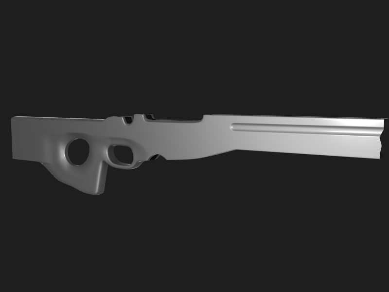
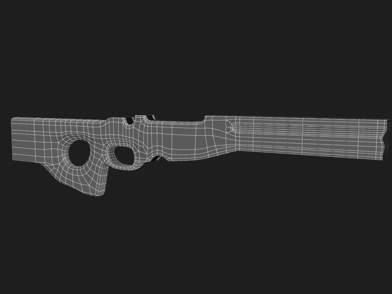
Finally got around to doing a workshop. I hope to learn a lot about sub-d and workflow during this project. Any c&c will be much appreciated. (Paint overs are always great  )
)
Anyway, first post. This is actually my second attempt at the body. On my first attempt I blocked out the whole thing first and then began sub dividing, which caused me to run into a lot of problems, so I scrapped that. Here is the second go. Its not near finished, but I figured I would post it to keep me motivated. The handle area is just blocked in for the moment. I cut off the front tip of the body because I was not happy with what I had. I'll fix that for the next post.
(Thanks to SyncViews for the materials)


Replies
A. Take a look at actual curve
B. It should be more round and less pointy
C. Being this an industrial model, straight edges should be absolutely straight, use some more geometry near the curved extremities to make the central line lie flat
D. Is it too deep? Cannot really tell from the image (see J)
E. See point C
F. the surface seen from the side of the model appears to be more thin, it means the section should be more V shaped than U shaped (It is because of the draft angle needed to extract the shell from the mold)
G. This is a more organic surface, make it less straight, and the section more round (like point I)
H. Is the hole right? It looks a bit too round, while should be a little more oval, but cannot really tell.
I. The handle should be a little less flat and more round, not perfectly round, just less hard
J. When framing an object for a showcase render use a better point of view, where all dimensions can be read. Laying the camera too flat makes impossible to determine the model width. In general the chassis seems to be a little too thin, but it's just an impression. Crop the empty background.
Keep up the good work!