Glock
Hi,
I started modeling about two years ago. I never really got in to texturing, but I started doing that now.
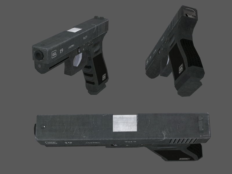
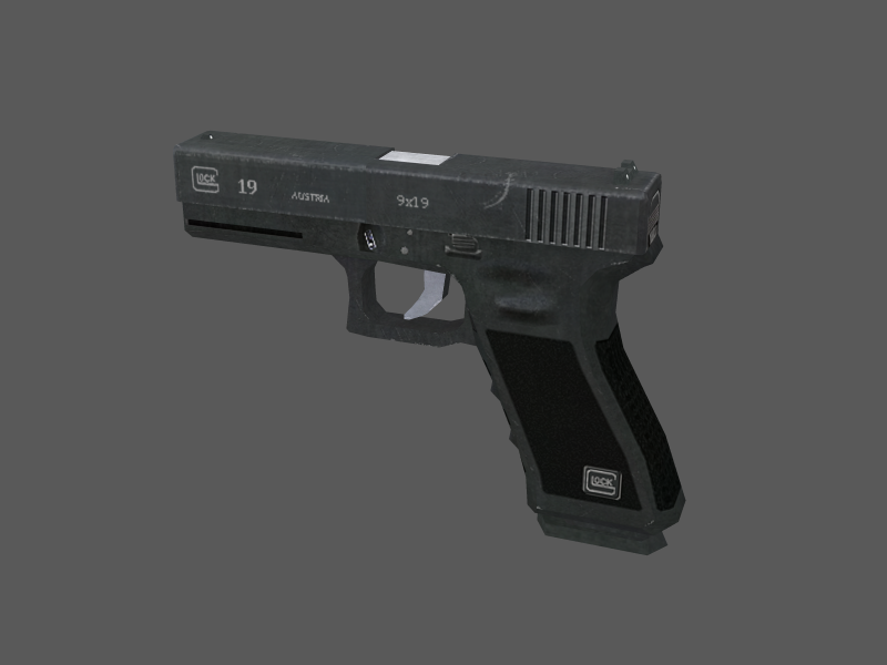
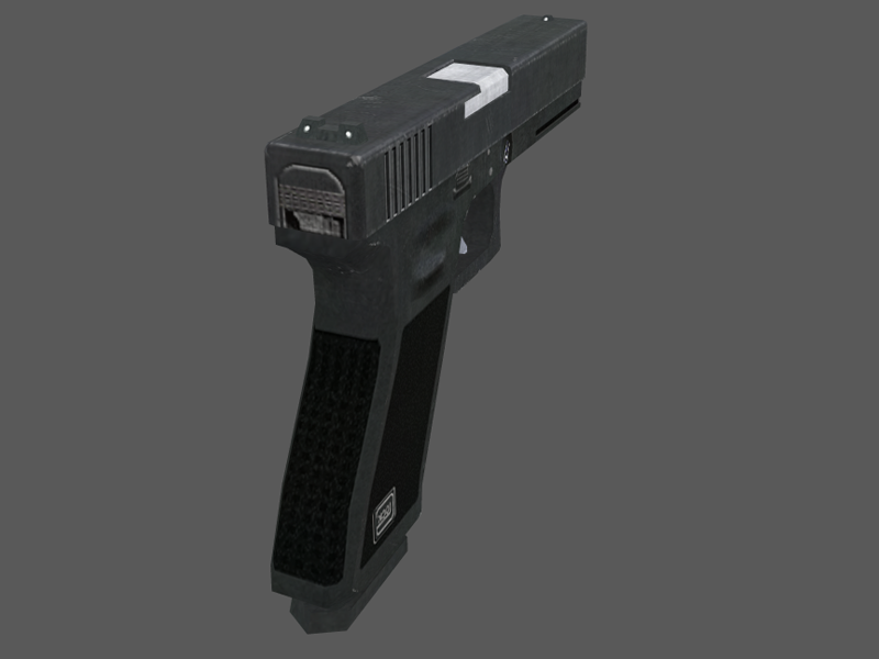
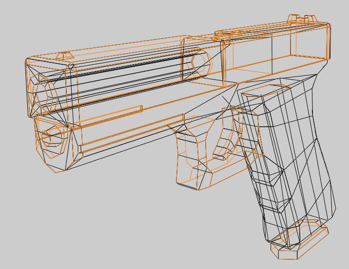
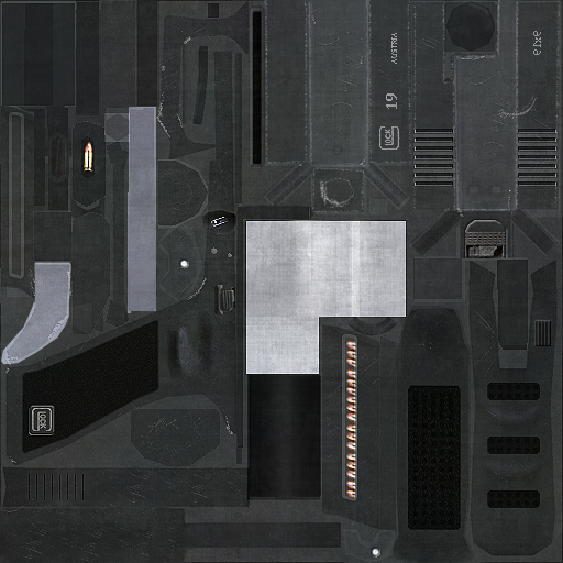
Here's my glock. 784 triangles, 512*512 texture map, this model is for a first person shooter (q3 engine based), I'm really looking for some constructive critism so I can improve.
I started modeling about two years ago. I never really got in to texturing, but I started doing that now.
Here's my glock. 784 triangles, 512*512 texture map, this model is for a first person shooter (q3 engine based), I'm really looking for some constructive critism so I can improve.


Replies
p.s. Glocks are not made of metal.
keep up the good work.
Add AO/Spec/Normal and this will be better.
Cheers!
Anyway.
Try not to use a phototexture as your metal base and paint lighting into your texture
to fake the reflections/lighting/specular. And use another base for the synthetic stuff.
Also what rang3r said about the cloudy look of the metal.
Not just necessarily good looking, but having different maps for each attribute of a material for how it acts in real world, gives better control over how it should appear in real-time/renders.
While painting in those is somewhat quicker, but then it wouldn't react accordingly to the surroundings in-game, which is very much required, especially if its a handheld weapon/prop like this one. You can't paint in reflections when the object is not stationary in the given premises,.
This may not be the best example but you need to define your materials a little better and normally when hand painting the light I tend to paint the highlights by hand and don't rely on a ao map.
How should I make my base metal? What I do now is the render>clouds and then sponge method, and I add some blobbyness by painting white and black with various dirt brushes, on a layer with low opacity.
It will takes ages to fix this, so I'm going to do something new and keep all suggestions in mind.
That is correct, but read what you had asked, you generalized the question, so you get an answer based on extensive technology.
For baking in - Maya or Max
Use multiply for AO map on the diffuse map, that should work just fine..
Your currents are well made, just need a bit of contrast I suppose..
Sure they are. Glocks aren't "ceramic" like a lot of movies would like to have you believe - the slide, barrel and many of the inner workings are made out of steel. The frame, however, is indeed not made of metal - instead being a polymer.
..and as many people said, the texture is too light. Glocks hover more towards black in real life (unless you blast them with flash like a lot of reference photos on the internet do). In reality there's not really much difference at all between the grippy part of the frame and the rest of it. The frame could possibly benefit from some noise as well. Front sight post is too low as well.. but overall it's not bad for a low poly model.
Skip ahead until you see an actual glock.
[ame]