The BRAWL² Tournament Challenge has been announced!
It starts May 12, and ends Oct 17. Let's see what you got!
https://polycount.com/discussion/237047/the-brawl²-tournament
It starts May 12, and ends Oct 17. Let's see what you got!
https://polycount.com/discussion/237047/the-brawl²-tournament
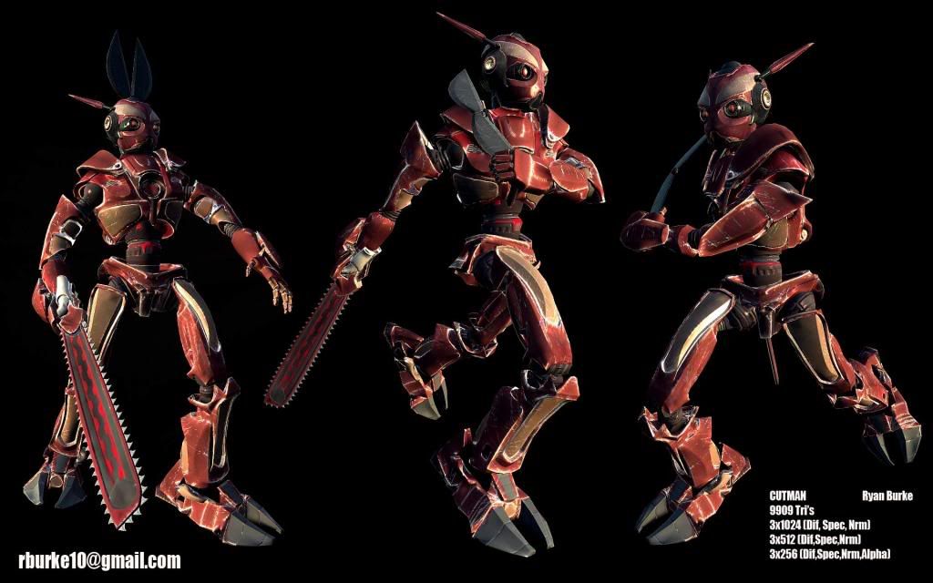
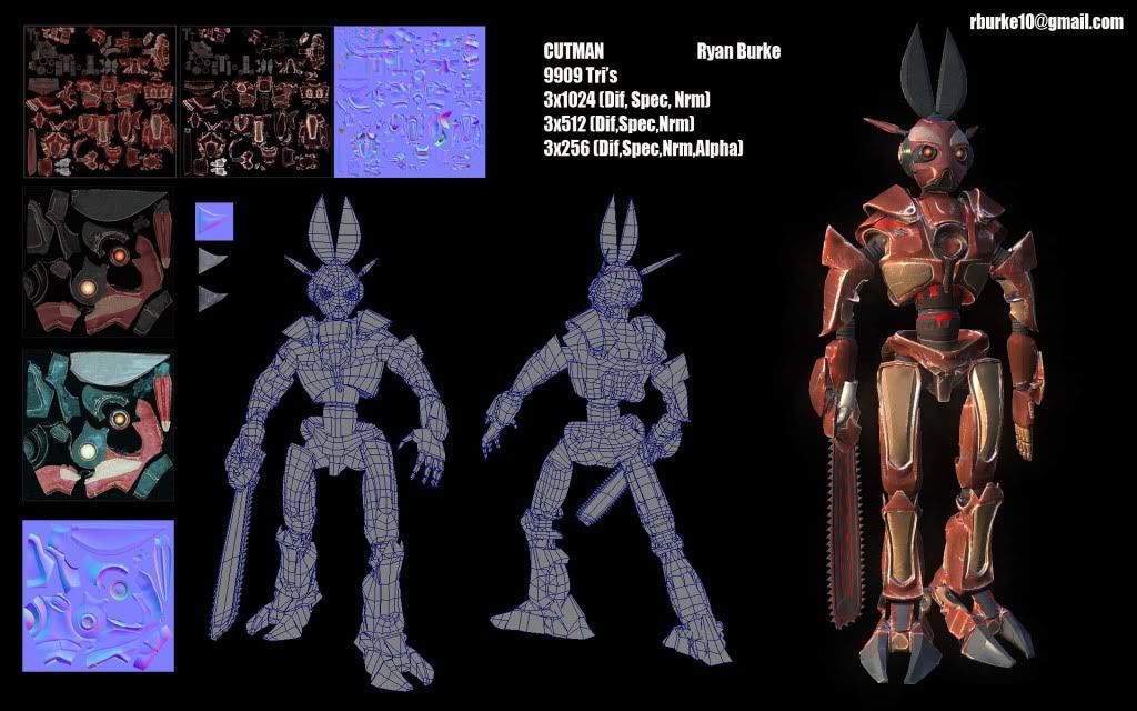
Cutman Remake (WIP)
Well this was my entry for a recent contest at www.gamestepper.com the contest was to redesign one of the original character from Mega Man 1. I choose to redesign cutman. We had a 10k tri budget and all textures could total a single 2k map.
you can see the other entries here:
http://gamestepper.com/forums/showthread.php?t=4035
Unfortunately i did not place but i still like it anyways.
winners here:
http://gamestepper.com/forums/showthread.php?p=43033#post43033
I plan on developing the textures further and have been working on a pedestal for a turntable. Any feedback is appreciated, there is a lot i could have done better, and i only had one day for textures, posing, rendering, and composition so i might even just start the textures from scratch, depends what sort of feedback i get.


Replies
Great work with your model, I'd only exaggerate the blade a lot more. From a distance, it doesn't scream "CUUUT MAAAAN", y'know?
your texturing could use some love with its spec which can add more to it
Metals really get there love from a proper spec , and almost a entirely different metal within the spec as a overlay itself.
you need some more love with color, overall Red on top of red is fine but the glowing bits being red to is a bit overkill
try some orange or even yellows .
Also Ive been contemplating secondary details, like possible locations for bolts or screws, maybe some service hatches or something. I'm up for ideas.
http://www.mediafire.com/?ezzgxzmzxim
sorry its not an embedded video but should be fast to download.
this one may be a bit saturated depending on what media player you use ive seen mixed results.
and here it is in 1080 if your interested.
http://www.mediafire.com/?wjxzn2tyjzg
its all real-time i captured it from the maya viewport. i still need to finish the pedestal and add some lights to the pedestal pointing up at the model to make it more dramatic. my main challenge here was doing a real-time turntable in maya that would be similar to what i was getting in marmoset. so i developed a shader in mental mill and i think i got pretty decent results. one of the features i imlpemented in this shader was an ambient environment cubemap (based off what i learned from Kodde shader). Then i am using another cubemap to add reflections etc. Also this is a ward shader but im not really using the specular direction components for this. but the shader does support anisotropic direction mapping, and since that seemed to work well with carbon fiber type stuff it also has options to add tiled textures to be used as fibers or whatever else works, and then of course a clear coat that can be adjusted for various looks.
Here i am just using its diffuse, spec, nrm, and refl tex inputs, the ambient env cubemap, the reflection cubemap, and the clear coat.
lighting is 3 points and 1 directional, and sry no shadows yet its one of the limitations of using cgfx with maya, im limited to one render pass.
Other than that i plan to finish the pedestal a bit and clean up the platform he stands on it has some placeholder texture there now, and i am in the process of making a cubemap in maya, so the platform will reflect cutman more appropriately.
so ill prob work it some more so any feedback would be useful.
ill prob do a embedded video once i have a final version.
__________________
I really dig this though. I think that the blades on the head should be larger,and I think that having a more saturated red would have been nice.
Looking foward to the final version!