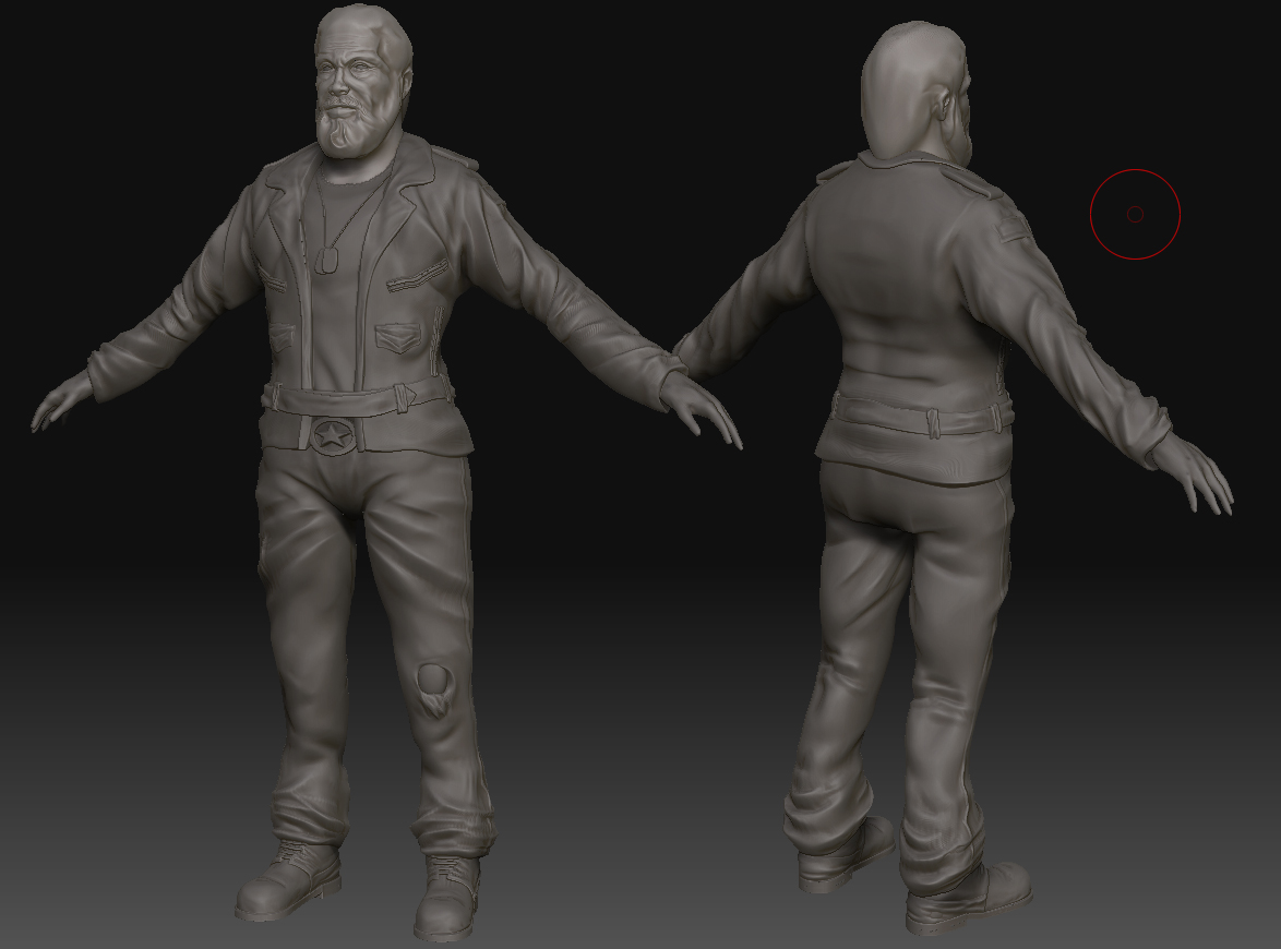
Biker Game Character WIP
This is some work that I have been doing for a mod. I have only done a few characters before, this is about my 2nd real character, i.e, fully mapped, start to finish complete, that I have ever done so still alot to learn.
Here is the work I have done so far.
Kind of taking my time on this and concentrating on the head first but this is the body so far:

Head sculpt, will probably try and use some extra planes alphas with the hair and beard to make it really pop.

First AO and normal map bake:

And first diffuse pass. Beard/hair is still under construction, normal map looks a little intense in areas, also looks a little blurred out, needs more skin texture:

Any and all crits welcome.
If your interested other older wip images can be seen: here
Here is the work I have done so far.
Kind of taking my time on this and concentrating on the head first but this is the body so far:

Head sculpt, will probably try and use some extra planes alphas with the hair and beard to make it really pop.

First AO and normal map bake:

And first diffuse pass. Beard/hair is still under construction, normal map looks a little intense in areas, also looks a little blurred out, needs more skin texture:

Any and all crits welcome.
If your interested other older wip images can be seen: here

Replies
I love the broken nose, lol.
Looking forward to seeing some progress
I tried inverting the green channel of the normals but I dont think that's causing the problems. There is a lot of noise in some areas of the normal map which I think its causing the errors your referring to. I have toned down some of the added detail, it was a little intense in areas. I think it looks better.
I have started some of the hair. Its only the base for now and I have tried to get some alphas to work. It's my first time using alphas to create hair.
Here are some gifs to show the hair so far. Comments and Crits welcome.
HonkyPunch Glad you liked the broken nose
ivanushka I see what your talking about, thanks for pointing it out.
Yamo I do need to give the back of the head and the neck area some tlc, I have neglected them, and focused a lot the on the face so far. TY
Gallows The skin is looking a little pale in the animated gifs vs the previous images for some reason, though when is a Maya render the other a view port screenshot. While he probably isnt sunbathing I do want to give him red cheeks, and the flushed face of a heavy drinker.
I wanted to add some alpha to the hair atop his head but wasn't sure how to go about it. I started with a similar approch to the beard but by the end of there were so many polygons and it just looked a mess. And with that many polys I couldn't justify doing his whole head.
So I have kept it minimal and just added some around by his ears and at the back of his head where his hair ends. (I have onl added them to right side of his head so far.)
LINK
Have greyed his hair a little, and added a few finer details, but the head is for the most part done, and so have began work on the low poly body.
Worked on a few things like the teeth. Very simple, top and bottom are the same, I think I may need to change the the top jaw a little from the bottom:
I have been doing some test bakes as I go, to make sure the model is capturing enough detail from the high-poly. So there are parts that at the moment aren't working, like the pockets and zips of the jacket, the dog tag isn't being baked at all (I'm using xnormal btw.) But that's what these test are for
Latest low-poly wip, he is currently weighing in little over 5800 tris.
I think low poly is going ok but I'm a little concerned about my topology. I think its a little messy in places,particularly the arms. I tried to follow the creases in the arms but I don't know if this is going to cause too many problems when/if its animated, any thoughts?
Here is the diffuse and alpha map to show what's going on. I realise I could be a little more ecnomical with the alphas and use larger repeatable tiles, but this seemed to work. I might experiment a little more with doing it more efficiently now I know how to do it and if I have time. Its a little rough and untidy. Still a few things to go on it like the tongue, teeth and mouth.
The low poly version is looking really good. Looking forward to the texture.
Might be cool to see some tuffs of white in his hair/beard, add a bit of character and variety to 'em. The beard also seems a little too well trimmed, be nice to see some stray hairs along the beard line (is that what it's called?), would ease the transision between the beard and the face to boot.
Yeh, agree with you about the beard. Adding a few white hairs to the alphas would probably make them stand out more too.
Finished the low poly today, still open to crits and comments. Final polycount 6785 tris. Which is well with in budget, but then the budget was some what excessive.
And seeing as I was testing the body in marmoset I dropped the wip diffuse map in there too.
That quiff of hair is looking mighty dodgy.
Next on the agenda, create body diffuse map and finish head diffuse. To the bat mobile!
Been working on the diffuse map today. Can't get that knee between the split of his jeans to look natural. May close the gap and put it into shadow if I it doesn't work out. Also the back of his leather jacket is looking very plain I think. Haven't to to the buckle, boots or dog tags yet. Still a lot of detail to work into it but enjoying it
I'm not sure if the jacket looks a little too 'blazer' like.
Bike jackets are usually shorter and are either 'collarless' or have the double breasted kinda vibe.
Here's what I mean by blazer:
And a biker style leather jacket:
Thanks for pointing it out and for the pics too. I'm thinking maybe if add some details like the zips, silver buttons and roughin' it up some more it will move away from the blazer and resemble the the jacket more. Thanks man.
You say this is for a mod, and this dude kinda looks like the leader of the gang, reminds me of the boss dude from GTA's Lost and Damned. So maybe if you do any more biker guys you could obviously use the shorter jackets on the others.
you've probably finished the head's diffuse now but i had a minor suggestion; you said he'd have red cheeks because of heavy drinking, and i thought you could depict that more with a ruddy/blotchy complexion and 'hemorrhaged' pores/skin.
i would love to see how you sculpted the leather jacket - especially the sleeves (cause I'm currently having problems with my own
anyway nice work
Sorta like this guy
achmedthesnake I still have some tweaks that I want to make to the head. Blotchy skin is kind of what I had in mind. Thanks for c&c.
As for the folds I didn't really plan it per se and I didn't have any specific photo reference. What I did find useful was looking at artwork by Mashru Mishu and Benjamin Leitgeb. I know its not always good to rely upon the artwork of others for direct reference but knowing what it looks like when done right helped me. Selwy has kinda tutorial as well as his "fold" brushes for download. Which I found useful when starting out, but a combination of lazy mouse, gravity, and the standard brush tool with an increased focal shift works.
crazyfingers Thanks for the c&c. The guy wasn't concepted to be quite as broad as that guy! But I see what your saying. ;p He is a little on the short side, I keep meaning to make him a little taller but haven't got round to it, I'll probably also play with the proportions a little, see what I can do with out too much stretching.
LlamaJuice Ooo yeah, those are a little small now you point it out.
Ok for an update, I have added some details such as zips, buttons, patchs, stains, dirt, etc, etc. Just keeping at it, scribing in the details.
Overall, the skin tone you have now seems pretty washed out...and the cooler grey/black tones of the shadows and wrinkles are probably contributing. I think that adding ruddiness and blotchiness to his face, as well as making the shadows warmer, will make his complexion more convincing.
Thanks snake85027 for pointing out the hands, I added in the gloves and looks like I didnt quite scale hands correctly it seems, should look a little better now.
Thanks for the c&c Fireflights. I think relying too much on the AO for shading did result in washed out skin tones.
I have tried to work in some blotchy skin but I think some more detail could still be added.