P90 smg
polycounter lvl 17
Hey PC!
So after spending my whole winter break on playing mw2, and falling in love with the P90. I decided to model one. Just finished the hi poly as good as I could from references. Only part I'm a little unsure about is under the back handle piece, it looks like there should be buttons of some sort? Not sure, any help would be very appreciated!
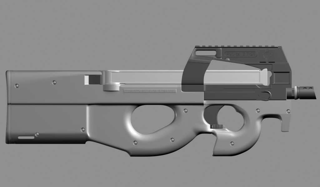
So after spending my whole winter break on playing mw2, and falling in love with the P90. I decided to model one. Just finished the hi poly as good as I could from references. Only part I'm a little unsure about is under the back handle piece, it looks like there should be buttons of some sort? Not sure, any help would be very appreciated!
Replies
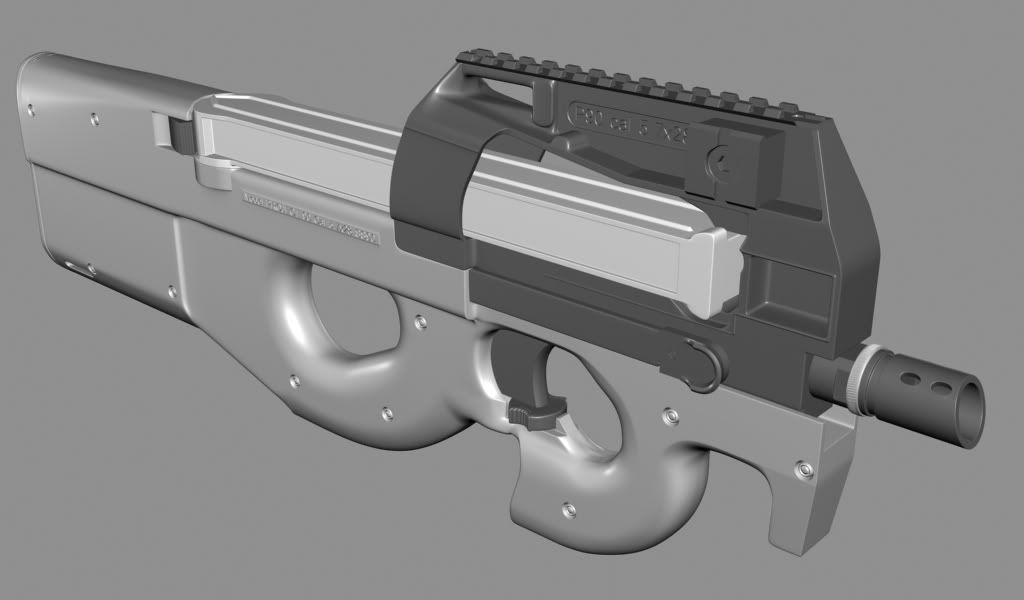
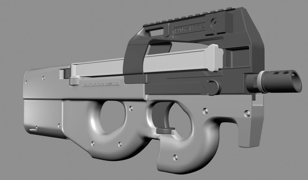
Looks great Diwan. I think it looks just like the reference you've used, so im not sure i have much of a critique. That's the beauty of modeling existing props
I'll have more critiques when you get into baking/lowpoly/texturing.
Love where it's going for sure.
Some parts seem a bit skinny to me, the most noticeable and significant being where the stock meets the back of the magazine, it should taper outward more and meet almost flush with the cylindrical end of the magazine.
Can't wait to see the LP and bakes!
Here is the link in case my internet is being wonky:
http://www.pixagogo.com/DeicideNBF
Thanks guys for the kind words
But I've found that doing very subtle stuff with a nice spec is alot more interesting/visually appealing. like EricV said, it looks like a bomb went off near it or something.
So I would say to tone that stuff down alot, and bring in some smaller nicks/scratches around some of the edges, but don't make the scratches too uniform, keep them somewhat random.
There's not much to say on the color, but the magazine almost looks like it's made of Bakelite, the usual FN P90 mag appears more opaque and you can almost see the bullets along with the springs.
It would be nice to see some highlights on the body to make it pop out.
Any plans to add something on top like a red dot sight?
The diffuse is high contrast and cloudy and makes it look like some smoky, ethereal thing. Lower the contrast on the basic tones and solidify that thing up. Pop should come from material changes and scratched edges, not a ridiculous photoshop cloud filter.
Also, general rule of thumb, your plastics' specular base color should be as light as or lighter than your diffuse -- and your metals, the specular should be much lighter.
Do it like this -> http://www.3pointstudios.com/portfolio_weapons.shtml
contrast comes from specular! These are hard surfaces!
the model/bake is sweet, though.
EQ eat a dongle.
EricV - Are you saying that the scratches are too much as well?
mLichy - I was trying really hard to not make the scratches on the metal piece too uniform, are you suggesting that I bring them down even more?
pliang - Yeah the tape isn't really for the fragility of the weapon, just holding up the wire from the flashlight and the flashlight button on place.
I agree on the mag color, but as I stated on my post I didnt have any alpha maps going on to make the mag opaque for now, just trying to get the color right
SupRore - Yeah like I stated on my post, only diffuse is shown in those screenshots, no spec at all. But yeah I agree the dirt was to much, I was trying to make the plastic look interesting I guess.
EQ - Hey, my normals are tangent, let me know what you think of the normalmap and the new ss.
Johny - Not sure what part you mean, but if you mean the dirtyness on the handle part I believe that is plastic and not metal. Correct me if I'm wrong, but it looks really like plastic to me.
I went ahead and did a quick change on the color and just slapped on a simple spec map for now to see some of the details more closely. The plastic area is my biggest challenge so far, I went ahead and tried to give it some greasy surface. Let me know what you think, Thanks!
but it feels like the top tape parts color is almost identical to some of the metal on the pipe.. maybe make the colors more distinct or change a little in the spec? anyways, great work!
Then start your spec! these are not materials which you can accurately represent with diffuse only. You need the relationship between spec/diffuse from the start, or it's going to look like shit.
The plastic will look interesting because of your specular map. Get to it!
Make the highlights much tighter in those plastic areas by increasing the spec power.
As for the tape, it is a good idea but i don't think you are doing it justice. IMO, 2 pieces is unnecessary. The placement of the tape also makes little sense. Adding a large crack somewhere in the stock of the gun, and tape to keep it together reinforces how beat up it already looks and adds character as the owner of the gun has repaired it. Also, maybe some sort of writing on the tape to reinforce ownership, a name for the gun or perhaps hash marks for how many kills have been made by it.
The magazine is way too dirty and cloudy, tighten the grunge into the corners and apply that opacity so you can make more accurate decisions as to what is needed.
Keep up the good work dude!